13.6 Visualizing spatial autocorrelation with the Moran scatter plot
In GeoDa, a Moran scatter plot is created from the menu as Space > Univariate Moran’s I. Alternatively, it can be invoked through the
left most icon in the spatial subset of the toolbar, highlighted in Figure 13.1, followed by selecting Univariate Moran’s I from the drop down list.
13.6.1 Creating a Moran scatter plot
The first requirement for the Moran scatter plot is to select a variable, through the familiar Variable Settings interface. The community area income per capita variable is INCPERCAP. The Weights need to be chosen from the matching drop down list.
If the Weights Manager does not contain at least one spatial weight, then one must be created or loaded. The example uses first order queen contiguity, as the file Chicago_2020_q.gal. Selecting OK brings up the Moran scatter plot shown in Figure 13.9. This graph has the same features as the standard scatter plot (Section 7.3), except that no statistics are provided at the bottom. Also, in contrast to what holds for the standard scatter plot, the Regimes Regression option is not active.
13.6.2 Moran scatter plot options
In the usual way, a right click on the graph brings up a list of available options. These are largely identical to those for a standard scatter plot (Section 7.3.1), with a few exceptions. Since the variables in the Moran scatter plot are standardized by design, there is no Data option.
One additional feature is to Save Results. This saves two new variables to the data table, one with the standardized variable and one with its spatial lag. The default variable names for these are, respectively, MORAN_STD and MORAN_LAG.
13.6.2.1 Randomization
As such, the slope of the linear fit only provides an estimate of Moran’s I, but it does not reveal any information about the significance of the test statistic. The latter is obtained by means of the Randomization option, which implements a permutation approach. Four hard-coded choices are provided for the number of permutations: 99, 199, 499, and 999. In addition, there is an Other option, which allows for any value up to 99,999. As a consequence, the smallest result that can be obtained for the pseudo p-value is 0.00001. This implies that out of 99,999 randomly generated data sets, none yielded a computed Moran’s I that equals or exceeds the one obtained from the actual data.
The result for a choice of 999 is shown in Figure 13.7, with an associated pseudo p-value of 0.001 for the spatial distribution of the Chicago community area per capita income data. The graph provides strong evidence of spatial clustering of similar values.
As detailed in Section 13.5.2.2, the reference distribution is accompanied by several descriptive statistics, such as the theoretical (E[I]) and empirical means, the standard deviation, and the associated z-value.
The Run button allows for repeated simulations in order to assess the sensitivity of the result to the particular run of random numbers that is used. For a large number of permutations such as 999, one run is typically sufficient.
13.6.2.2 Reproducing results - the random seed
In order to facilitate replication, the default setting in GeoDa is to use a specific
seed for the random number generator. This is evidenced by the check mark
next to Use Specified Seed in the Randomization options.
The default seed value used is shown when selecting the Specify Seed … box, where it can also be changed.
The random seed can also be set globally in the Preferences, under the System tab, selected under the GeoDa item on the menu. At the bottom of the dialog, under the item Method:, the box for using the specified seed is checked by default, and the value 123456789 is used as the default seed. This can be changed by typing in a different value.
The same random seed
is used in all operations in GeoDa that rely on some type of random permutations, such as all flavors
of the Moran scatter plot, as well as all the local spatial autocorrelation statistics. This
ensures that the results will be identical for each analysis that uses the same
sequence of random numbers.
However, due to the way the random number generator is implemented in each operating system, there may be slight differences in the results depending on the hardware, especially when a different number of CPU cores is used.102 In order to control for any such discrepancies, it is possible to Set the number of CPU cores manually in the Preferences.
13.6.2.3 LOWESS smoother
For the Moran scatter plot, the default is a Linear Smoother, but just as for the standard scatter plot, it is also possible to use a nonlinear smoother. The View > LOWESS Smoother works in exactly the same way as for the standard scatter plot.
With the View > Linear Smoother option turned off, only the nonlinear fit from the local regression is shown on the Moran scatter plot, as in Figure 13.12. The LOWESS smoother can be explored to identify potential structural breaks in the pattern of spatial autocorrelation. For example, in some parts of the data set, the curve may be very steep and positive, suggesting strong positive spatial autocorrelation, whereas in other parts, it could be flat, indicating no autocorrelation.
The local smoother is fit through the points in the Moran scatter plot by utilizing only those observations within a given bandwidth. As for the standard scatter plot, the default is to use 0.20 of the range of values. This can be specified by selecting the View > Edit LOWESS Parameters item in the options menu, in the usual way.
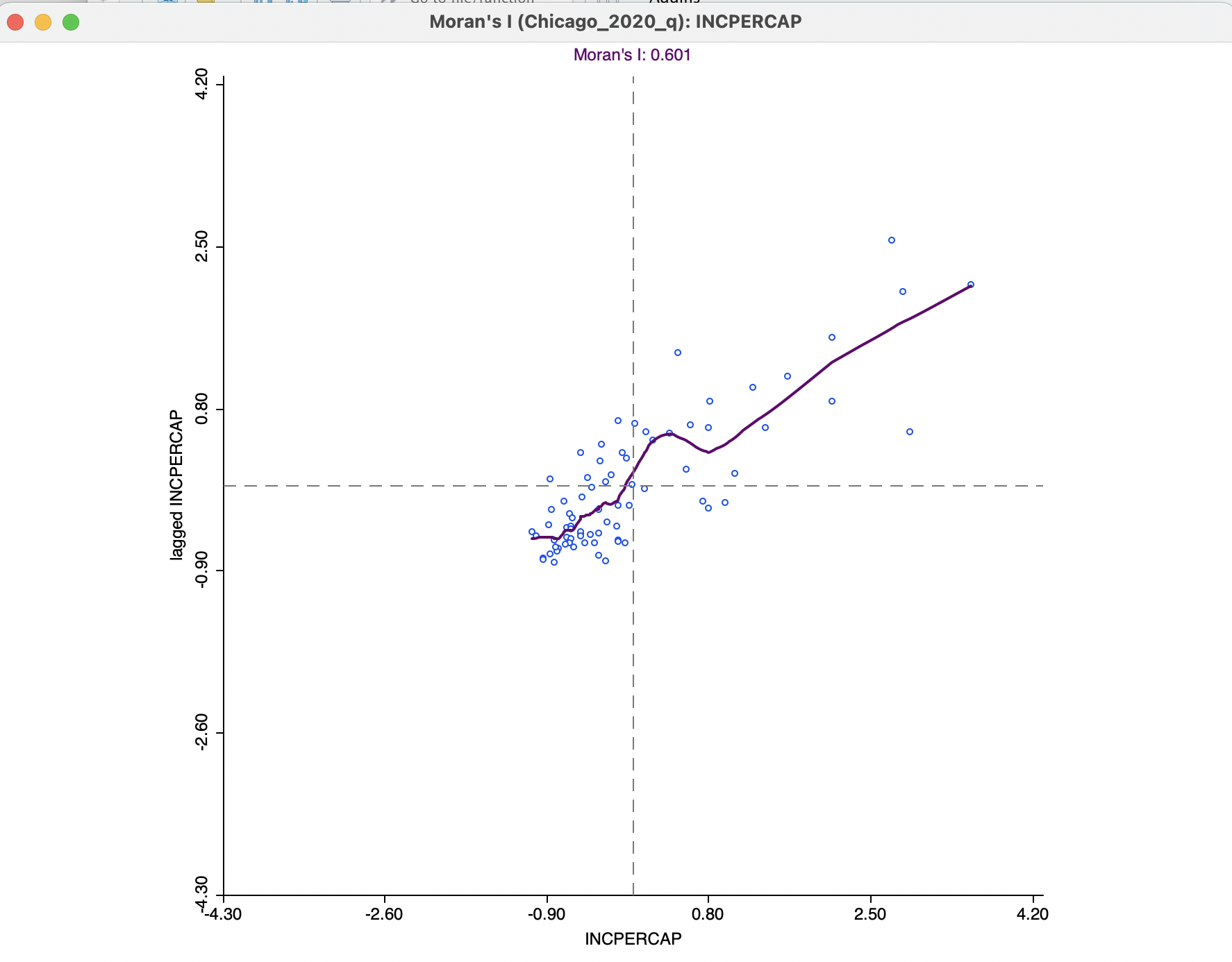
Figure 13.12: Moran scatter plot LOWESS smoother
Using the default bandwidth, the nonlinear smoother in Figure 13.12 suggests some instability in the global spatial autocorrelation for values of \(z\) between 0 and 0.80, where the generally positive slope turns into a negative one for a brief interval. Through linking (and brushing), the corresponding observations can be identified on the associated map.
13.6.3 Brushing the Moran scatter plot
An important option to assess the stability of the spatial autocorrelation throughout the data set, or, alternatively, to search for potential spatial heterogeneity, is the exploration of the scatter plot through dynamic brushing.
This is invoked by selecting Regimes Regression in the View option. As in the standard scatter plot, with this option selected, statistics for the slope and intercept are recomputed as observations are selected and unselected. However, this is implemented somewhat differently for the Moran scatter plot.
As soon as this option is activated, three Moran scatter plots are shown, as in Figure 13.13. The one to the left (in red) is for the selected observations. The one to the right is for the complement, referred to as unselected (in black).
In the figure, 18 observations from the high-high and high-low quadrants have been selected, as indicated in the status bar. These yield a Moran’s I of 0.035, illustrated by the plot on the left. The Moran’s I for the complement is 0.750. While there is no significance associated with these measures, they suggest the presence of spatial heterogeneity.
The distinguishing characteristics of the selection in the Moran scatter plot (and any associated brushing) is that the spatial weights are dynamically updated for both the selection and the unselected observations. More precisely, for each of the subset of observations, selected and unselected, the spatial weights are adjusted to remove links to observations belonging to the other subset. In other words, there are no edge effects and each subset is treated as a self-contained entity.
As a result, the slope of the Moran scatter plots on the left and the right are as if the data set consisted only of the selected/unselected points. This is a visual implementation of a regionalized Moran’s I, where the indicator of spatial autocorrelation is calculated for a subset of the observations (Munasinghe and Morris 1996). As the brush is moved over the graph, the selected and unselected scatter plots are updated in real time, showing the corresponding regional Moran’s I statistics in the panels.
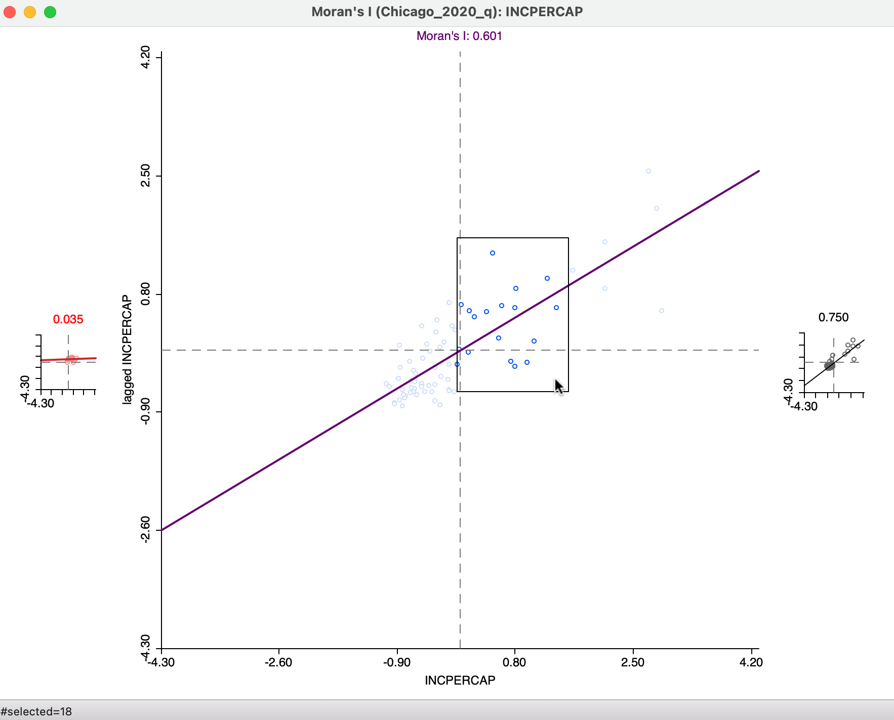
Figure 13.13: Brushing the Moran scatter plot
An alternative perspective is to approach the brushing starting with the map, as in Figure 13.14. In the left panel, 22 community areas are selected, with the associated observations highlighted in the Moran scatter plot to the right. The Moran’s I corresponding to the selection is 0.006, with 0.583 for the complement, again suggesting somewhat of a structural break.
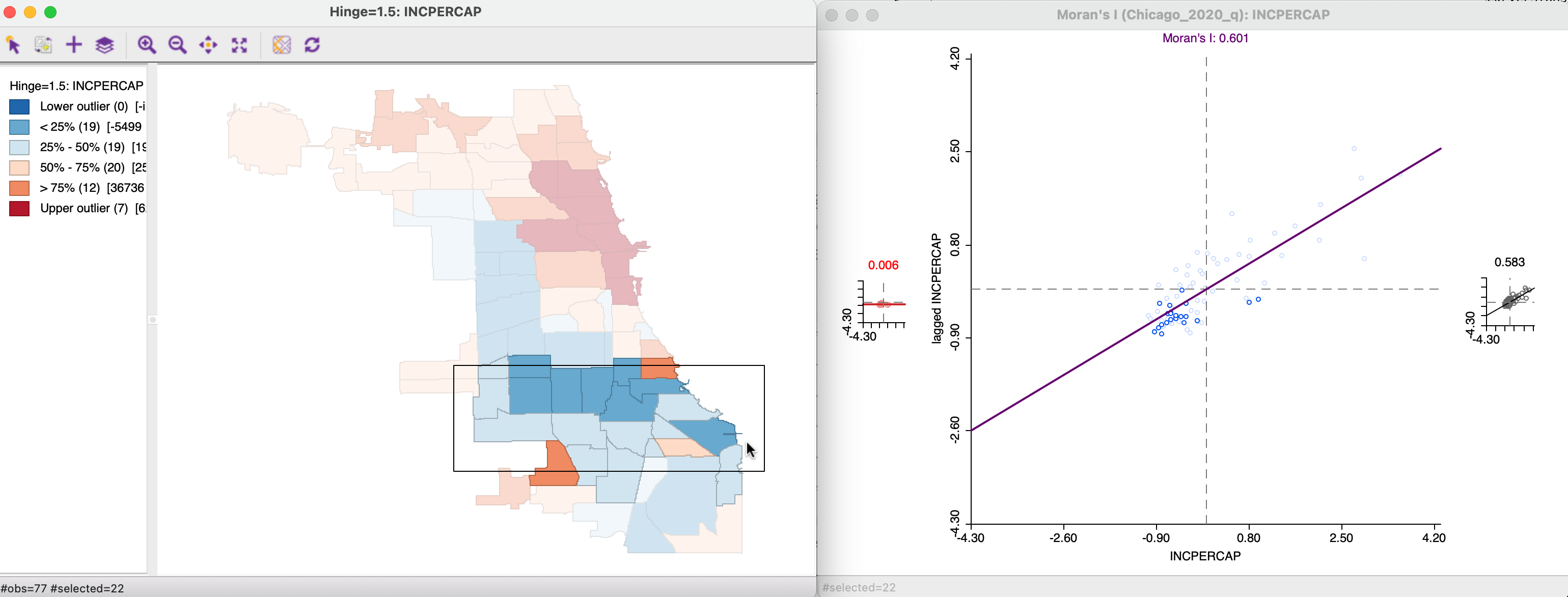
Figure 13.14: Brushing and linking the Moran scatter plot
13.6.3.1 Static and dynamic spatial weights
The behavior of the Moran scatter plot with Regimes Regression turned on is to have the spatial weights updated dynamically, in order to remove any edge effects. This contrasts with the treatment in a conventional scatter plot constructed with the standardized variable and its spatial lag.
In Figure 13.15, the two variables are used that were formed by the Save Results option, i.e., MORAN_STD on the horizontal axis and MORAN_LAG on the vertical axis. Since this is a standard scatter plot, the Regimes Regression option is on by default, resulting in the statistics for selected and unselected at the bottom.
The graph is for the same 22 observations as selected in Figure 13.14. However, in contrast to that case, there is no dynamic adjustment of the spatial weights.
More precisely, this means that the spatial lag for a selected/unselected observation is computed from all its original neighbors, including the ones that belong to the other subset. In the example, the corresponding slopes are, respectively, 0.218 and 0.590, compared to 0.006 and 0.583 for the dynamic weights. The associated Chow test shows strong evidence of structural instability.
However, this result needs to be interpreted with caution, since the weights structure has not been adjusted to reflect the actual breaks within the data set. Specifically, the areas at the edge of the selection are still connected to their neighbors, whereas this is not the case in the dynamic weights approach. The standard scatter plot ignores boundary effects, in the sense that it includes neighbors outside the regimes. In some contexts, this may be the interpretation sought, whereas in others the dynamic weights adjustment is more appropriate.
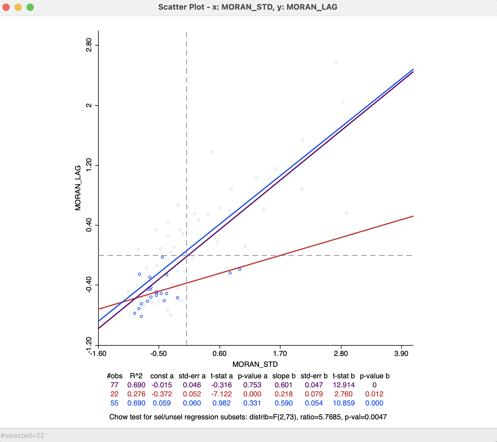
Figure 13.15: Static spatial weights in Moran scatter plot
The implementation of the random numbers in
GeoDatakes advantage of multi-threading, a built-in form of parallel computing.↩︎