16.4 Clusters and Spatial Outliers
A critical link in the interpretation of significant Local Moran statistics is the connection between the Moran scatter plot and the cluster map. As shown in Chapter 14, the Moran scatter plot provides a classification of spatial association into four categories, corresponding to the location of the observations in the four quadrants of the plot. These categories are referred to as High-High, Low-Low, Low-High and High-Low, relative to the mean, which is the center of the graph. It is important to keep in mind that there is a difference between a location being in a given quadrant of the plot, and that location being a significant local cluster or spatial outlier.
The cluster map provides a way to interpret the results and classify observations. However, this is only valid for those locations where the local statistic is significant.
16.4.1 Clusters
Clusters are centered around locations with a significant positive Local Moran statistic, i.e., locations with similar neighbors. In the terminology of the Moran scatter plot, these are either High-High or Low-Low locations.
Figure 16.4 illustrates the connection between the Moran scatter plot and the cluster map. On the left, the 230 observations in the High-High quadrant of the Moran scatter plot for p_PHA (2010) (using queen contiguity) are selected. Through the process of linking, the corresponding observations are highlighted in the cluster map on the right. It is clear that only a fraction of the locations in the High-High quadrant are actually significant (42), shown as the bright red municipalities in the map. The non-significant ones are identified in a grey color, as illustrated by the locations within the red rectangle on the map.
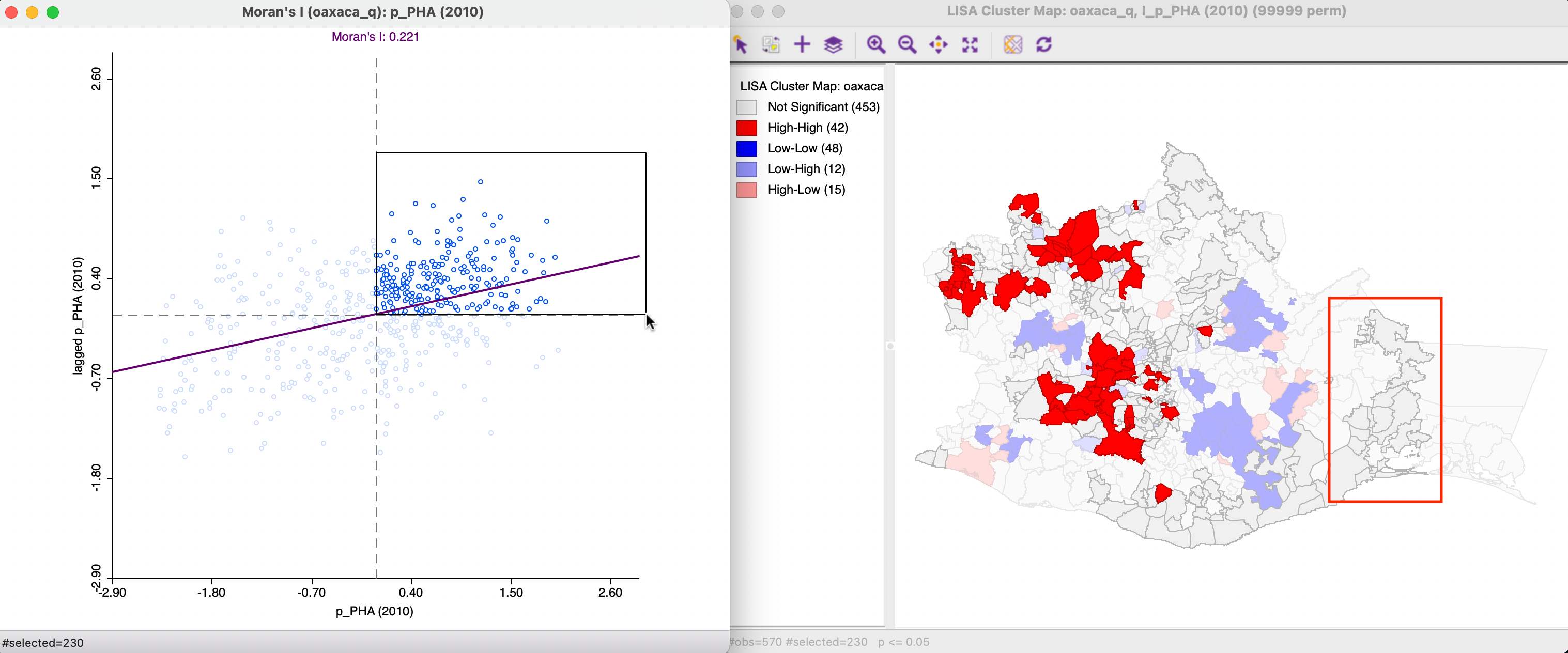
Figure 16.4: High-High observations in Moran Scatter Plot
The reverse logic works as well, as shown in Figure 16.5. The High-High locations are selected in the cluster map on the right (by clicking on the red rectangle in the legend) and the corresponding 42 observations are highlighted in the Moran scatter plot on the left. Again, this confirms that just belonging to the High-High quadrant in the Moran scatter plot does not imply significance.
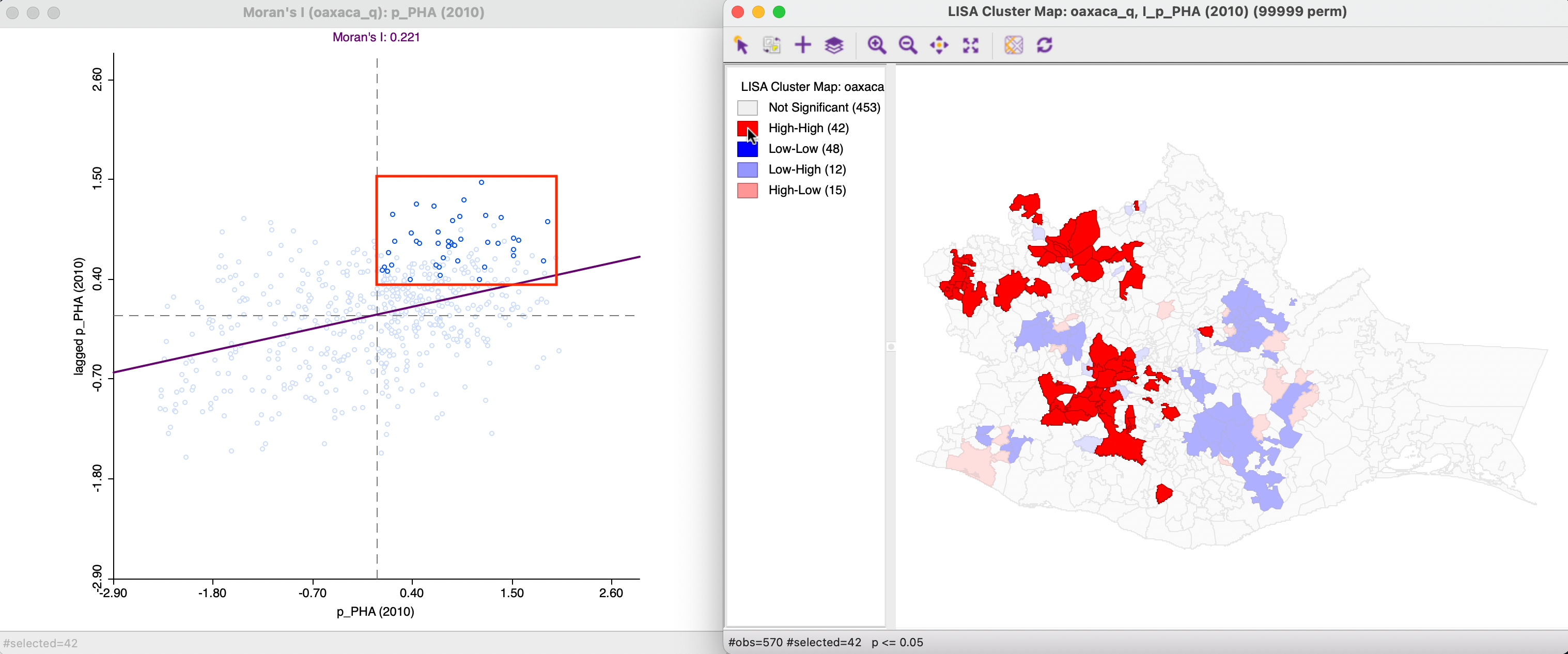
Figure 16.5: Significant High-High observations in Moran Scatter Plot
A similar exercise can be carried out for observations in the Low-Low quadrant, which also correspond with positive local spatial autocorrelation.
The interpretation of clusters is not always that straightforward (see also Section 16.5.3), especially after inspecting a choropleth map of the variable of interest. In some instances, it is very clear that an observations is selected as High-High when it is in the top category and surrounded by neighbors that are also in the top category. For example, in Figure 16.6, the location selected within the black rectangle on the cluster map (with the arrow pointed at it) belongs to the top quartile in the box map on the left. In addition, its neighbors all also belong to the top quartile, hence a natural interpretation as a cluster.
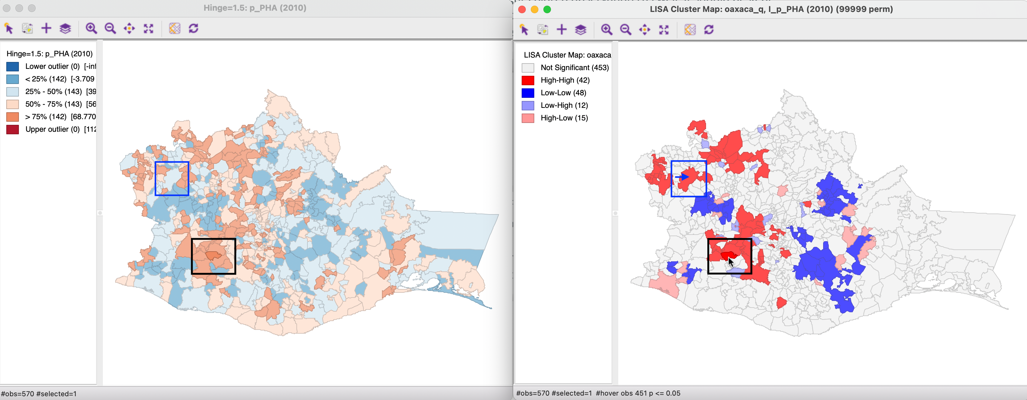
Figure 16.6: High-High cluster location
However, in other instances, the identification as a High-High (or similarly, Low-Low) cluster may seem counter-intuitive. Consider the High-High location identified with the blue arrow on the cluster map. In the box map to the left, that location is shown as belonging to the second quadrant, i.e., below the median, which would seem to contradict the characterization as high. However, as it turns out, for 2010 the median value of access to health care (56.9) is above the mean (53.4), so that it is possible for an observation to be below the median, but still above the mean. Moreover, the simplification of the continuous distribution into a small number of discrete map categories may be confusing. In this particular example, the spatial lag is well above the mean, even though the neighbors of the location in question consist of a mix of municipalities from all four categories on the map. It is important to keep in mind that the spatial lag is the average of the neighbors, and its value can be easily influenced by a few extreme values. In addition, the categories on the map may contain observations with very disparate values (depending on the range in the given category), which may yield less than intuitive insights into the similarity of neighbors.
16.4.2 Spatial Outliers
Spatial outliers are locations with a significant negative Local Moran statistic, i.e., locations with dissimilar neighbors. In the terminology of the Moran scatter plot, these are observations in the off-diagonal quadrants, i.e., High-Low or Low-High locations.
Again, the significant spatial outliers are only a subset of the observations in the respective off-diagonal quadrant of the Moran scatter plot. For example, in Figure 16.7, the selected High-Low spatial outliers in the cluster map on the right correspond to only 15 of the 106 observations in the lower left quadrant, as shown in the left-hand panel.
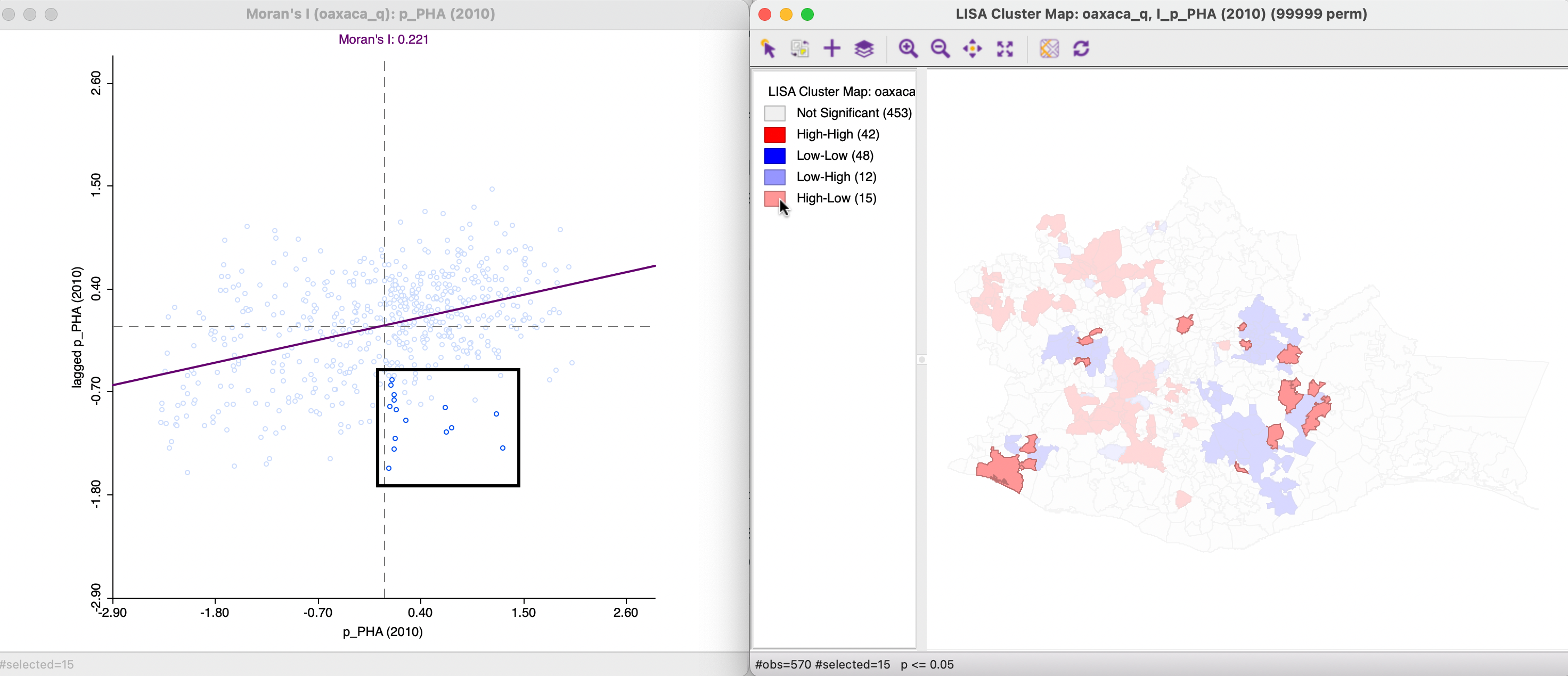
Figure 16.7: Significant High-Low observations in Moran Scatter Plot
Here also, there may be some counter intuitive results. On the one hand, in the case of the selected High-Low outlier in the purple rectangle in the right-hand panel of Figure 16.8, the interpretation is straightforward. As seen in the left-hand panel, it consists of an observation in the top quartile (indicated by the dark brown color), surrounded by neighbors in the first or second quartile (blue colors), corresponding with much lower values. However, the interpretation of the spatial outlier in the blue rectangle is less straightforward. As shown in the left-hand panel, this corresponds with an observation in the second quadrant, i.e., below the median, but, as before, above the mean, hence classified as high. This observation is surrounded by neighbors in the first quadrant (i.e., with lower values), but one neighbor belongs to the top quadrant. Again, what matters here is the average of neighboring values, not the classifications within which they fall.
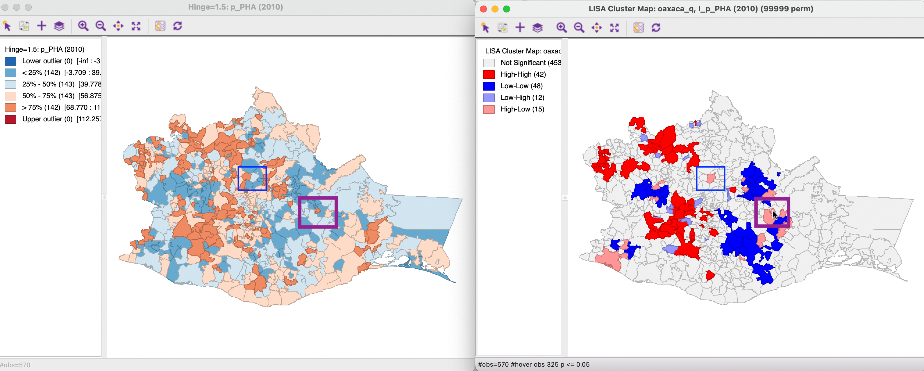
Figure 16.8: High-Low spatial outlier location