7.3 Bivariate Analysis - The Scatter Plot
The most commonly used tool to assess the relationship between two variables is the scatter plot, a diagram with two orthogonal axes, each corresponding to one of the variables. The observation (X, Y) coordinate pairs are plotted as points in the diagram.
Typically, the relationship between the two variables is summarized by means of a linear regression fit through the points. The regression is: \[y = a + bx + \epsilon,\] where \(a\) is the intercept, \(b\) is the slope, and \(\epsilon\) is a random error term. The coefficients are estimated by minimizing the sum of squared residuals, a so-called least squares fit, or ordinary least squares (OLS).
The intercept \(a\) is the average of the dependent variable (\(y\)) when the explanatory variable (\(x\)) is zero. The slope shows how much the dependent variable changes on average (\(\Delta y\)) for a one unit change in the explanatory variable (\(\Delta x\)). It is important to keep in mind that the regression applied to the scatter plot pertains to a linear relationship. It may not be appropriate when the variables are non-linearly related (e.g., a U shape).
When \(y\) and \(x\) are standardized (mean zero and variance one), then the slope of the regression line is the same as the correlation between the two variables (the intercept is zero). Note that while correlation is a symmetric relationship, regression is not, and the slope will be different when the explanatory variable takes on the role of dependent variable, or vice versa. Just as a linear regression fit may not be appropriate when the variables are related in a non-linear way, so is the correlation coefficient. It only measures a linear relationship between two variables, which is clearly demonstrated by its equivalence to the regression slope between standardized variables.
7.3.1 Scatter plot basics
A scatter plot is created by selecting Explore > Scatter Plot from the menu, or by clicking on the matching toolbar icon, the third from the left in Figure 7.1. This brings up the Scatter Plot Variables dialog, where two variables need to be selected: one for the X axis (Independent Var X) and one for the Y axis (Dependent Var Y).
To illustrate this graph, the X variable is ppov_20 (percent population living in poverty in 2020) and the Y variable pfood_20 (percent population with food insecurity in 2020). The resulting scatter plot, with all the default settings, is as in Figure 7.10.
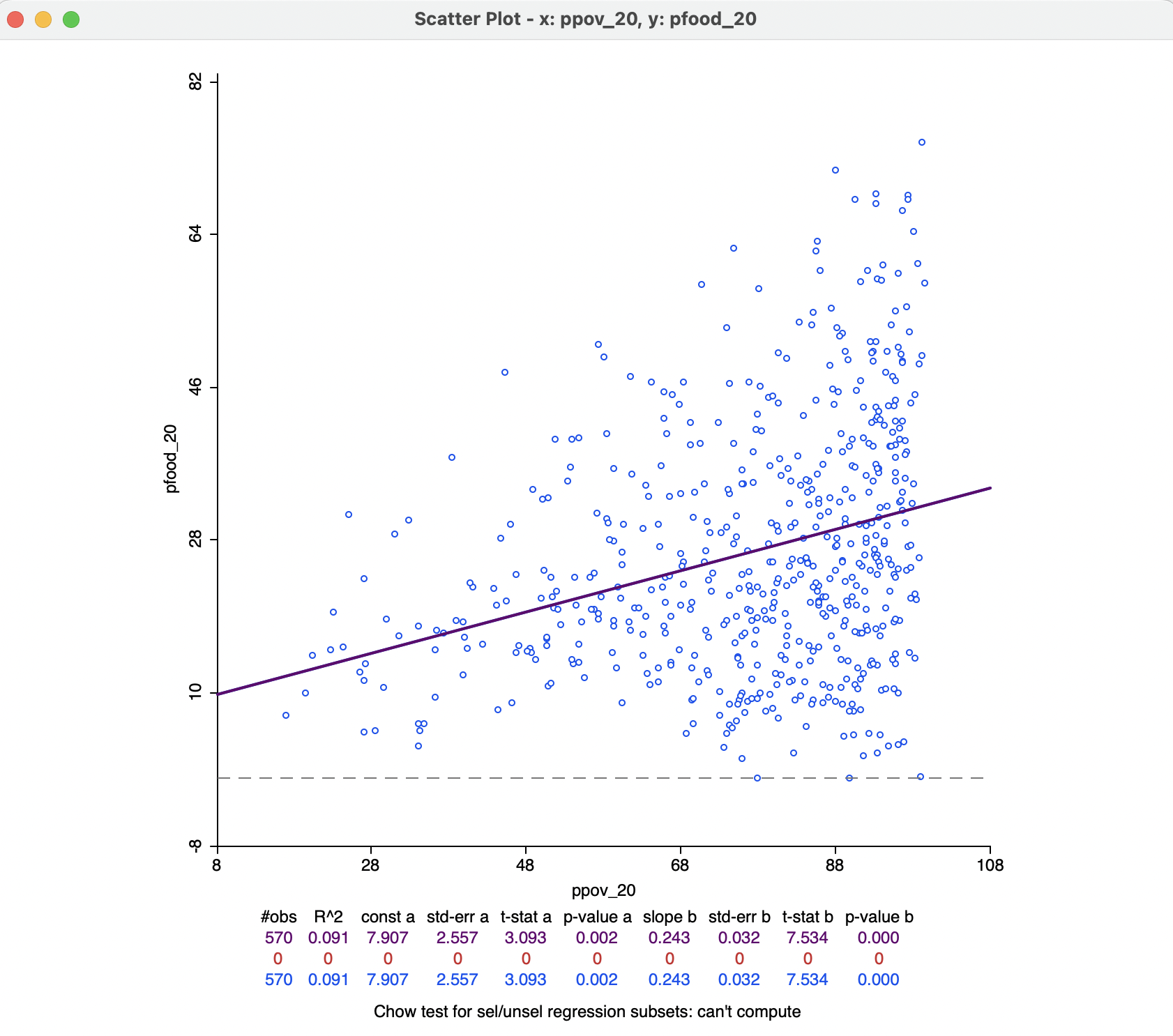
Figure 7.10: Scatter plot of food insecurity on poverty
The top of the graph spells out the X and Y variables, which are also listed along the axes. The linear regression fit is drawn over the points, with summary statistics listed below the graph. These included the fit (\(R^2\)) and the estimates for constant and slope, with estimated standard error, t-statistic, and associated p-value. In the example, the fit is a low 0.091, which is not surprising, given the cone shape of the scatter plot, rather than the ideal cigar shape. Nevertheless, both intercept and slope coefficients are highly significant (rejecting the null hypothesis that they are zero) with p-values of 0.002 and 0.000 respectively.
The positive relationship suggests that as poverty goes up by one percent, the share in food insecurity increases by 0.24 percent.
In the current setup, no observations are selected, so that the second line in the statistical summary in Figure 7.10 (all red zeros) has no values. This line pertains to the selected observations. The blue line at the bottom relates to the unselected observation. The sum of the number of observations in each of the two subsets always equals the total number of observations, listed on the top line. The three lines are included because of the default View setting of Regimes Regression, even though there is currently no active selection (see Section 7.3.1.1).
The scatter plot has several options, invoked in the customary fashion by right clicking on the graph. They are grouped into eight categories:
- Selection Shape
- Data
- Smoother
- View
- Color
- Save Selection
- Copy Image to Clipboard
- Save Image As
Selection Shape works as in the other graphs and maps (see Section 2.5.4), and so do the three last options. The Color options allow for the Regression Line Color, Point Color and Background Color to be set. The remaining options are discussed in more detail below.
7.3.1.1 View options
The View option manages seven settings, all but the first two checked by default:
- Set Display Precision
- Set Display Precision on Axes
- Fixed Aspect Ratio Mode
- Regimes Regression
- Statistics
- Axes Through Origin
- Status Bar
These options are mostly self-explanatory, or work in the same way as before (such as Statistics), except for the Regimes Regression.
The latter allows for a dynamic assessment of structural stability by comparing the regression line for a selected subset of the data to its complement (unselected). For example, in Figure 7.11, 206 observations have been selected (inside the selection rectangle). This yields three regression lines: a purple one for the full data set (same results as in Figure 7.10), a red one for the selected observations, and a blue one for its complement (384 observations). With each regression line corresponds a line in the statistics summary. In Figure 7.11, the selected observations show no significant linear relationship between the two variables. In other words, for a range of poverty roughly between 30% and 70%, there is no linear relationship with food insecurity (p-value of 0.542), whereas for the whole and for the complement, there is. This is an indication of structural instability.
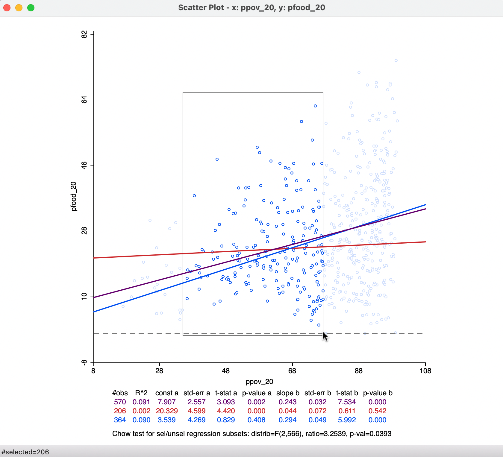
Figure 7.11: Regime regression
A formal assessment of structural stability is based on the Chow test (Chow 1960). This statistic is computed from a comparison of the fit in the overall regression to the combination of the fits of the separate regressions, while taking into account the number of regressors (k). In our simple example, there is only the intercept and the slope, so k = 2. The residual sum of squares can be computed for the full regression (\(\mbox{RSS}\)) and for the two subsets, say \(\mbox{RSS}_1\) and \(\mbox{RSS}_2\). Then, the Chow test follows as: \[C = \frac{(\mbox{RSS} - (\mbox{RSS}_1 + \mbox{RSS}_2))/k}{(\mbox{RSS}_1 + \mbox{RSS}_2)/(n - 2k)},\] distributed as an F statistic with \(k\) and \(n - 2k\) degrees of freedom. Alternatively, the statistic can also be expressed as having a chi-squared distribution, which is more appropriate when multiple breaks and several coefficients are considered.54 In our example, the p-value of the Chow test is 0.039, which is only weakly significant (in part this is due to the fact that the overall regression coefficient of 0.243 is not that different from zero itself). The assessment of structural stability is considered further in the context of spatial heterogeneity in Section 7.5.2.
The Regimes Regression option is on by default. Turning it off disables the effect of any selection and reduces the Statistics to a single line.
7.3.1.2 Data options
The default setting for the Data option is to View Original Data. In other words, the points in the scatter plot correspond to the respective entries for the variables in the data table. With this option turned to View Standardized Data, each variable is used in standardized form. As a result, the axes can be interpreted as expressing standard deviational units. Values larger than two in absolute value indicate potential outliers.
The slope of the regression line applied to the standardized variables corresponds to the correlation coefficient. The intercept will be zero.
In Figure 7.12, some outliers can be detected at the lower end for ppov_20, but not at the upper end. For, pfood_20, the reverse is the case, with several upper outliers, but no lower outliers. The correlation coefficient is 0.301.
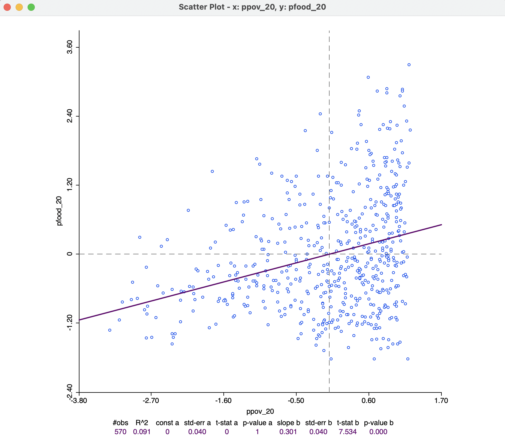
Figure 7.12: Correlation
7.3.2 Smoother option - local regression
The default fit to the scatter plot points is a global linear regression. This can be turned off by means of the Smoother > Show Linear Smoother option.
When the relationship between the two variables in the scatter plot is not linear, or shows complex sub-patterns in the data, a linear fit may not be appropriate. An alternative consists of a so-called local regression fit. A local regression fit is a nonlinear procedure that computes the slope from a subset of observations on a small interval on the X-axis. In addition, values further removed from the center of the interval may be weighted down (similar to a kernel smoother). As the interval (the bandwidth) moves over the full range of observations, the different slopes are combined into a smooth curve (for a detailed overview of the methodological issues, see, e.g., Cleveland 1979; and Loader 1999, 2004).
A local regression fit reveals potential nonlinearities in the bivariate relationship or may suggest the presence of structural breaks. Two common implementations are LOWESS, locally weighted scatter plot smoother, and LOESS, a local polynomial regression. The two are often confused, but implement different fitting algorithms.
The option Smoother > Show LOWESS Smoother calculates a local regression fit based on the LOWESS algorithm. Continuing with the same two variables, the result is as in Figure 7.13, using the default settings.
The smoothness of the local fit depends on a few parameters, considered next. Note that the Regimes Regression setting has no effect on the LOWESS fit. Also, in Figure 7.13, the linear fit has been turned off. However, in some instances, it may be insightful to have both fits showing in the scatter plot.
In the example, the curve shows a fairly regular, near linear increase up to a poverty level of about 60 %, but a much more irregular pattern at higher poverty rates, with a very steep positive relationship at the very high end. In the middle range (the same range of ppov_20 as selected in Figure 7.11), the curve is almost flat, in rough agreement with what was found in the regime regression example.
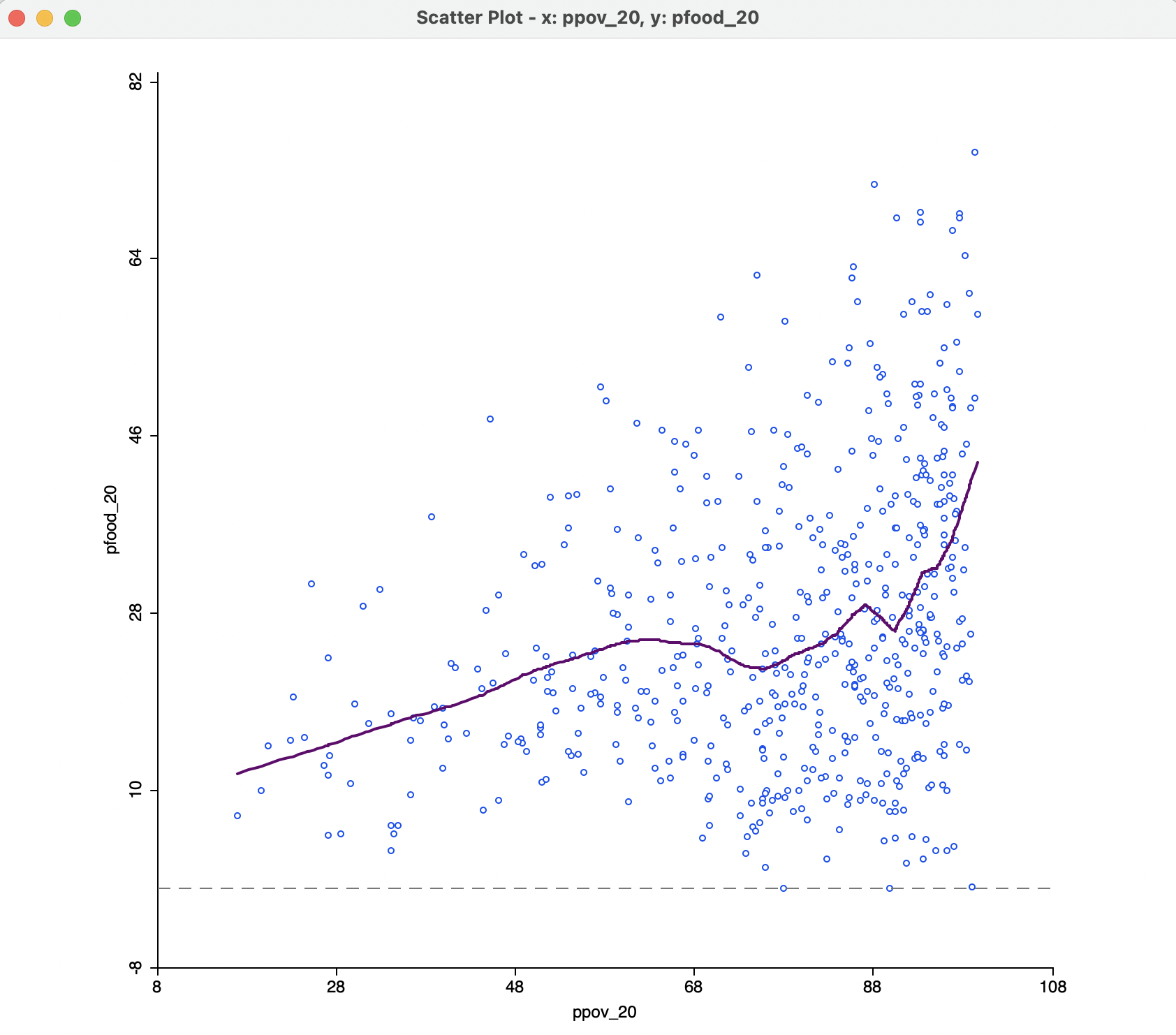
Figure 7.13: Default LOWESS local regression fit
7.3.2.1 LOWESS parameters
The nonlinear fit is driven by a number of parameters, the most important of which is the bandwidth, i.e., the range of values on the X-axis on which the local slope estimate is based.
The smoothing parameters can be changed in the options by selecting Edit LOWESS Parameters in the Smoother option. There are three parameters: Bandwidth (default setting 0.20), Iterations and Delta Factor.
The bandwidth determines the smoothness of the curve and is given as a fraction of the total range in X values. In other words, the default bandwidth of 0.20 implies that for each local fit (centered on a value for X), about one fifth of the range of X-values is taken into account. The other options are technical and are best left to their default settings.55
A higher value of the bandwidth results in a smoother curve. For example, with the bandwidth set to 0.6, the curve in Figure 7.14 results. This more clearly suggests different patterns for three subsets of poverty rates: a slowly increasing slope at the lower end, a near flat slope in the middle, and a much steeper slope at the upper end. In a data exploration, one would be interested in finding out whether these a-spatial subsets have an interesting spatial counterpart, for example, through linking with a map.
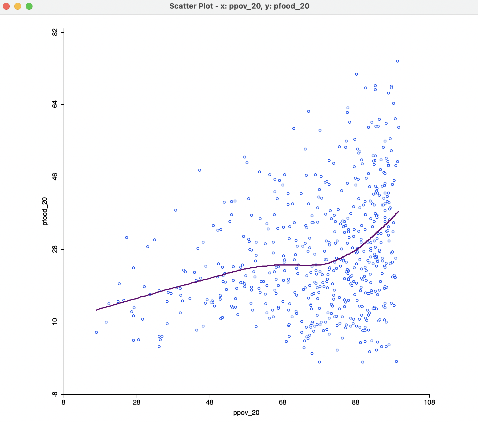
Figure 7.14: Default LOWESS local regression fit with bandwidth 0.6
The opposite effect is obtained when the bandwidth is made smaller. For example, with a value of 0.05, the resulting curve in Figure 7.15 is much more jagged and less informative.
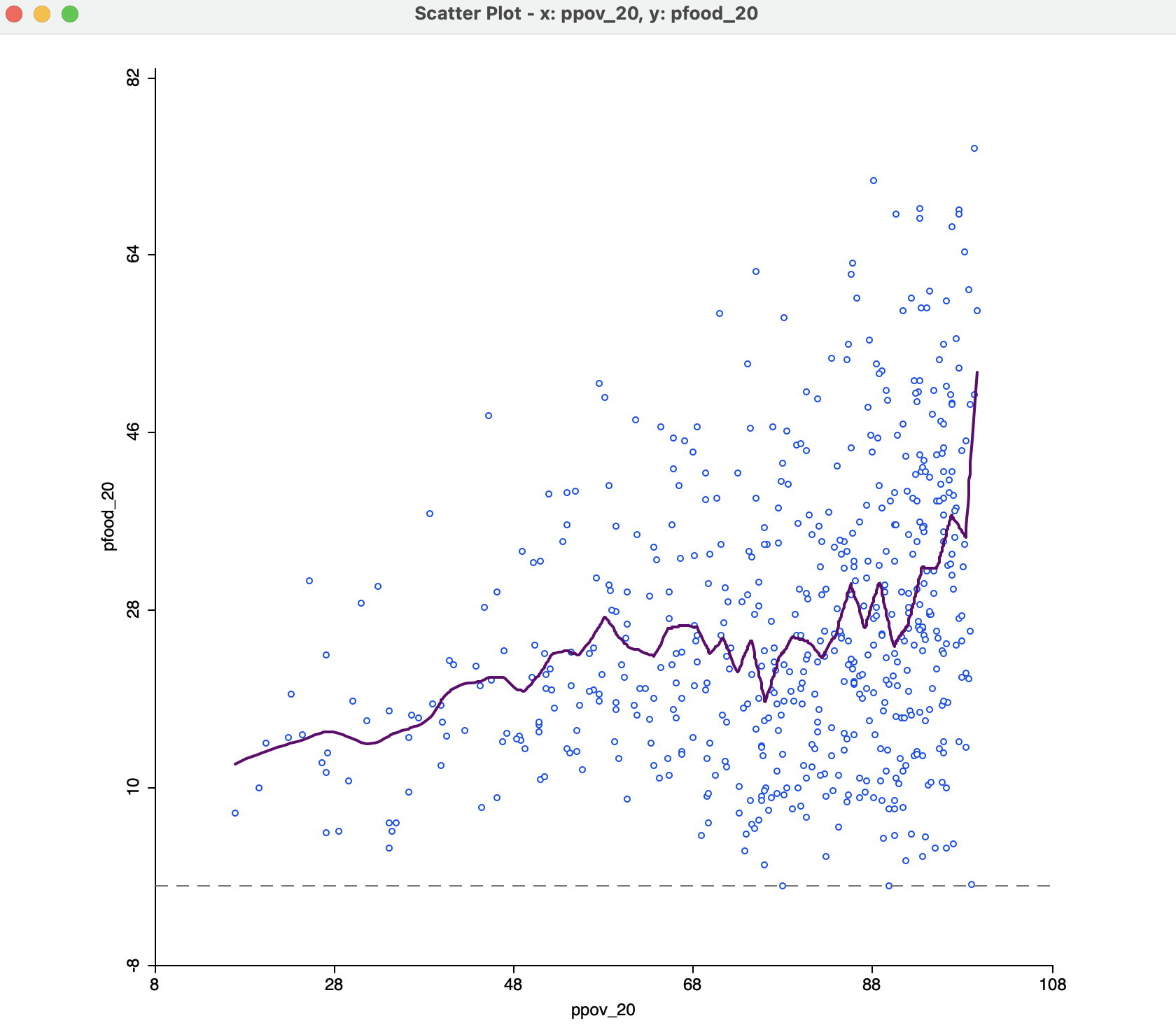
Figure 7.15: Default LOWESS local regression fit with bandwidth 0.05
The literature contains many discussions of the notion of an optimal bandwidth, but in practice a trial and error approach is often more effective. In any case, a value for the bandwidth that follows one of these rules of thumb can be entered in the dialog. Currently, GeoDa does not compute optimal bandwidth values.
Finally, while one might expect the LOWESS fit and a linear fit to coincide with a bandwidth of 1.0, this is not the case. The LOWESS fit will be near-linear, but slightly different from a standard least squares result due to the locally weighted nature of the algorithm.
Technical details can be found in in Anselin and Rey (2014), pp. 287-289.↩︎
The LOWESS algorithm is complex and uses a weighted local polynomial fit. The Iterations setting determines how many times the fit is adjusted by refining the weights. A smaller value for this option will speed up computation, but result in a less robust fit. The Delta Factor drops points from the calculation of the local fit if they are too close (within Delta) to speed up the computations. Technical details are covered in Cleveland (1979).↩︎