7.4 Scatter plot matrix
A scatter plot matrix visualizes the bivariate relationships among several pairs of variables. The individual scatter plots are stacked such that each variable is in turn on the X-axis and on the Y-axis.
When applied to standardized variables (with mean zero and variance one), it is the visual counterpart of a correlation matrix. In general, however, while the scatter plot matrix shows the linear association between variables, the graphs are not symmetric. In addition, in some instances a variable may not be appropriate to be both a dependent (Y-axis) and an explanatory variable (X-axis). For example, a variable such as elevation may affect socio-economic outcomes, but it is hard to imagine that socio-economic factors could in turn affect elevation.
The main interest is in the magnitude and sign of the slope in each
of the scatter plots, and the extent to which this points to a significant bivariate relationship,
similar to the insight provided by a correlation matrix. In GeoDa, the diagonal elements also contain a histogram for the variable in the corresponding row/column
to provide a sense of the univariate distribution.
Even though this method deals with multiple variables, it is not really a multivariate exploration. Rather, it consists of a collection of bivariate explorations for multiple variables.
7.4.1 Implementation
The scatter plot matrix operation is started by selecting the fourth icon on the EDA toolbar (Figure 7.1), or by choosing Explore > Scatter Plot Matrix from the menu.
This brings up a Scatter Plot Matrix Variables Add/Remove dialog, through which the variables are selected. The design of the interface is such that one selects a variable from the Variables list on the left and clicks on the right arrow > to include it in the Include list on the right. Alternatively, one can double click on the variable name to move it to the right-hand column. The left arrow < is there to remove a variable from the Include list.
As soon as two variables are selected, the scatter plot matrix is rendered in the background. As new variables are added to the Include list, the matrix in the background is updated with the additional scatter plots.
Figure 7.16 shows an example with four variables that were already used in the illustrations above: ppov_20, pfood_20, c_ptot12 and ALTID. Note that the latter really should not be portrayed on the Y-axis, although by construction this always happens for every variable in the scatter plot matrix.
With the default setting, each scatter plot shows the slope coefficient at the top, together with a designation of significance (** is p < 0.01, * is p < 0.05). Ignoring the bottom row (with ALTID on the Y-axis), significant coefficients are obtained in all instances, except between pfood_20 and c_ptot12. In other words, food insecurity and population change do not seem to be related. On the other hand, there is a strong and negative relationship between ppov_20 and c_ptot12. Altitude is significantly related with all three socio-economic outcomes, positively with ppov_20 (greater poverty at higher altitudes), but negatively with the other two. A substantive interpretation is beyond the scope.
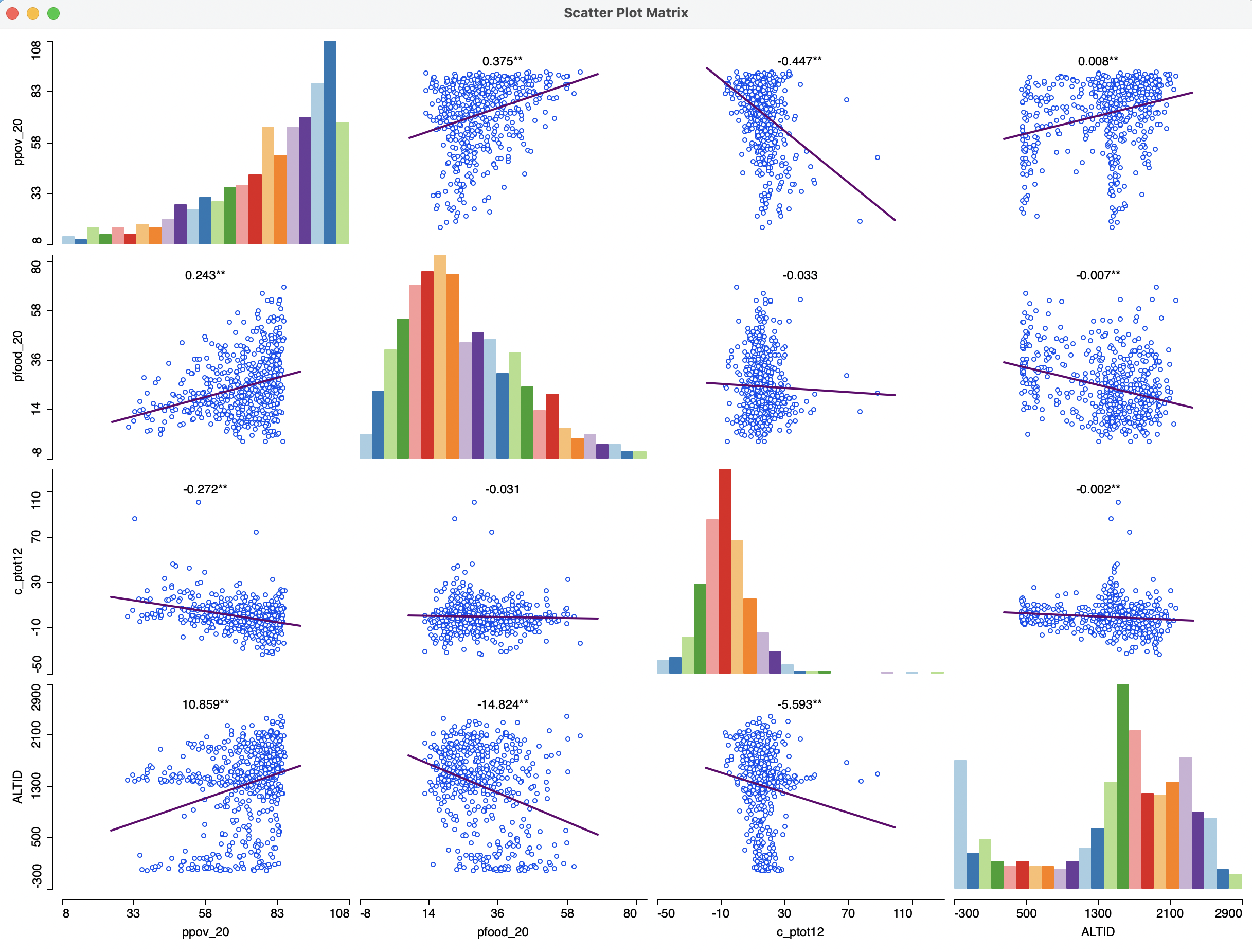
Figure 7.16: Scatter plot matrix
7.4.1.1 Scatter plot matrix options
The scatter plot matrix options consist of seven items:
- Add/Remove Variables
- Selection Shape
- Data
- Smoother
- View
- Color
- Save Image As
The first option invokes the Scatter Plot Matrix Variables Add/Remove dialog to allow for changes in the variable selection. Selection Shape and Save Image As work in the usual fashion.
View has options to Set Display Precision on Axes, Regimes Regression and Display Slope Values. The latter is checked by default. In contrast to the standalone scatter plot, Regimes Regression is turned off by default in the scatter plot matrix. However, it can readily be invoked, allowing for all features of linking and brushing, e.g., to explore spatial heterogeneity across all variables (see Section 7.5.2).
The Color option provides a way to change the Regression Line Color and Point Color. Data and Smoother are separately considered next.
7.4.1.2 Correlation matrix
The Data option contains the same two items as for the standalone scatter plot. With Data > View Standardized Data, the scatter plot matrix turns into a correlation matrix. As pointed out, in contrast to the regression slope, the correlation coefficient is fully symmetric and the results above the diagonal are the mirror image of the results below the diagonal. On the graph, they may look slightly different due to the use of different scales on the axes, but the coefficients are identical.
The result for the four variables considered before is as in Figure 7.17.
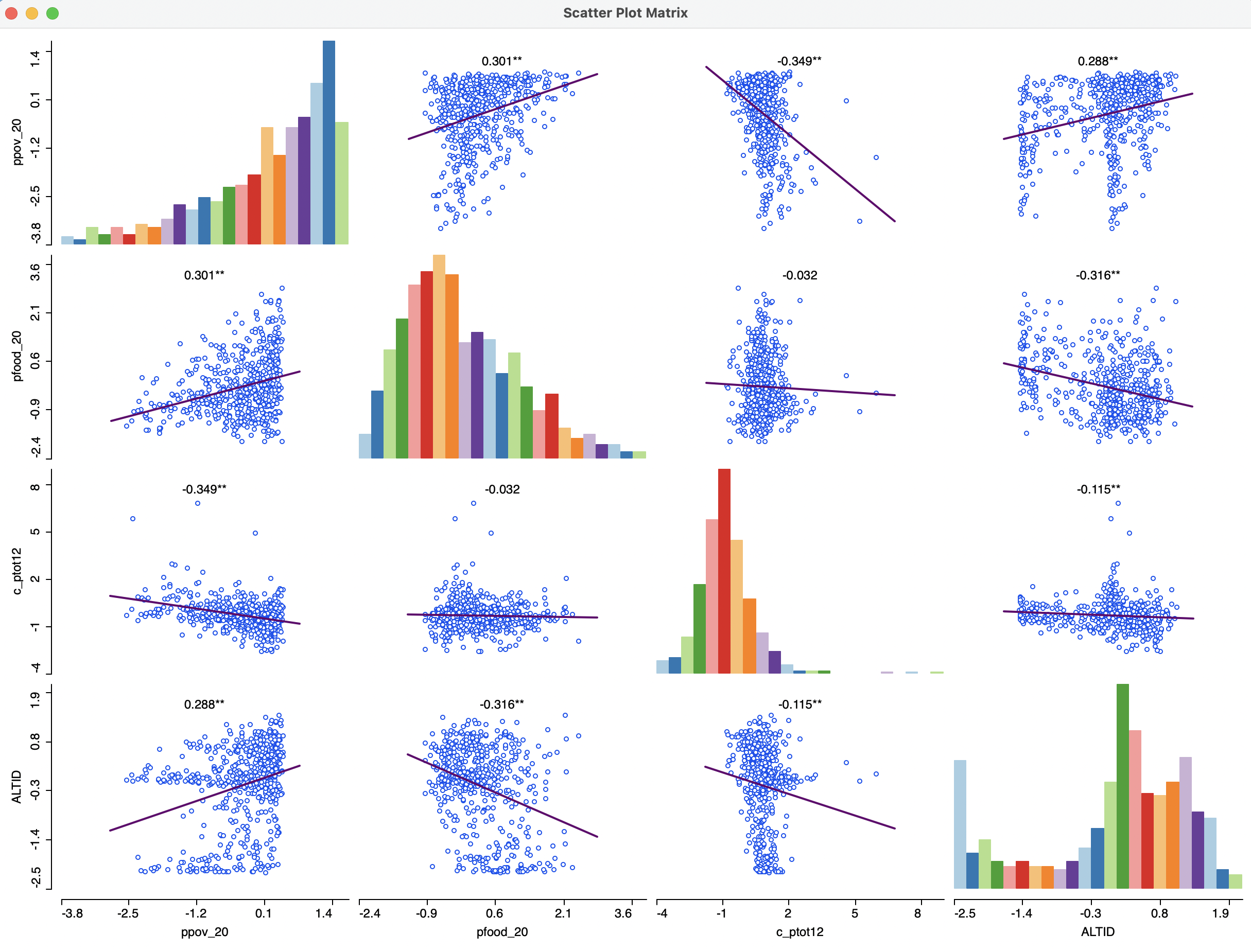
Figure 7.17: Scatter plot correlation matrix
7.4.1.3 LOWESS scatter plot matrix
Finally, the Smoother option allows for local regression, as in the standalone scatter plot, but now applied to all bivariate relationships. This provides a quick overview of the extent to which these relationships are linear, or instead show local instability and nonlinear patterns. The LOWESS parameters can be edited in the same way as before.
The result of a LOWESS fit for a bandwidth of 0.6 is illustrated in Figure 7.18. In order to make sure that the regression coefficient estimates are no longer shown, the option Display Slope Values must be turned off (it remains on by default). Also, in the figure, the linear fits are not shown.
The result shows some interesting patterns, especially for the relationship between altitude and respectively poverty and food insecurity. Instead of the strong overall positive and negative slopes, the evidence is much more nuanced. In fact, especially for the altitude-food insecurity graph, the negative slope for lower altitudes turns into a positive slope for the higher altitudes. Such patterns cannot be distinguished in a purely linear approach.
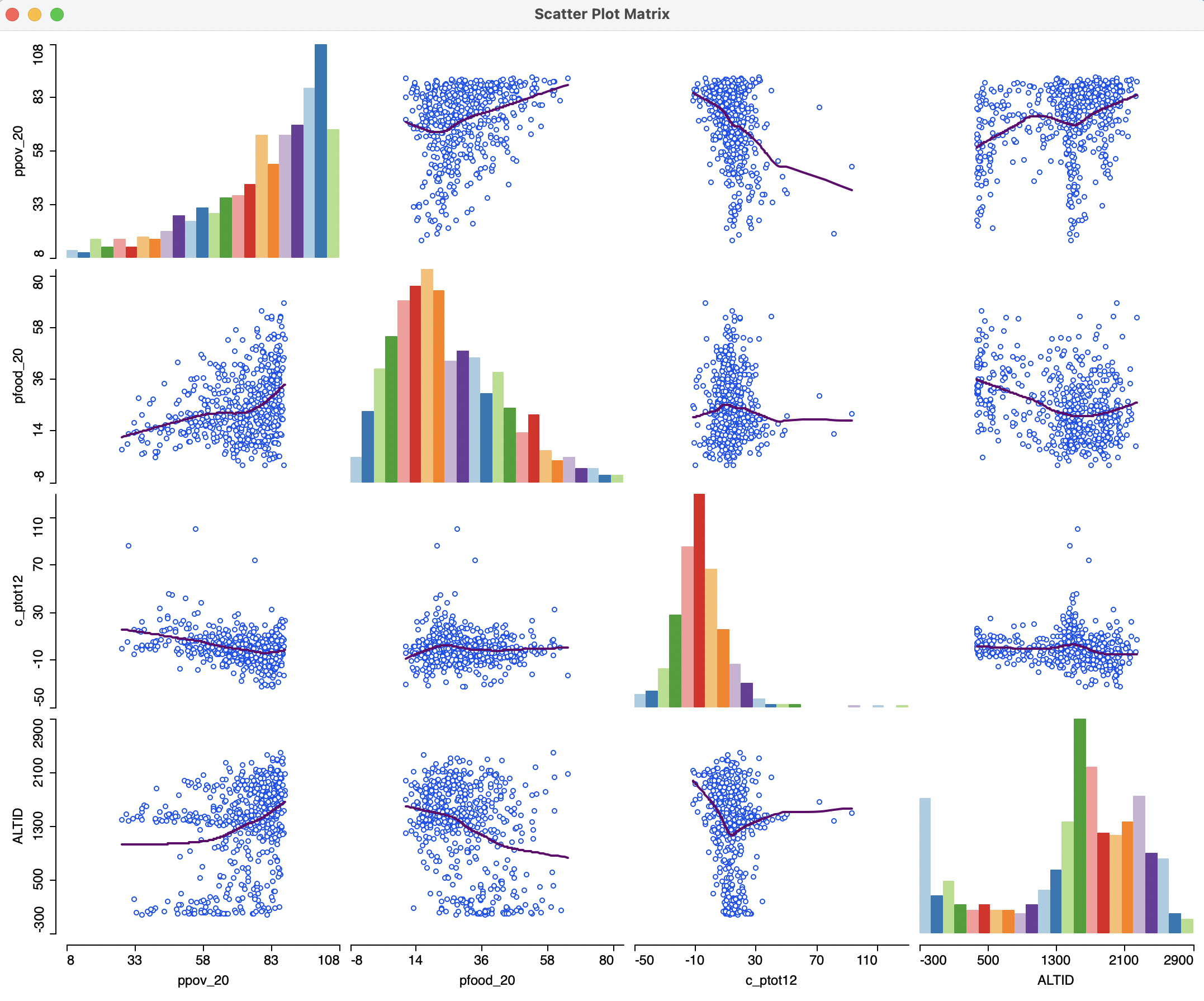
Figure 7.18: Scatter plot matrix with LOWESS fit