8.4 Conditional Plots
Conditional plots, also known as small multiples (Tufte 1983), Trellis graphs (Becker, Cleveland, and Shyu 1996), or facet graphs (Wickham 2016), provide a means to assess interactions among up to four variables. Multiple graphs are constructed for different subsets of the observations, obtained as a result of conditioning on the value of one or two variables, different from the variable(s) of interest. The graphs can be any kind of statistical graph, such as a histogram, box plot, or scatter plot. The same principle can be applied to choropleth maps, resulting in so-called micromaps (Carr and Pickle 2010).
With one conditioning variable, the observations are grouped into subsets according to the values taken by the conditioning variable, organized along the x-axis from low to high, e.g., below or above the median. For each of these subsets, a separate graph or map is drawn for the variable(s) of interest. The same principle is applied when there are two conditioning variables, resulting in a matrix of graphs, each corresponding to a subset of the observations that fall in the specified intervals for the conditioning variables on the x and y-axis. Of course, for this to be meaningful, one has to make sure that each of the subsets contains a sufficient number of observations.
The point of departure in the conditional plots is that the subsetting of observations should have no impact on the statistic in question. In other words, all the graphs or maps should look more or less the same, irrespective of the subset. Systematic variation across subsets indicates the presence of heterogeneity, either in the form of structural breaks (discrete categories), or suggesting an interaction effect between the conditioning variable(s) and the statistic under scrutiny.
In GeoDa, conditional graphs are implemented for the histogram, box plot, scatter plot and thematic map.
8.4.1 Implementation
A conditional plot is invoked from the menu by selecting Explore > Conditional Plot. This brings up a list of four options: Map, Histogram, Scatter Plot, and Box Plot. The same list of four options is also created after selecting the Conditional Plot icon, the right-most in the multivariate EDA subset in the toolbar shown in Figure 8.1. In addition, the conditional map can also be started as the third item from the bottom in the Map menu.
Next follows a dialog to select the conditioning variables and the variable(s) of interest. The conditioning variables are referred to as Horizontal Cells for the x-axis, and Vertical Cells for the y-axis. They do not need to be chosen both. Conditioning can also be carried out for a single conditioning variable, on either the horizontal or on the vertical axis alone.
The remaining columns in the dialog are either for a single variable (histogram, box plot, map), or for both the Independent Var (x-axis) and the Dependent Var (y-axis) in the scatter plot option.
8.4.1.1 Conditional plot options
Two important options, special to the conditional plot, are Vertical Bins Breaks and Horizontal Bins Breaks. These options provide a way to select the observation subsets for each conditioning variable. They include all the same options used in map classification (see Figure 4.2 in Chapter 4). Of special interest are the Unique Values option and the Custom Breaks options. Unique Values is particularly appropriate when the conditioning variable takes on discrete values, in which case other classifications may result in meaningless subsets (see the discussion of Figure 8.15). Custom Breaks is useful when subclasses for the conditioning variable were determined previously, preferably contained in a project file (see Section 4.6.3).
Each graph also has its usual range of options available, with the exception of Regimes Regression for the conditional scatter plot. Selection of observations is implemented, but it does not result in a re-computation of the linear regression fit. On the other hand, the conditional scatter plot does include the LOWESS Smoother option.
8.4.2 Conditional statistical graphs
To illustrate these concepts, first, a set of conditional scatter plots is created for the relationship between peduc_20 (x-axis) and pfood_20 (y-axis). This is conditioned by three subcategories (the default number) for pch12 in the horizontal dimension (an indicator variable for whether the population increased, =1, or decreased, =0, between 2010 and 2020). The conditioning variable in the vertical dimension is ALTID. The default classification is to use Quantile with three categories for both conditioning variables.
This yields the plot shown in Figure 8.15. Something clearly is wrong, since there turns out to be only one subcategory for the horizontal conditioning variable. This is because a 3-quantile classification of the indicator variable does not provide meaningful categories. This will be dealt with next.
However, first consider the substantive interpretation of this graph. The three plots show a strong positive and significant relationship in each case (significance indicated by **). In other words less access to education is linearly related to less food security, more or less in line with our prior expectations. The lack of difference between the graphs would suggest that the relationship is stable across all three ranges for altitude, the conditioning variable.
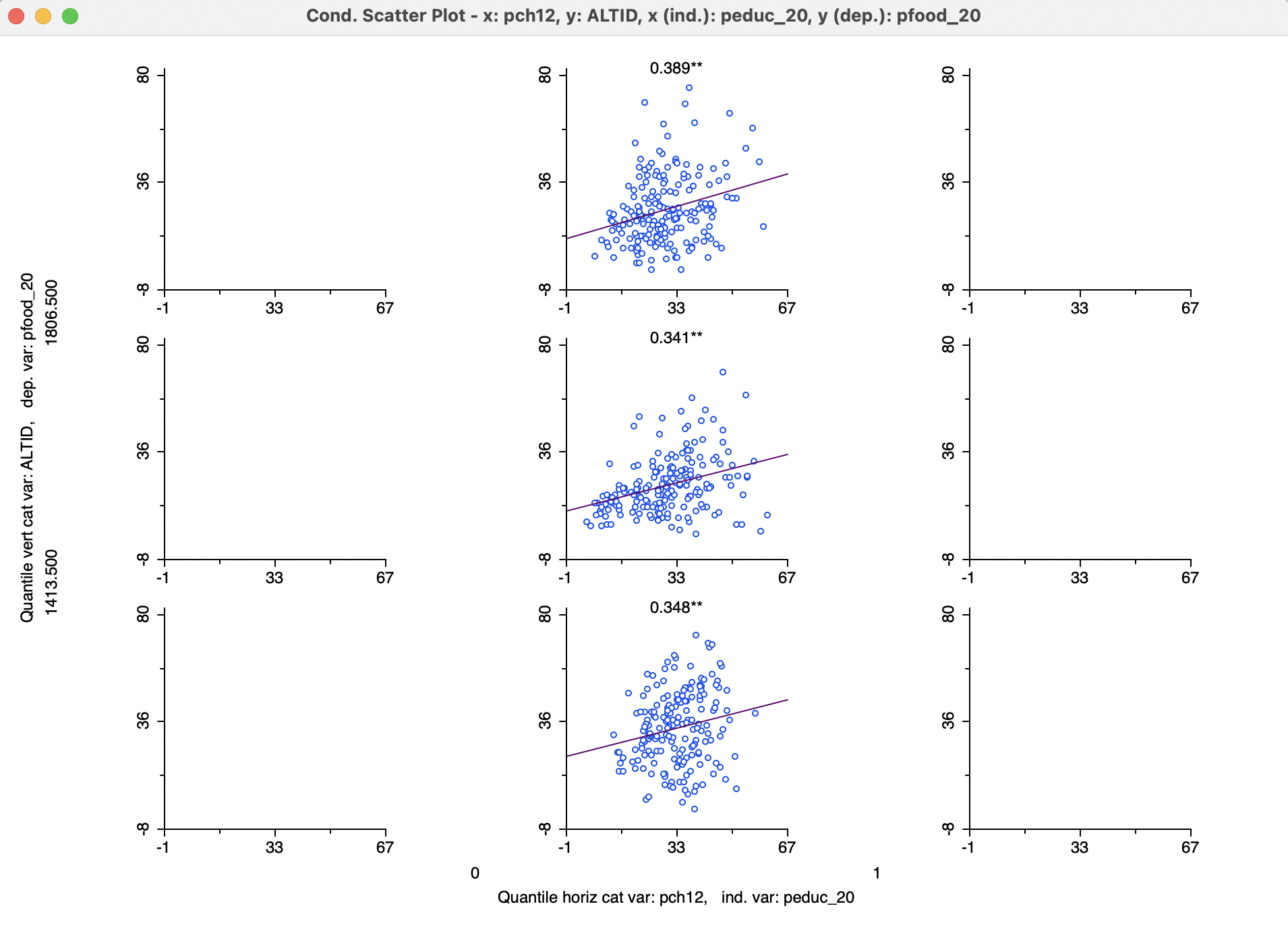
Figure 8.15: Conditional scatter plot - 3 by 3
Figure 8.16 results after changing the Horizontal Bins Breaks option to Unique Values. At this point, the two categories for the horizontal conditioning variable correspond to the values of 0 and 1 for the population change indicator variable.
Conditioning on this variable does provide some indication of interaction. For pch12 = 1, the linear relationship between peduc_20 and pfood_20 is strong and positive, and not affected by altitude. However, for pch12 = 0, there does not seem to be a significant slope for any of the subgraphs, suggesting a lack of relationship between the two variables in those municipalities suffering from population loss. The change in sign of the slope along altitude is not meaningful since the slopes are not significant.
If only the horizontal classification had been used as a condition, the result would be the same as a Regimes Regression in a standard scatter plot. However, in order to consider the simultaneous conditioning on two variable,six separate selection sets would be required to create six individual scatter plots with regimes, which is not very practical. In addition, the double conditioning allows for the investigation of more complex interactions among the variables.
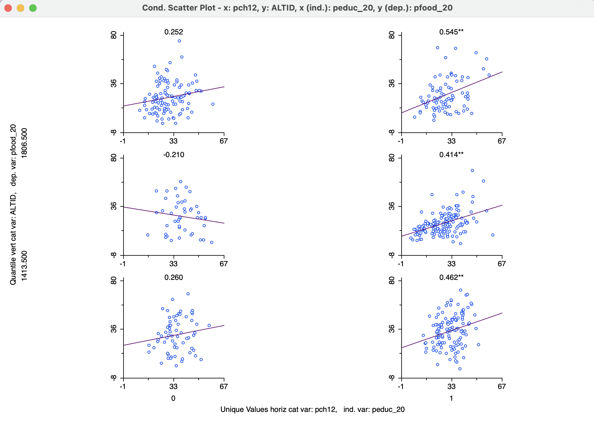
Figure 8.16: Conditional scatter plot - unique values
An alternative as well as generalization of the consideration of spatial heterogeneity by means of the Averages Chart (see Section 7.5.1) is the application of a Conditional Box Plot with a conditioning variable that corresponds to spatial subsets of the data. In Figure 8.17, this is illustrated for pheal_20 (percent population that lacks access to health care), using the Region classification as the conditioning variable along the horizontal axis. In the graph, Valles Centrales (8) shows a median value that is higher than the other regions, with Canada (1) having the best median health outcome (lowest value for lack of access). While the conditional box plot is not an alternative to a formal difference in means (or medians) test, it provides a visual overview of the extent to which heterogeneity may be present.
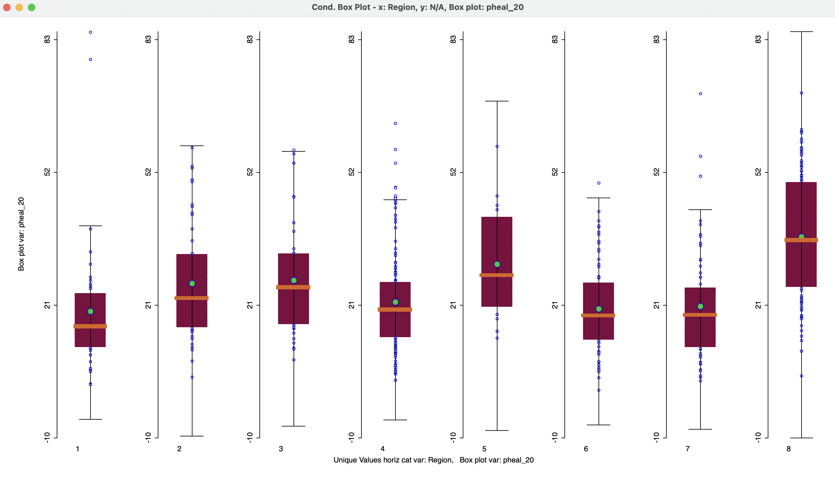
Figure 8.17: Conditional box plot - lack of health access by region
8.4.3 Conditional Maps
A final example is the conditional map or micromap matrix shown in Figure 8.18. Four box maps are included for ppov_20, conditioned by peduc_20 on the horizontal axis and pheal_20 on the vertical axis. The graph is obtained after changing the bin breaks to two quantiles, i.e., below and above the median for each of the conditioning variable.
As before, the interest lies in the extent to which the maps represent similar spatial patterns in each of the subcategories. The maps suggest an interaction with peduc, where more of the brown values (more poverty) are found for above median values for lack of education, and more blue values (less poverty) in the lower median (better education). A potential interaction with health access is less pronounced.
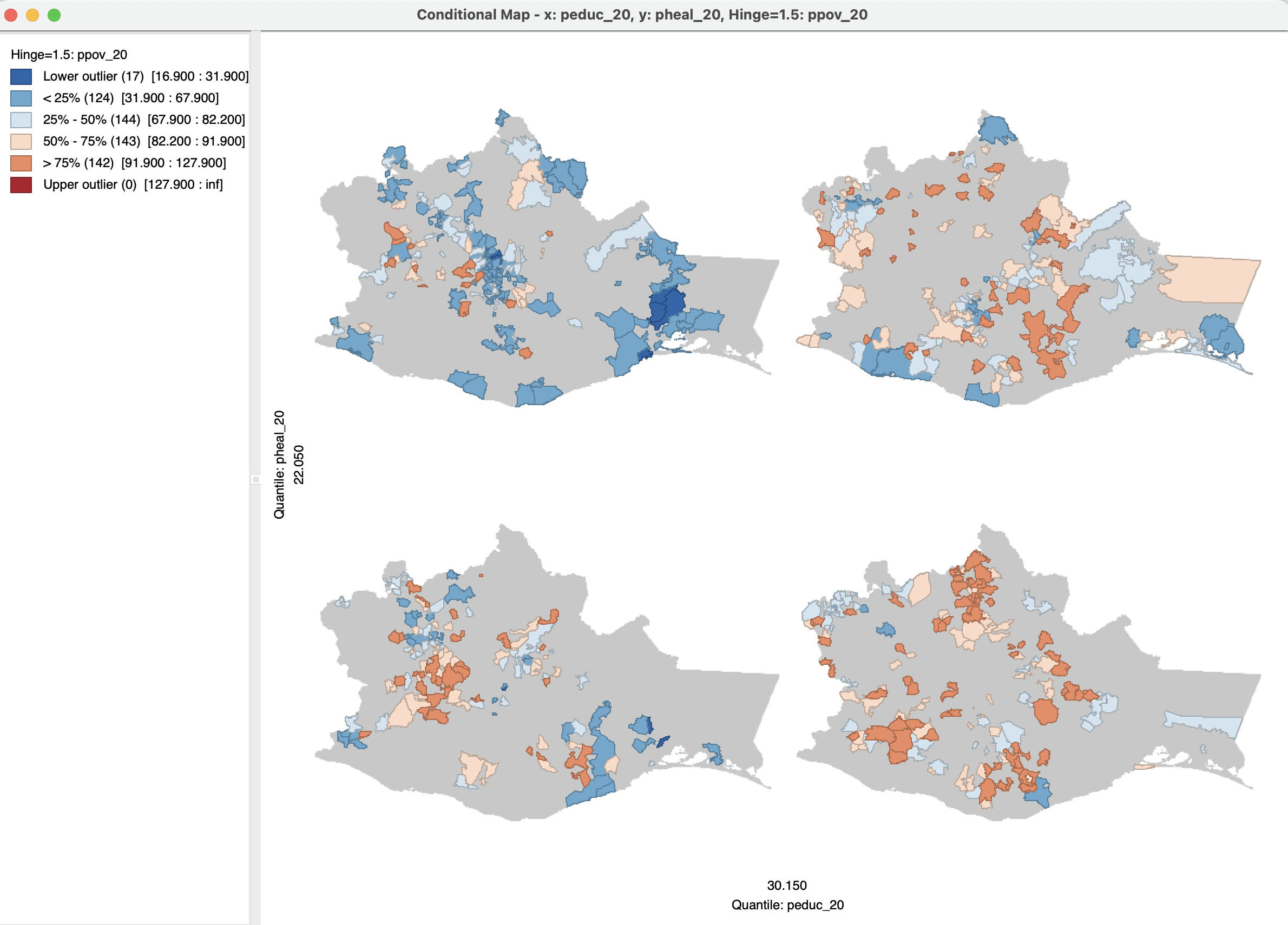
Figure 8.18: Conditional box map - 2 by 2
As in any EDA exercise, considerable experimentation may be needed before any meaningful patterns are found for the right categories of conditioning variables. Of course, this runs the danger than one ends up finding what one wants to find, an issue which revisited in Chapter 21.