7.2 Analyzing the Distribution of a Single Variable
The first step in the analysis of the distribution of a single variable is a summary of its characteristics, focusing on central tendency (mean, median), spread (variance, interquartile range), and shape (skewness, kurtosis). Here, I briefly review two familiar visualizations of a univariate distribution in the form of the histogram and the box plot.
7.2.1 Histogram
Arguably the most familiar statistical graphic is the histogram, which is a discrete representation of the density function of a continuous variable. In essence, the range of the variable (the difference between maximum and minimum) is divided into a number of equal intervals (or bins), and the number of observations that fall within each bin is depicted proportional to the height of a bar. This classification is the same as the principle underlying the equal intervals map, which was covered in Section 4.4.2. The main challenge in creating an effective visualization is to find a compromise between too much detail (many bins, containing few observations) and too much generalization (few bins, containing a broad range of observations).
7.2.1.1 Histogram basics
The histogram functionality is started by selecting Explore > Histogram from the menu, or by clicking on the Histogram toolbar icon, the left-most icon in the univariate set (within the blue rectangle) in Figure 7.1.
This brings up the Variable Settings dialog, which lists all the numeric variables in the data set (string variables cannot be analyzed). For example, selecting ppov_20 from the list (percent of population living in poverty in 2020) creates the default histogram with seven bins, shown in Figure 7.2. The distribution is highly left-skewed, with a long tail towards the lower percentages, highlighting the prevalence of high-poverty municipalities (on the right).
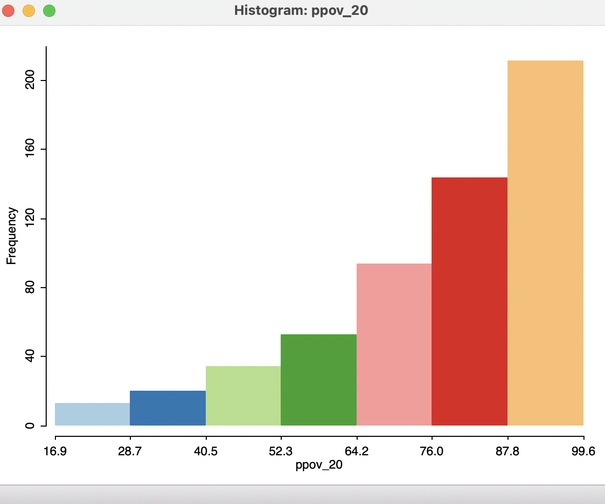
Figure 7.2: Histogram for percent poverty 2020
The histogram options are brought up in the usual fashion, by right-clicking on the graph. The options are grouped into three categories, the first consisting of histogram-specific items: Choose Intervals, Histogram Classification and View. Next is a Color option to set the background color (the default of white is usually best). Finally, the options to Save Selection, Copy Image to Clipboard and Save Image As work in the same way as for maps (see Section 4.5.5).
Of these options, the Choose Intervals is the most commonly used. It brings up a dialog to specify the number of bins for the histogram. For example, after changing from the default of seven to twelve bins, the histogram becomes as in Figure 7.3. In this particular instance, there is not much gained by the greater detail since the same overall pattern is maintained.
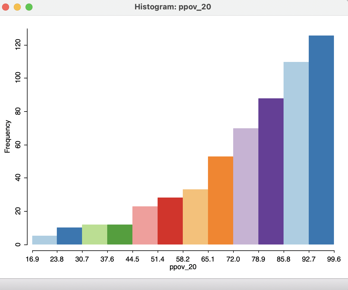
Figure 7.3: Histogram for percent poverty 2020 - 12 bins
The Histogram Classification option allows for the selection of a custom category specification. This works in the same way as for map classification, covered in Section 4.6.
The View option contains six items. Four of these pertain to the overall look of the graph and are self-explanatory: Set Display Precision (for the variable being depicted), Set Display Precision on Axes, Show Axes and Status Bar. The latter two are checked by default.
7.2.1.2 Bar charts
The first item under the View options, Set as Unique Value, is useful when the variable under consideration takes on integer values, e.g., when it is categorical or ordinal. While the corresponding graph is not technically a histogram (since categories do not imply any order), the same mechanics can be used to create a bar chart.
Under the default settings, the bins are computed by taking the range of values into consideration, i.e., the difference between the largest and smallest integer value. This is then divided by the number of bins, leading to unrepresentative category labels for integer-valued variables. This issue is remedied by means of the View > Set as Unique Value option. As a result, the values taken by the variable of interest are recognized as integer and depicted as such.
For example, the left panel in Figure 7.4 shows the default histogram for the variable CATMAX20, a categorical variable (or, more precisely, an ordinal variable) that corresponds to the largest settlement category in each municipality (each municipality consists of one of more localities or settlements).48
For Oaxaca in 2020, this variable ranges from 1 to 9. As a result, the default of seven histogram bins results in a bin width of 8/7, or roughly 1.14, which does not yield meaningful intervals.
By contrast, the right-hand panel in the figure shows the result after invoking Set as Unique Value. Now, each bar corresponds to a distinct discrete value, matching each category. The distribution is fairly symmetric around a mode of 4 (1,000 to 2,499 inhabitants), albeit slightly right-skewed .
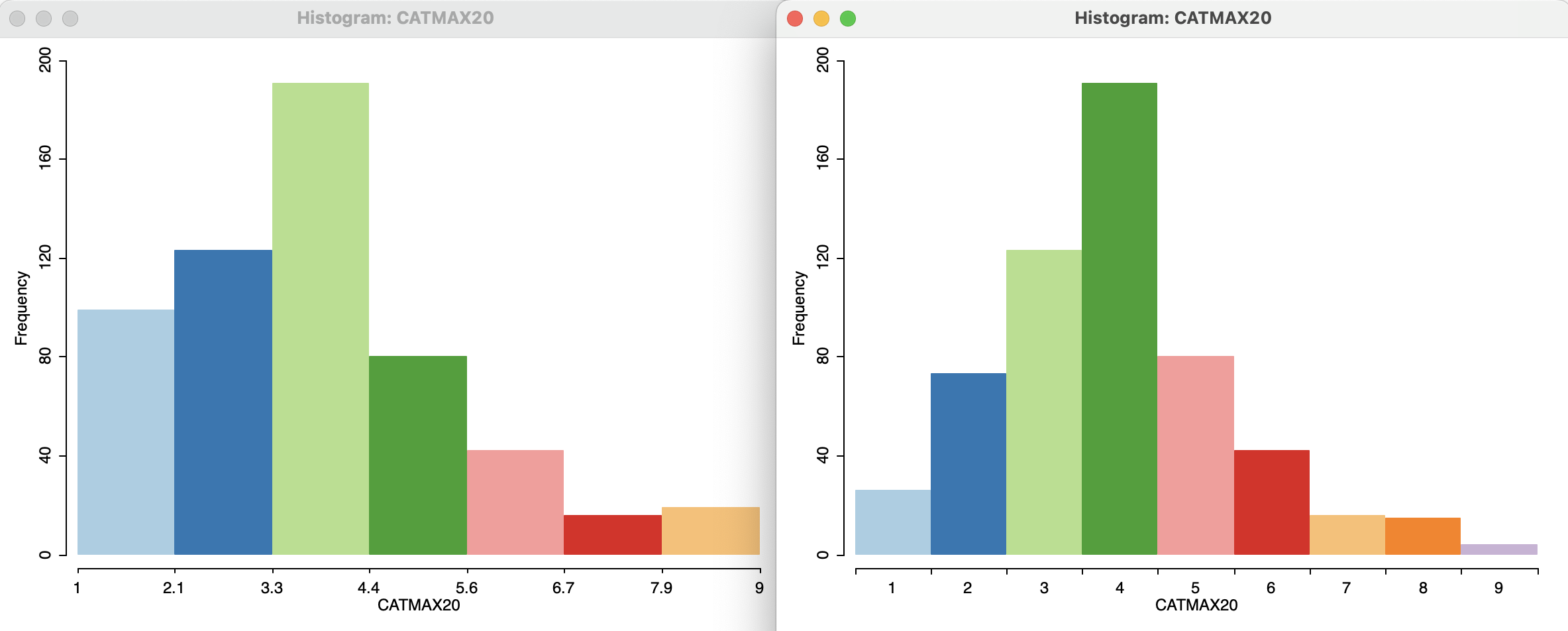
Figure 7.4: Bar chart for settlement categories
7.2.1.3 Descriptive statistics
The View > Display Statistics option brings up a number of descriptive statistics, shown below the histogram, as in Figure 7.5 for the ppov_20 variable.
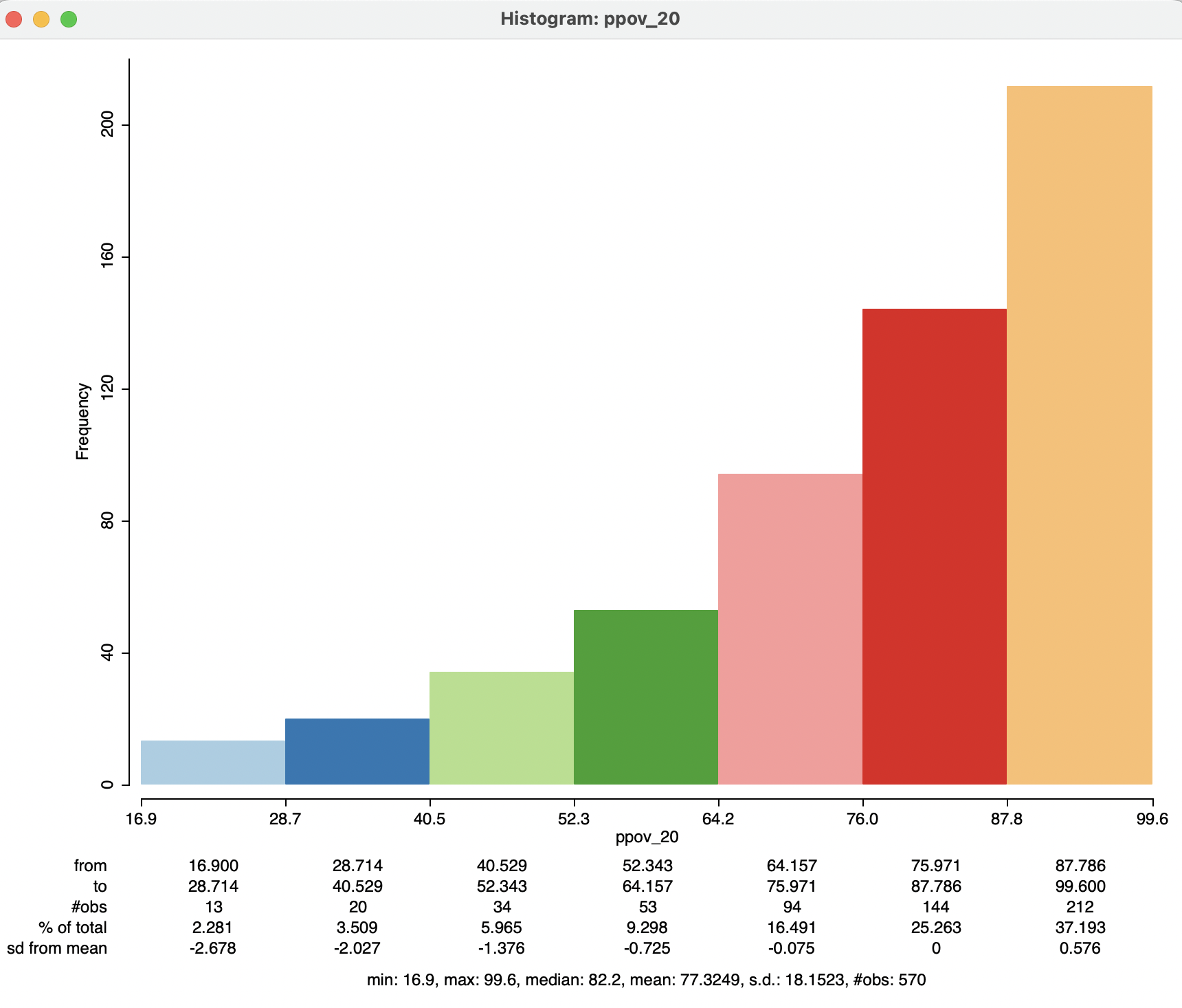
Figure 7.5: Descriptive statistics
The overall summary statistics are listed at the bottom: minimum of 16.9, maximum of 99.6, median of 82.2, mean of 77.3, standard deviation of 18.15, for 570 observations. In addition, each histogram bar is associated with a specific range, the number of observations it contains, % of total in that bin and the number of standard deviations from the mean. For the latter, results greater than two in absolute value can be classified as outliers. In the example, this is the case for the two lowest categories.
7.2.1.4 Linking map and histogram
The concepts of linking and brushing were already briefly introduced in Chapter 4. They are most powerful when connecting a-spatial EDA graphs with a map as a visualization of the spatial distribution of a variable. The map in question can pertain to the same variable (or be themeless), allowing to visually explore the extent to which observations in the same histogram categories also occur in similar locations (a pre-cursor to the more formal notion of spatial autocorrelation). Alternatively, the map can be for a different variable, providing a way to explore the association between observations in histogram bins to the spatial distribution of a different variable.
For example, in Figure 7.6, the map on the left is a six category quantile map for ALTID, a representative altitude for the municipality, in meters.49 When selecting the 73 observations in the lowest two histogram bins on the right (the largest settlement having respectively 1 to 249 or 250 to 499 inhabitants), the process of linking simultaneous selects the corresponding locations in the elevation map. The resulting configuration does not appear to be random (our prior expectation, or null hypothesis), but the respective municipalities are concentrated in the top elevation categories. In other words, settlements with smaller populations tend to be located in higher elevations (not an unexpected result, but still worthy of checking).
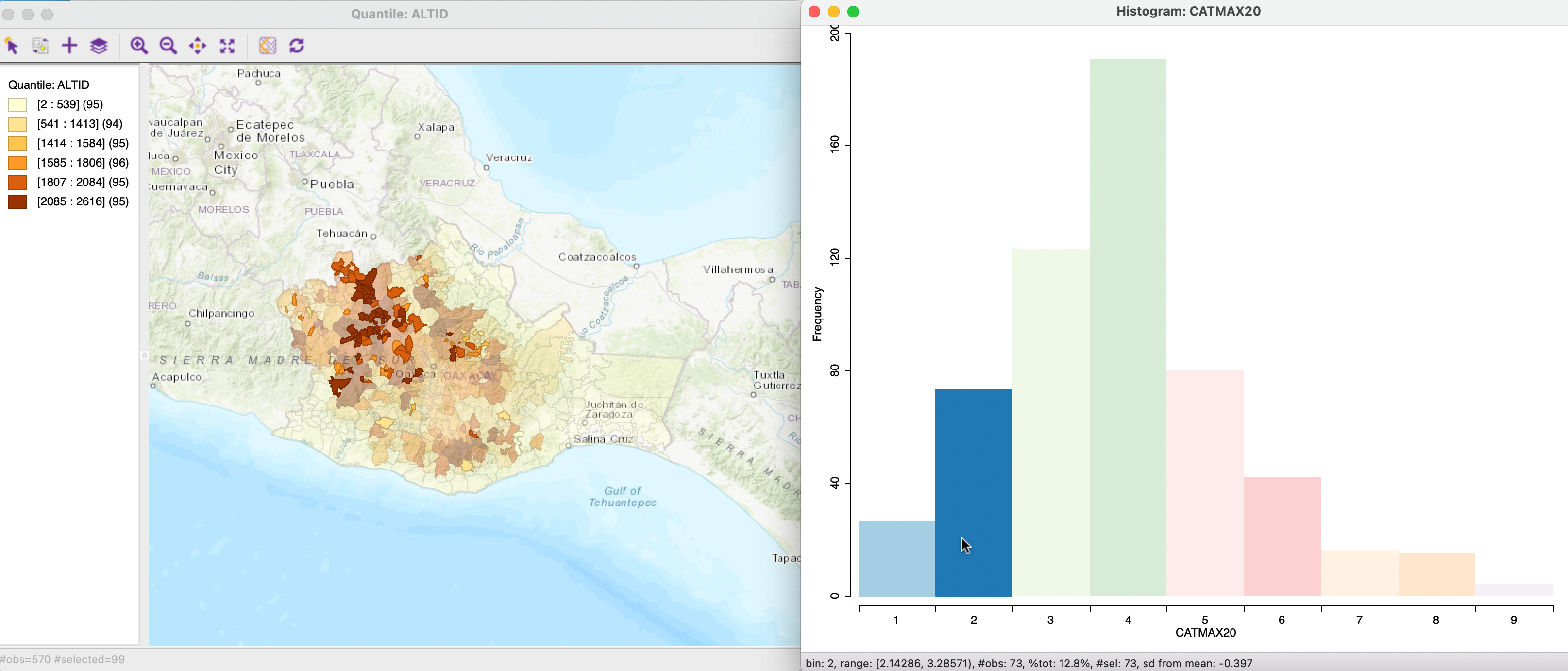
Figure 7.6: Linking between histogram and map
The reverse linking between the map and the histogram is illustrated in Figure 7.7. The selection rectangle in the map results in the corresponding observations to be highlighted in the histogram. Here, the focus is on spatial heterogeneity (further elaborated upon in Section 7.5). Everything else being the same, the expectation (null hypothesis) would be that the distribution of the selected observations largely follows that of the whole. In other words, in the histogram, the heights of the bars of the selected observations should roughly be proportional to the corresponding height in the full data set. In the example, this clearly is not the case, suggesting a difference between the distribution in the spatial subset and the overall distribution. In other words, this suggests the presence of spatial heterogeneity.
The process can be made dynamic through brushing, i.e., by moving the selection rectangle over the map. This results in an immediate adjustment of the selected observations in the histogram, allowing for an assessment of spatial heterogeneity by eye. A more formal assessment is pursued in Section 7.5.
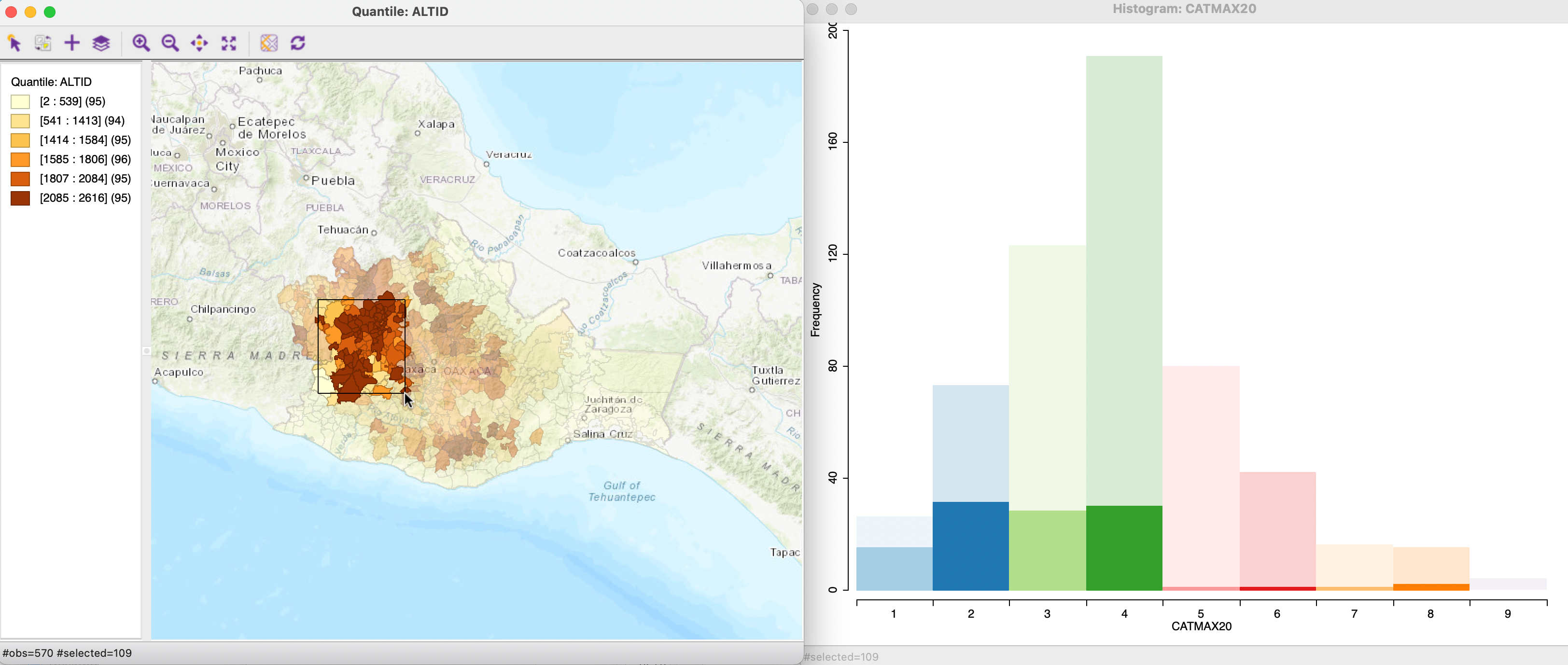
Figure 7.7: Linking between map and histogram
7.2.2 Box plot
The box plot is an alternative visualization of the distribution of a single variable that focuses on quartiles (see also Section 5.2.2 for a discussion of the associated box map). The observations are ranked from lowest to highest and (optionally) represented as dots on a vertical or horizontal line.50 The box consists of a rectangle, with the lower bound drawn at the first quartile (25%) and the higher bound at the third quartile (75%). Typically, a line is also drawn at the location of the median (50%).
The box plot introduces the notion of outliers, i.e., observations that are far from the central tendency (the median), suggesting they may not belong to the same distribution as the rest. The key concept in this regard is that of the inter-quartile range or IQR, the difference between the values at the third and first quartile. This is a measure of the spread of the distribution around the median, a counterpart to the variance. The IQR is used to compute a hinge (or fence), i.e., a value that is 1.5 times (or, alternatively, 3 times) the IQR above the third quartile or below the first quartile. Observations that lie outside the hinges are designated as outliers.
7.2.2.1 Implementation
The box map is invoked as Explore > Box Plot from the menu, or by selecting the Box Plot as the second icon from the left in the toolbar in Figure 7.1. Identical to the approach followed for the histogram, next appears a Variable Settings dialog to select the variable.51
To illustrate this graph, we select the variable c_ptot12, the percentage population change between 2020 and 2010 (positive values are population growth). The default box plot, with a hinge of 1.5, is shown in the left-hand panel of Figure 7.8. The descriptive statistics are listed at the bottom.52
The observations range from -31.2 % to 113.3 %, with a slightly positive median of 3.0 % (the mean is 4.0 %, reflecting the influence of upper outliers). The interquartile range is 13.9. Consequently, the upper hinge is roughly 10.7 (Q3) + 1.5 \(\times\) 13.9, or 37.9 %. Fifteen observations take on values that are larger than this upper hinge and are designated as upper outliers. The lower hinge is -3.2 - 1.5 \(\times\) 13.9, or -21.1 %. Ten observations have population decreases that are even larger, hence these are lower outliers.
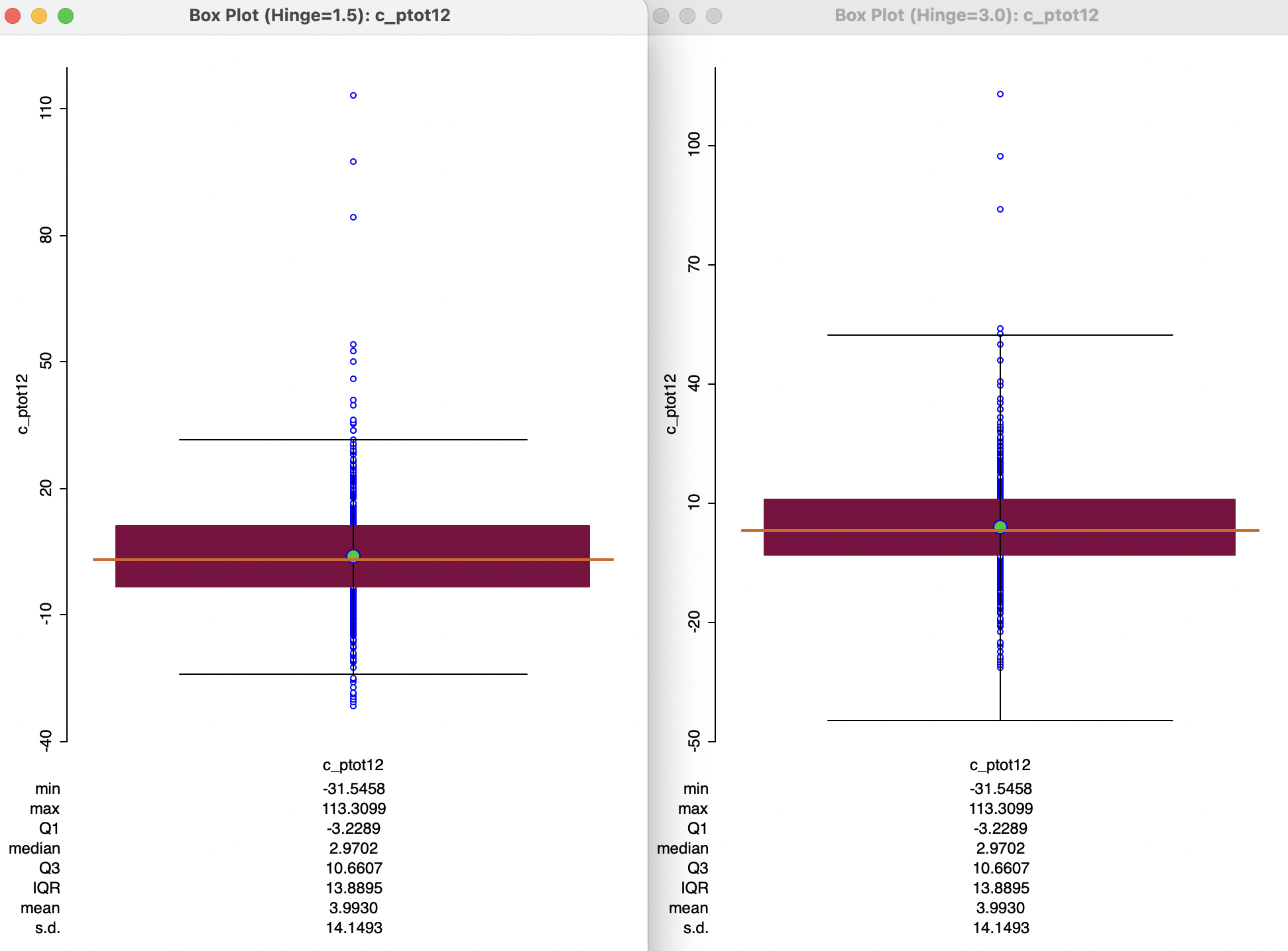
Figure 7.8: Box plot for population change 2020-2010
7.2.2.2 Box plot and box map
Selections in the box plot can be linked to a map, and vice versa. However, to a large extent this is already accomplished by means of the box map, discussed in Section 5.2.2.
The interesting research question is the extent to which a-spatial outlying observations, such as the fifteen outliers identified in the box plot in Figure 7.8 show a spatial pattern that may suggest some structure, rather than randomness. The box map for c_ptot12 in Figure 7.9 shows the outlying observations highlighted in dark red (selected in the box plot).53 The map indicates that about ten of the outliers are located in the center of the country (inside the blue rectangle). The research question is then whether this is purely due to chance, or, instead, suggests a pattern of clustering. This is pursued more formally in Parts IV and V.
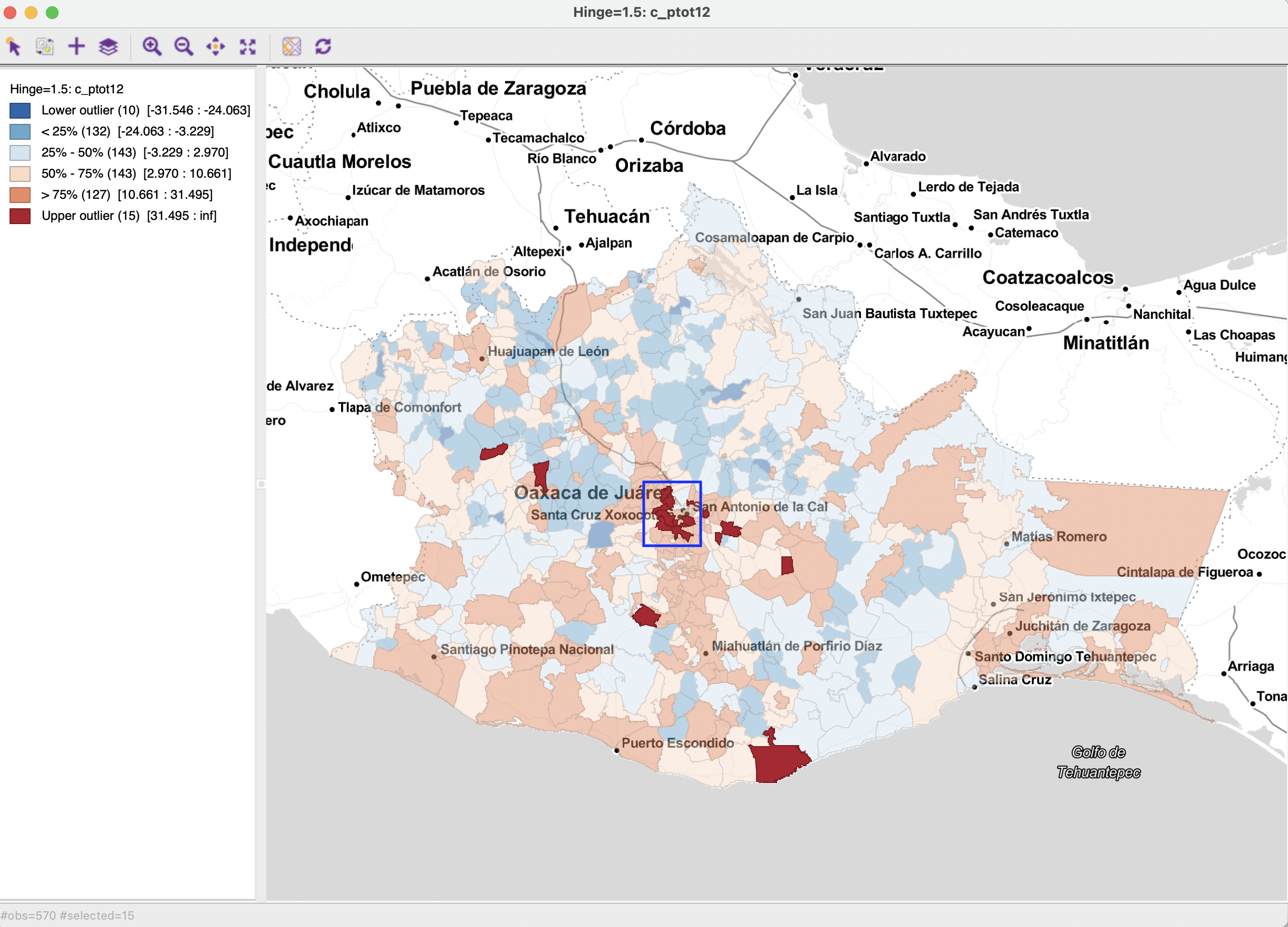
Figure 7.9: Box map for population change 2020-2010 (upper outliers selected)
7.2.2.3 Box plot options
Several of the box plot options are shared with the other graphs (and maps). There are seven categories. The last three are Save Selection, Copy Image To Clipboard and Save Image As, which work as before. The Show Status Bar is listed as a main option (checked by default) and the Color option also provides a way to change the color of the points (in addition to the background color).
The View option contains four items, all self-explanatory: Set Display Precision, Set Display Precision on Axes, Display Statistics and Show Vertical Axis.
The typical multiplier for the IQR to determine outliers is 1.5 (roughly equivalent to the practice of using two standard deviations in a parametric setting). However, a value of 3.0 is fairly common as well, which considers only truly extreme observations as outliers. The multiplier to determine the fence can be changed with the Hinge > 3.0 option (obtained by right clicking in the plot to select the options menu, and then choosing the hinge value). This yields the box plot shown in the right-hand panel of Figure 7.8. The new hinge no longer yields lower outliers, and the upper outliers are reduced to five extreme observations.
The main purpose of the box plot in an exploratory strategy is to identify outlier observations in an a-spatial sense. Its spatial counterpart is the box map.
The original variable is tamloc, which ranges from 1, for 1 to 249 inhabitants, to 14, for more than a million inhabitants. CATMAX20 is the highest category obtained for a locality in the municipality. In this example, the maximum is 9, for 30,000 to 49,999 inhabitants.↩︎
The Basemap is ESRI > WorldTopoMap. As is to be expected, the darker colors are associated with higher elevations on the topographical map.↩︎
GeoDatakes the vertical approach.↩︎In
GeoDa, the default is that the variable from any previous analysis is already selected.↩︎For the box plot, this is the default. It can be turned off by unchecking View > Display Statistics in the options.↩︎
The basemap is Stamen > TonerLite.↩︎