4.4 Common Map Classifications
4.4.1 Quantile map
A quantile map is based on sorted values for a variable that are then grouped into bins. Each bin has the same number of observations, the so-called quantile. The number of bins corresponds to the particular quantile, e.g., four bins for a quartile map, or five bins for a quintile map, two of the most commonly used categories.
This is illustrated in Figure 4.3 with a quintile map for the housing index in the Ceará data set. The index is scaled between zero and one, with higher values corresponding to better housing conditions.25 This map is obtained in two steps. First, the classification Quantile Map > 5 is selected from the options in Figure 4.2. This brings up a dialog to choose the variable to be mapped, in this example housing.
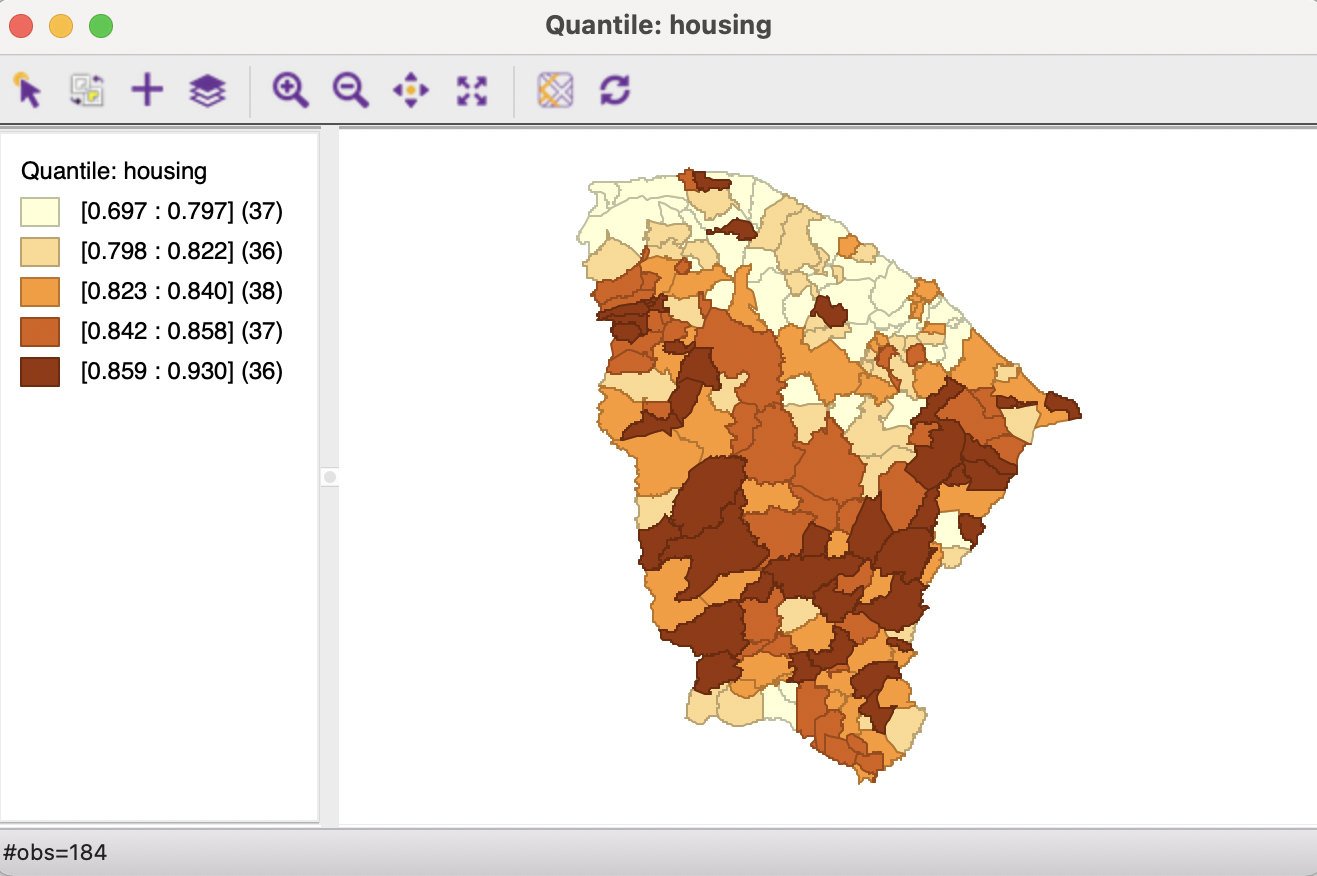
Figure 4.3: Quintile map for housing index, Ceará
The legend, to the left of the map, shows the type of classification (quantile) and lists the name of the variable (housing). The five legend categories correspond with increasingly darker shades of brown. The range of values included in each category is listed in square parentheses and the number of observations in round parentheses. The map suggests that lower values for the housing index tend to be concentrated in the north of the state, with the highest (darkest) values occupying a band in the southern part.
In a quintile map, each category should contain one fifth of the total number of observations, or, 184/5 = 36.8, so roughly 37 observations. However, in the legend in Figure 4.3, the number of observations varies from 36 to 37 and 38. This is examined more closely in Section 4.4.1.1.
Another important characteristic of the quantile map is that the range of values in each category is not constant. In the example, this varies from 0.1 in the lowest quintile to 0.016 for the fourth. The larger the range, the more heterogeneous the observations are that were grouped into the same category. In other words, very distinct values may be associated with the same color on the map, which could easily create misleading impressions about the characteristics of the spatial distribution.
4.4.1.1 The problem with quantile maps
In a non-spatial analysis, the computation of quantiles is straightforward. One sorts the data from low to high and looks up the value for the given quantile. In the example, those would be at observations ranked 37, 74, 111, etc. A quick check in the table yields the values 0.797 for observation ranked 37 (actual observation 58), and 0.823 for observation ranked 74 (actual observation 59). However, the second category in the legend goes from 0.798 (observation ranked 38) to 0.822 (observation ranked 73). The true cut-off value of 0.823 is moved to the third quintile.
A closer inspection of Figure 4.4 illustrates the problem. The third category is selected from the legend in the map, with the corresponding observations highlighted in yellow in the table. The observations for housing have been sorted (as indicated by the > next to the variable name), with the corresponding rank shown in the next column.
In a non-spatial analysis, the correct value for the quintile is 0.823, without having to necessarily specify the actual observation that matches this value. However, in a spatial analysis, such as a thematic map, each location/observations must be allocated to a map category. In the example, observations ranked 74 (actual 59), 75 (actual 19), 76 (actual 140) and 77 (actual 18) all have the same value. In a thematic map, one cannot arbitrarily decide which of these should be in category 2 and which in category 3. This is the problem of ties in the ranking that forms the basis for the computation of the quantiles.
GeoDa uses a heuristic that assigns tied observations to the next higher map category. As a result, the second category in Figure 4.3 contains only 36 observations, whereas the third category contains 38.
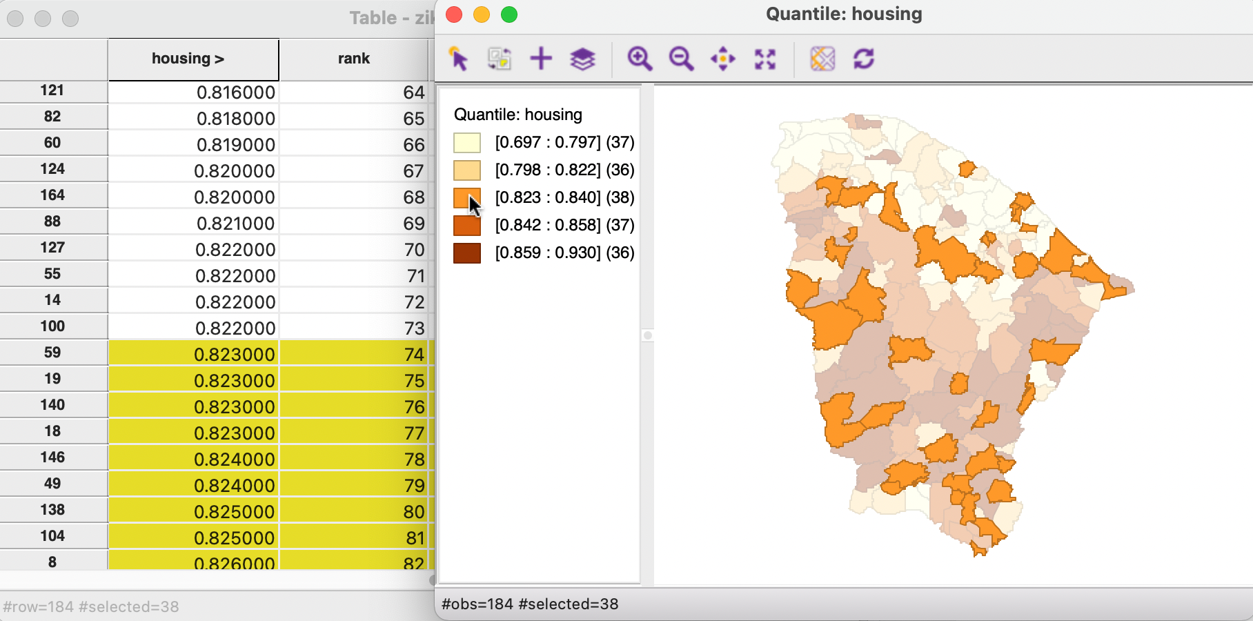
Figure 4.4: Tied values in a quantile map
Even though it is often used as the default setting in thematic mapping software, a quantile map should be interpreted with caution. Widely different value ranges for the quantile categories could mask underlying heterogeneity. In addition, the existence of ties can create problems in practice. For example, when a large number of observations have the same value, some quantile categories may turn out to be empty (GeoDa moves tied observations to the next higher category). This is the case for the Zika and Microcephaly incidence variables in the Ceará example data set, where many municipios have an incidence of zero (see also Section 5.3.1).
4.4.2 Equal intervals map
The observations for the housing index go from a minimum of 0.697 to a maximum value of 0.93, resulting in a range of 0.233. In an equal intervals map, this range is divided into a number of bins of equal size. For example, for a five category map, that would yield intervals of 0.233/5 = 0.0466.
Figure 4.5 illustrates the result for the housing variable with five categories. This is produced as Equal Intervals Map > 5, followed by selecting housing (the previously selected variable will be the default in the variable selection dialog). The overall design of the map window is the same as for the quantile map.
In contrast to the quantile map, each category now contains greatly varying numbers of observations, ranging from 7 for the highest category to 75 for the middle category. As intended, the range of each category is exactly 0.0466. Both the lowest and the highest categories contain much fewer observations than in the quantile map.
The patterns suggested by the equal intervals map are quite distinct from those in the quantile map. The overall impression of a band of the lowest index value municipios in the north has been replaced by a scattering of 8 observations, not showing any apparent systematic pattern. Also, the band of 36 observations with the highest category in the quantile map has been replaced by a seven locations, not grouped in any particular way.
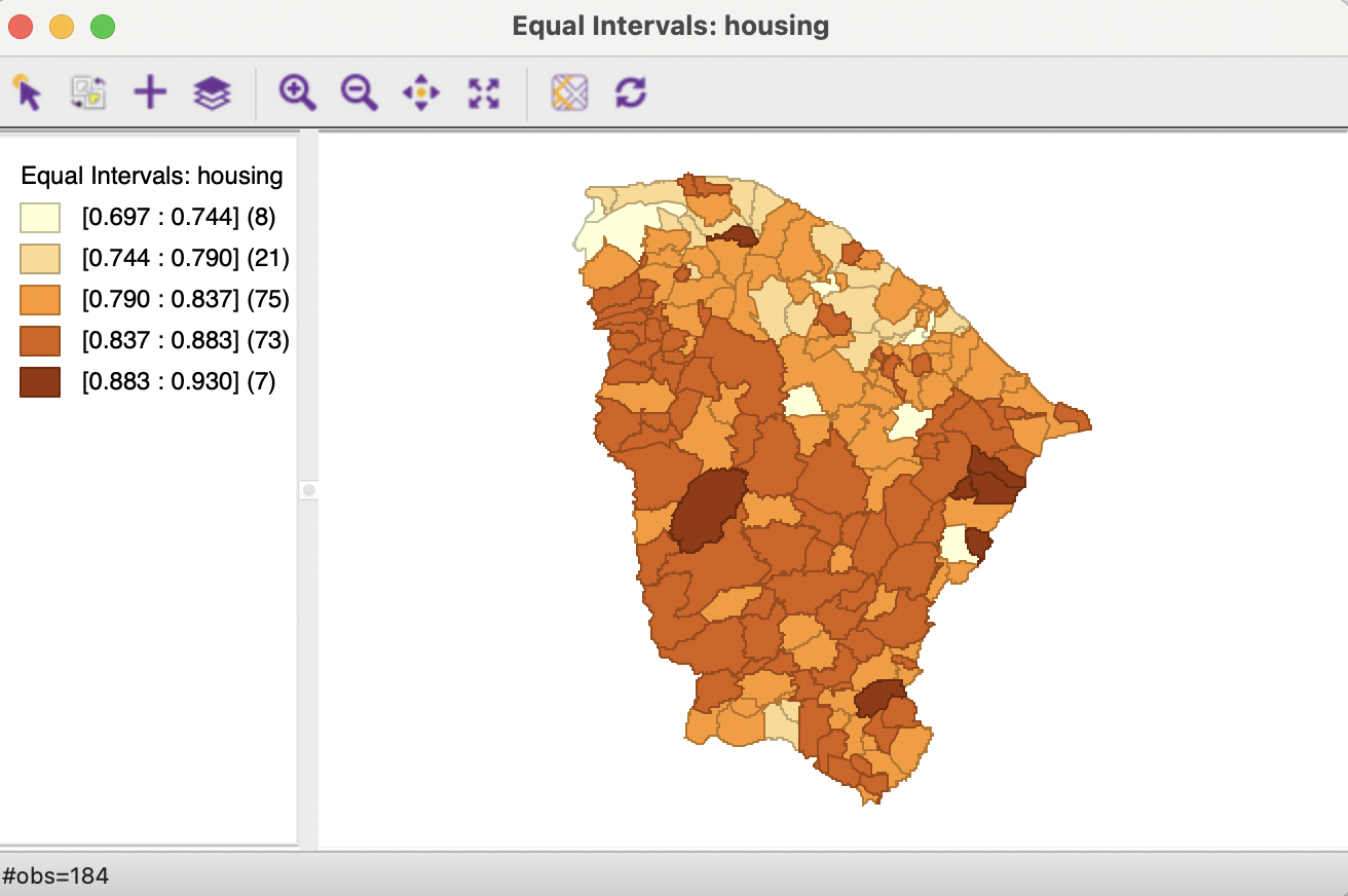
Figure 4.5: Equal intervals map for housing index, Ceará
The equal intervals map follows the same classification logic as the histogram, illustrated in Figure 4.6. In the Figure, the two graphs are located side by side, with the highest bar selected in the histogram. Through the process of linking, this results in the seven observations from the fifth map category being selected in the map. In practice, inspecting the histogram (or box map) for the variable under consideration is often instructive in suggesting whether a quantile map or equal intervals map is appropriate for the distribution in question.
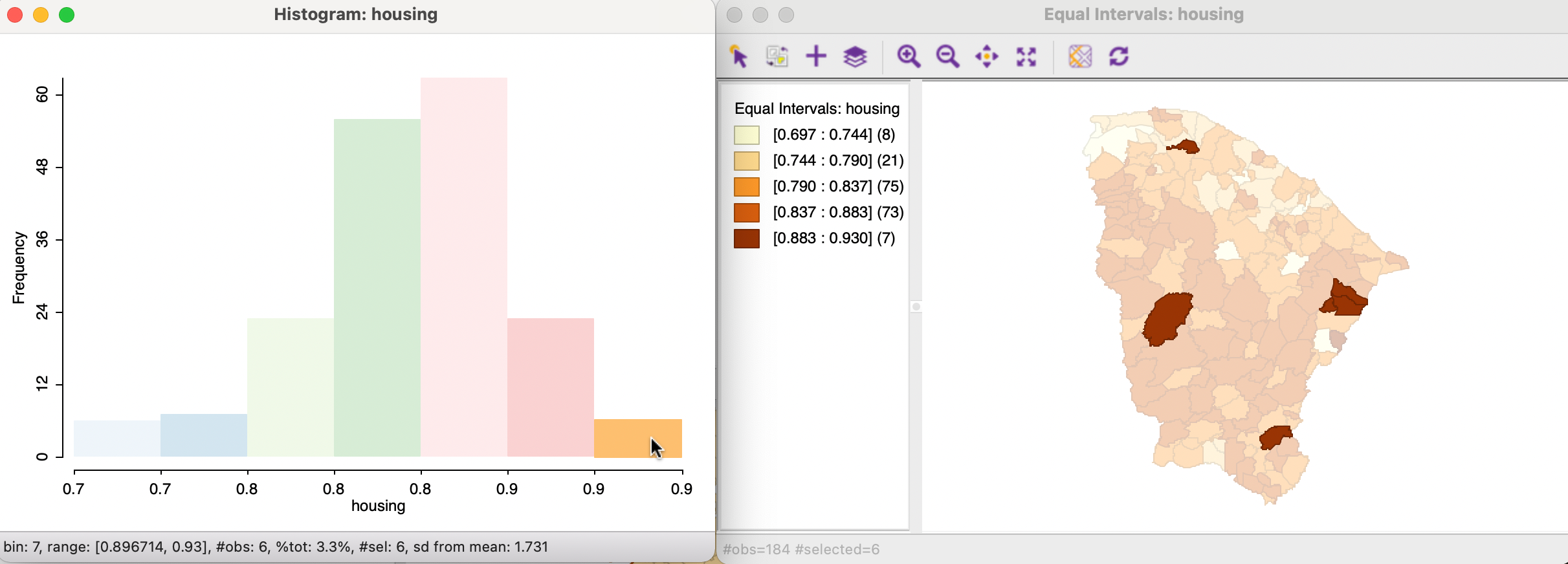
Figure 4.6: Equal intervals map and histogram
4.4.3 Natural breaks map
A natural breaks map uses a nonlinear algorithm to group observations such that the within-group homogeneity is maximized, following the path-breaking work of Fisher (1958) and Jenks (1977). In essence, this is a clustering algorithm in one dimension to determine the break points that yield groups with the largest internal similarity, i.e., the smallest internal variance (see also Volume 2). The algorithm to obtain the optimal break points is quite complex, and for large data sets heuristics based on sampling strategies may be necessary (Rey et al. 2013; Rey, Stephens, and Laura 2017).
An example is shown in Figure 4.7 for the housing variable, using Natural Breaks Map > 5 to obtain five intervals.
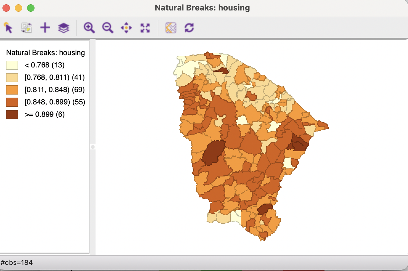
Figure 4.7: Natural breaks map for housing index, Ceará
The format of the legend in the natural breaks map differs slightly from the one used in the previous two map types. Each interval is depicted as half open, with the lower value included - shown by the left square bracket [ - and the upper value excluded - shown by the right parenthesis ). Similarly, the bounds of the lowest and highest category are shown, not the lowest and highest value as before.
The patterns suggested by the map have several similar features to the equal intervals map, in that the middle categories contain most observations, and the lowest and highest categories are small. However, the intervals are far from equal, ranging from 0.031 for the fifth category to 0.071 for the first.
The natural breaks bring out a northern pattern for the second category, similar to what was suggested by the first quintile in the quantile map, and again there is a seeming band of higher values. However, in contrast to what the quintile map suggested, the associated observations are not the extremes.
In practice, it is important to go beyond using a single map type, and to compare the similarities and differences between the patterns suggested by the various map classifications.
The housing condition index is based on the proportion of people living in shanty towns, number of bedrooms with a maximum of two people, number of households with a maximum ratio of 4 people per restroom, proportion of households whose walls are made of brick or appropriate wood, and proportion of inadequate households. See Amaral et al. (2019) for further details.↩︎