15.4 Smoothed distance scatter plot
The smoothed distance scatter plot (Anselin and Li 2020) offers an alternative approach to relating a measure of attribute dissimilarity to distance. It is similar in spirit to the familiar semi-variogram from geostatistics (Isaaks and Srivastava 1989; Cressie 1993; Chilès and Delfiner 1999; Stein 1999), but also different in some important respects.
In geostatistics, the point of departure for the semi-variogram is to express the magnitude of the variance of the difference between observations at two points in space as a function of the distance that separates them: \[\gamma(h) = \frac{1}{2} \mbox{Var}[z_s - z_{s+h}],\] where \(\gamma\) is the semi-variogram function and \(h\) is the separation between two observations.
Exploiting assumptions of spatial stationarity (such as constant mean and constant variance), this results in a simpler expression that relates the expected value of the squared difference to distance: \[\gamma(h) = \frac{1}{2} \mbox{E}[z_s - z_{s_h}]^2.\] An empirical variogram is estimated from the data by computing the average squared difference for several distance bins, similar to the computation of the spatial correlogram (Section 15.3.2.1). A number theoretical variograms have been proposed, such as the spherical, exponential and Matérn (see, e.g., Banerjee, Carlin, and Gelfand 2015 for an overview). These differ in terms of characteristics, such as the range, at which point the semi-variogram becomes flat, and the shape of the function between the origin and the range.
The smoothed distance scatter plot is similar in spirit in that it relates a measure of dissimilarity to the distance separating the observations, but it is not based on the typical assumptions from geostatistics. It is a simple scatter plot of the distance in attribute space (on the vertical axis) against the distance in geographic space (on the horizontal axis). The distance in attribute space for a single variable \(z\) can be expressed as: \[v_{ij} = \sqrt{(z_i - z_j)^2},\] with \(i\) and \(j\) as the observation locations. Note that this is not the squared difference, as in the semi-variogram, but its square root, as a direct measure of distance.
The geographic Euclidean distance between the observation point is then the familiar: \[d_{ij} = \sqrt{(x_i - x_j)^2 + (y_i - y_j)^2},\] with \((x_{i, j}, y_{i, j})\) as the observation coordinates.
Whereas the geographic distance has an immediate interpretation in terms of distance units (e.g., kilometers), this is not the case for the attribute distance matrix. In practice, it is therefore advisable to first standardize the variable, so that attribute distance is expressed in standard deviational units.
An example of the resulting scatter plot is shown in Figure 15.7 for the variable LLP (2016) from the Italy Community Banks data set. The graph shows a slow increase up to about 120 km, after which it is mostly flat (but see Section 15.4.3 for more detailed options and interpretation).
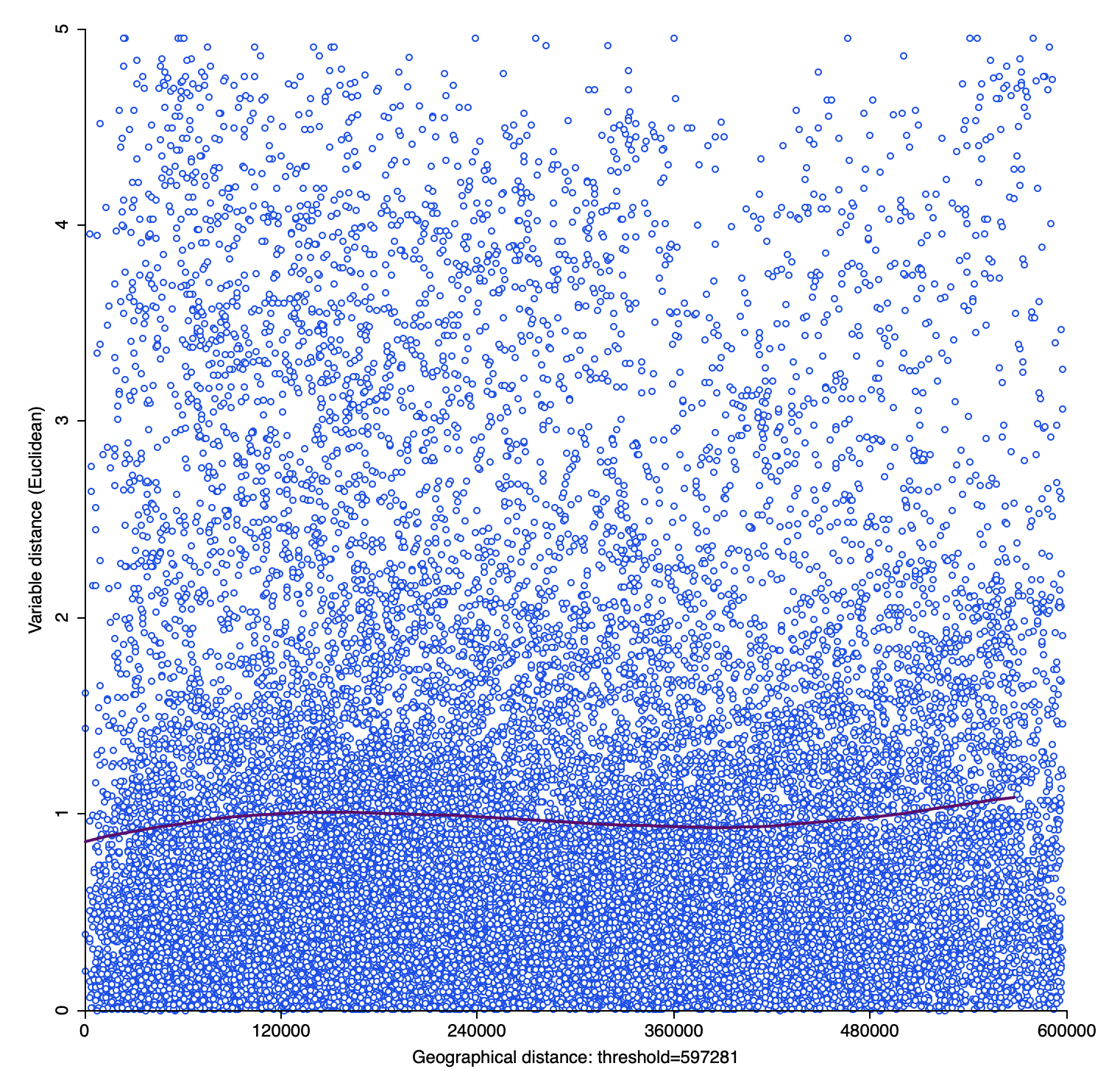
Figure 15.7: Smoothed distance scatter plot
The idea of combining a measure of distance in attribute space with geographic distance goes back at least to an example in Oden and Sokal (1986). They implemented a Mantel test (Section 13.4.3) to assess the similarity between the elements of a geographic distance matrix and a variable dissimilarity matrix. However, their approach is less flexible than the smoothed distance scatter plot and does not lend itself readily to an extension to multiple variables (Section 15.4.1).
One may be tempted to apply a linear fit to the scatter plot as an intuitive measure of the association between the two variables. However, this would imply a linear relationship between the two, whereas Tobler’s law suggests a non-linear distance decay, with a range beyond which there is no association, in the same fashion as shown for the spatial correlogram. However, in contrast to the correlogram, the smoothed distance scatter plot increases with distance until the range is reached, since it involves a measure of dissimilarity.
A non-parametric local regression fit is applied to the smoothed distance scatter plot to extract the overall pattern. Specifically, the implementation in GeoDa is based on the
loess approach (Cleveland, Grosse, and Shyu 1992).
As for the spatial correlogram, the main interest in this graph is to obtain an estimate of the range of interaction, i.e., the point where the curve ceases to increase with distance and begins to flatten out.
15.4.1 Multivariate extension
As explored in more depth in Chapter 18, a spatial autocorrelation measure based on a cross-product (like Moran’s I) is difficult to extend to multiple variables. In contrast, as demonstrated in Anselin (2019a), this is not the case for statistics that use a squared difference (or its square root) as an indicator of attribute dissimilarity.
More specifically, the univariate attribute distance is readily extended to \(k\) variables as: \[v_{ij} = \sqrt{ \sum_k (z_{ki} - z_{kj})^2},\] for \(k\) variables \(z_k\) observed at locations \(i\) and \(j\). This Euclidean distance in multi-attribute space will play an important role in the treatment of clustering considered in Volume 2. Instead of a Euclidean distance, a Manhattan metric could be used. Neither of these takes into account the inherent correlation among the variables, which could be addressed by means of a Mahalanobis distance, although this requires a reliable estimate of the variance matrix (more precisely, the inverse of the variance matrix).111 This approach is not considered further.
The multivariate smoothed distance plot replaces the univariate attribute distance by its multivariate counterpart on the vertical axis. In all other respects, the method is the same as the univariate case.
15.4.2 Creating a smoothed distance scatter plot
The smoothed distance plot is invoked as the second option from the spatial correlogram icon shown in Figure 15.1, or as Space > Distance Scatter Plot from the menu. The dialog that follows allows for the selection of the variable(s) and the settings to be used in the analysis. In contrast to the spatial correlogram, multiple variables can be selected. To illustrate the univariate case, the same variable as before is employed, LLP (2016). The extension to multiple variables is straightforward, the only difference being that more than over variable must be selected in the dialog. All other options and interpretations are the same as for the univariate case.
Other important initial settings in the dialog are the Variable Distance, either Euclidean Distance (the default) or Manhattan Distance, and the Geographic Distance, as Euclidean Distance (the default, for projected coordinates), or two versions of Arc Distance (in miles or kilometers, for coordinates as latitude-longitude).
In addition, a few options need to be set to make the plot operational. As argued for the spatial correlogram, it is usually not advised to compute the attribute distance for all the observation pairs in the data set. By default, the Max Distance box is checked, which results in 1/2 maximum pairwise distance to be used as the largest pairwise distance, following standard practice in empirical variography (Journel and Huijbregts 1978; Deutsch and Journel 1998). In the example, this is about 597 km (compared to a maximum distance of some 1,200 km). As in the spatial correlogram, this yields 17095 pairs to be considered, compared to the 33,930 pairs in the default case. A different option is to use 1/2 of the diagonal of the bounding box, another rule of thumb often used for empirical variograms.
The All Pairs button is checked by default. The alternative is to use Random Sample, which works in the same way as for the spatial correlogram.
These default settings yield the plot in Figure 15.7, but without the actual points, which are not shown by default. Using a more reasonable cut-off distance of 150 km yields the graph in Figure 15.8, based on the computation for 6579 observation pairs. In this plot, the range seems to be between 70 and 80 km, slightly higher than for the spatial correlogram in Figure 15.6.
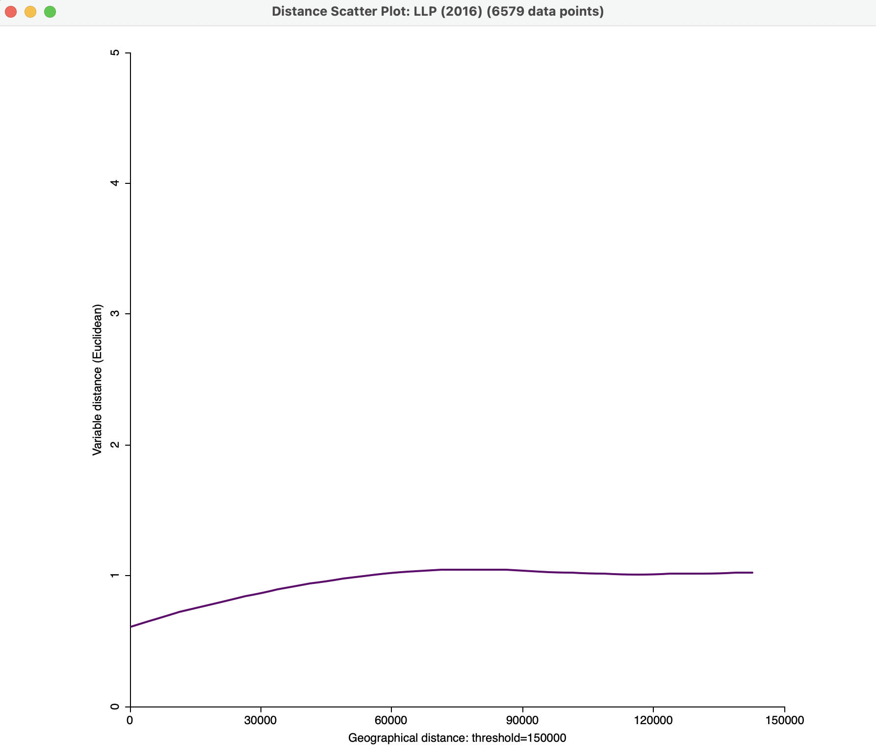
Figure 15.8: Smmoothed distance scatter plot with 150 km distance cut-off
Further options to refine the visualization are described in Sections 15.4.3 and 15.4.3.1.
15.4.3 Smoothed distance scatter plot options
The plot has several options that are invoked in the usual fashion, by right clicking on the graph. There are five items:
- LOESS Setup
- View
- Color
- Axis Option
- Save Results.
The LOESS Setup determines the settings for the nonparametric local regression and is considered in Section 15.4.3.1.
The default View setting is to show the status bar. View > Show Data Points adds all the points to the scatter plot. As mentioned, this is turned off by default. The Color options allow the color to be specified for the regression line, the scatter plot points and the background.
An important option for effective visualization is to adjust the range on the Y-axis. This is implemented through Axis Option > Adjust Value Range of Y-Axis. It allows the minimum and maximum values for the Y-Axis to be customized, resulting in a clearer view of the shape of the graph. For example, setting the maximum at 1.5 in Figure 15.8, yields the plot shown in Figure 15.9.
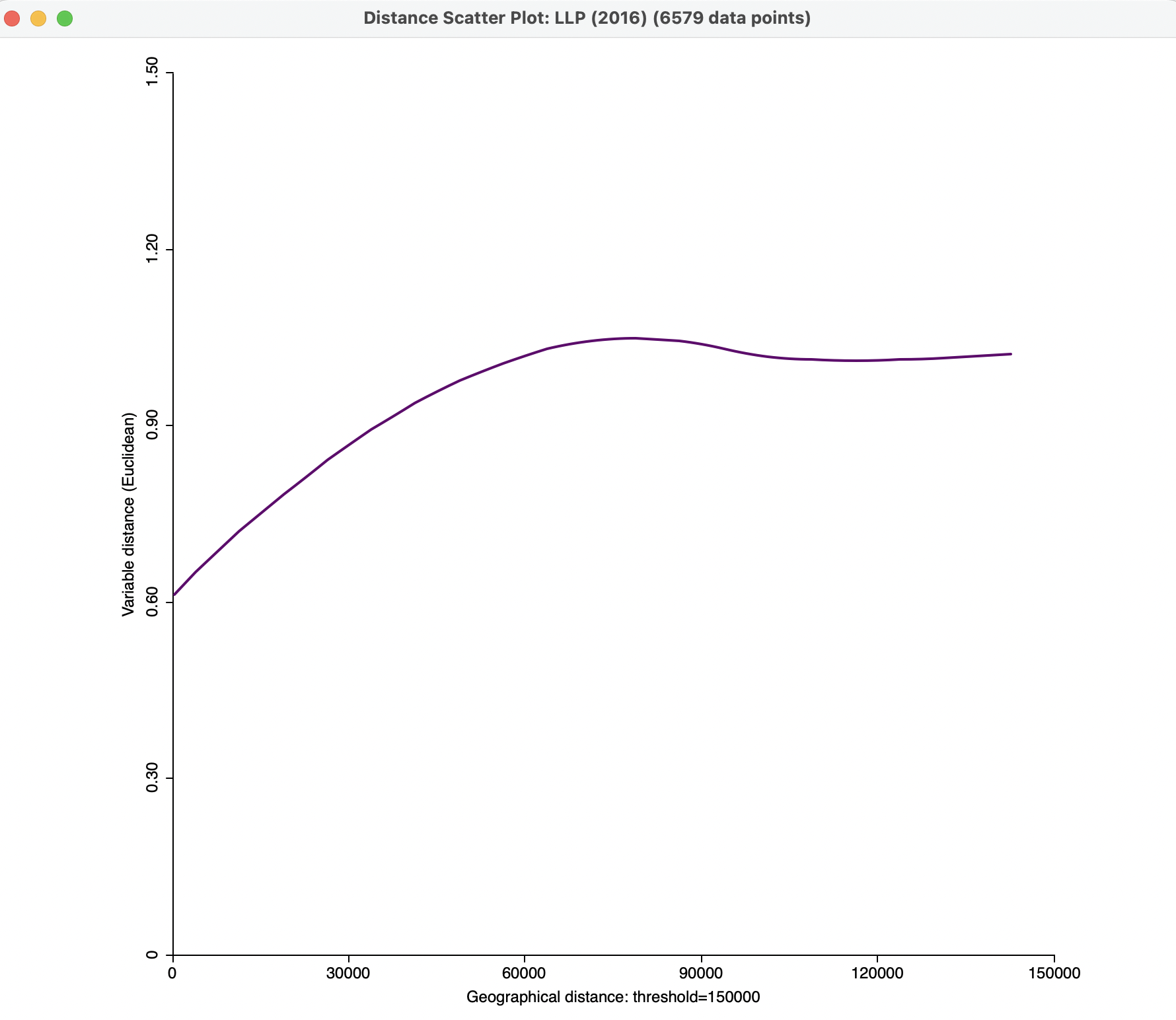
Figure 15.9: Smmoothed distance scatter plot with 150 km distance cut-off and customized Y-Axis
In addition, the Axis Option can be used to specify the display precision, in the usual way.
Finally, Save Results will create a comma separated value (csv) file that contains all the scatter plot points with their X and Y coordinates. This file can then be used as input to more advanced statistical analyses.
15.4.3.1 Loess settings
The loess approach implements a local polynomial regression method as outlined in
Cleveland, Grosse, and Shyu (1992). The implementation in GeoDa is based on the code contained in the netlib library. The local regression uses a subset of the observations within a close attribute distance from each observation point to compute the slopes in a polynomial regression, which are then combined to produce a smooth function of predicted values. Since the smoothed distance scatter plot only has one explanatory variable (geographic distance), the loess implementation is fairly straightforward.
The LOESS Setup option allows for three important parameters to be set. The first is the Degree of smoothing (span), i.e., the share of total observations that is used. The netlib default is 0.75, which is also the default value in GeoDa. This corresponds to the formal smoothing parameter \(\alpha\) which is used in some other software implementations. The observations within the maximum range from the fit point are weighted as in a kernel regression.112
The Degree of the polynomials is 2 by default, for a quadratic model, but 1 (linear) is another (less often used) option. Finally, the Family setting selects the type of fitting procedure. The default is gaussian, which boils down to a least squares fit. The alternative is a sometimes more robust symmetric option.
To illustrate the sensitivity of the graph to some of these settings, Figure 15.10 shows the effect of setting the span to 0.50, for a more local fit.
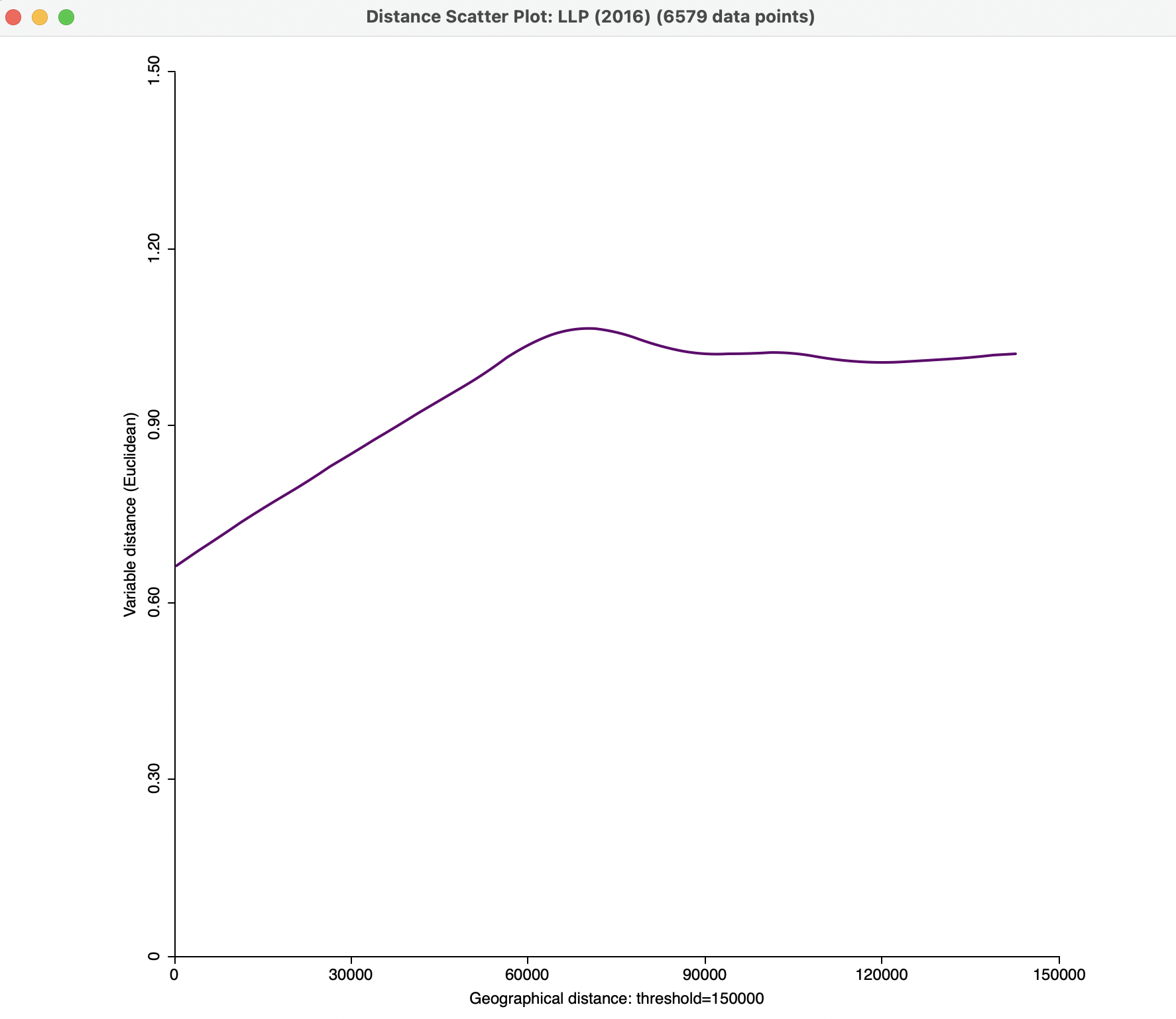
Figure 15.10: Smmoothed distance scatter plot with 150 km distance cut-off and span 0.5
Figure 15.11 illustrates the effect of a linear fit vs a quadratic fit (with the same span of 0.5).
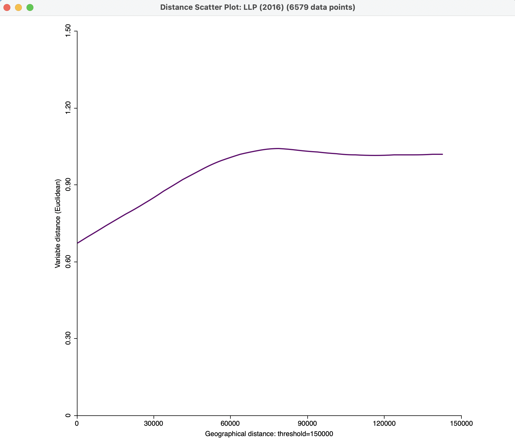
Figure 15.11: Smmoothed distance scatter plot with 150 km distance cut-off, span 0.5, linear fit
In practice, some experimentation may be necessary to yield the most effective graph.
Finally, Figure 15.12 illustrates a smoothed distance scatter plot for two variables, technical input efficiency in 2016, TE_IN (2016) and loan loss provision LLP (2016). The span is set to 0.5, with a quadratic function and the vertical axis truncated at 2. The graph shows a gradually increasing function up to about 70 km, after which it is more or less horizontal. This suggests the presence of a spatial relationship of the tuples of the two variables observed within this range.
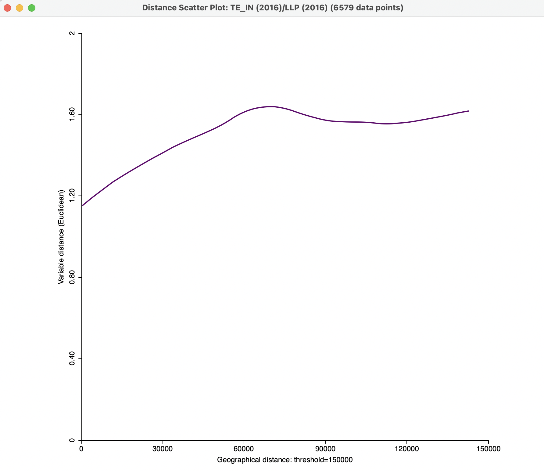
Figure 15.12: Bivariate smmoothed distance scatter plot
The Mahalanobis distance between vectors \(\mathbf{x}_i\) and \(\mathbf{x}_j\) is \(d_{ij} = \sqrt{(\mathbf{x}_i - \mathbf{x}_j)'\Sigma^{-1}(\mathbf{x}_i - \mathbf{x}_j)}\), with \(\Sigma\) as the covariance matrix.↩︎
The netlib implementation uses a tricubic weighting scheme, i.e., \((1 - (\mbox{distance}/\mbox{maximum distance})^3)^3\).↩︎