6.3 Excess Risk - SMR - LQ
6.3.1 Relative risk
In Chapter 5, several map types were introduced that focus the attention on extreme values. Clearly, these same maps can be applied to rates, as in the illustration in Figure 6.4, showing a box map. However, for rates, there is an additional concept that helps in identifying extreme observations.
The concept is that of a relative rate or a relative risk, also referred to as excess risk. In essence, this boils down to the ratio of the observed rate at a location to some reference rate. In demography and public health analysis, such a ratio is referred to as a standardized mortality rate (SMR). In regional economics, when applied to the fraction of employment in a given sector, the corresponding concept is that of a location quotient (LQ).
The idea is to compare the observed rate at a small area to a national (or regional) standard. More specifically, the observed number of events (\(O_i\)) is compared to the number of events that would be expected (\(E_i\)), had a reference risk been applied.
In most applications, the reference risk is estimated from the aggregate of all the observations under consideration, as the ratio of the sum of numerators over the sum of denominators. Formally, this is expressed as: \[\tilde{\pi} = \frac{\sum_{i=1}^{i=n} O_i}{\sum_{i=1}^{i=n} P_i},\] with \(O_i\) and \(P_i\) as before. Note that this is different from a simple average of the rates. In fact, it is a population weighted average that properly assigns the contribution of each area to the overall total.
If the ratio \(\tilde{\pi}\) would apply equally to each observation, the result would be the expected value for that observation. In demography and public health, this would be an expected number of deaths or incidence of a disease. In regional economics, it would be the expected share of employment in a sector (equal to the reference share). In general, this can be expressed as: \[E_i = \tilde{\pi} \times P_i.\] The relative risk then follows as the ratio of the observed rate over the reference rate, or, equivalently, of the observed number of events over the expected number of events: \[RR_i = \frac{r_i}{\tilde{\pi_i}} = \frac{O_i/P_i}{E_i/P_i} = \frac{O_i}{E_i}\].
If an area matches the (regional) reference rate, the corresponding relative risk is one. Values greater than one suggest an excess, whereas values smaller than one suggest a shortfall. The interpretation depends on the context. For example, in disease analysis, a relative risk larger than one would indicate an area where the prevalence of the disease is greater than would be expected. In regional economics, a location quotient greater than one, suggests employment in a sector that exceeds the local needs, implying an export sector.
6.3.2 Excess risk map
An Excess Risk map is a special rate map that uses a custom classification to indicate observations that fall below or exceed the reference relative risk rate of one. The legend is divergent, using blue hues to indicate values smaller than one and brown hues for values larger than one. The intervals are 1-2, 2-4 and greater than 4 on the high end, and 0.5-1, 0.25-0.5, and < 0.25 on the low end.
The map is invoked as Maps > Rates- Calculated Maps > Excess Risk in the usual fashion. Again, both the Event Variable and the Base Variable must be specified. In Figure 6.7, the resulting map is shown for gdp and pop as the numerator and denominator. The great majority of municipalities do not reach the state GDP per capita, yielding a blue hue in the map. Only nine observations have a GDP per capita that exceeds the state average by a multiple: five between 1 and 2, three between 2 and 4, and one observation has an excess risk rate greater than 4, highlighted in the map.
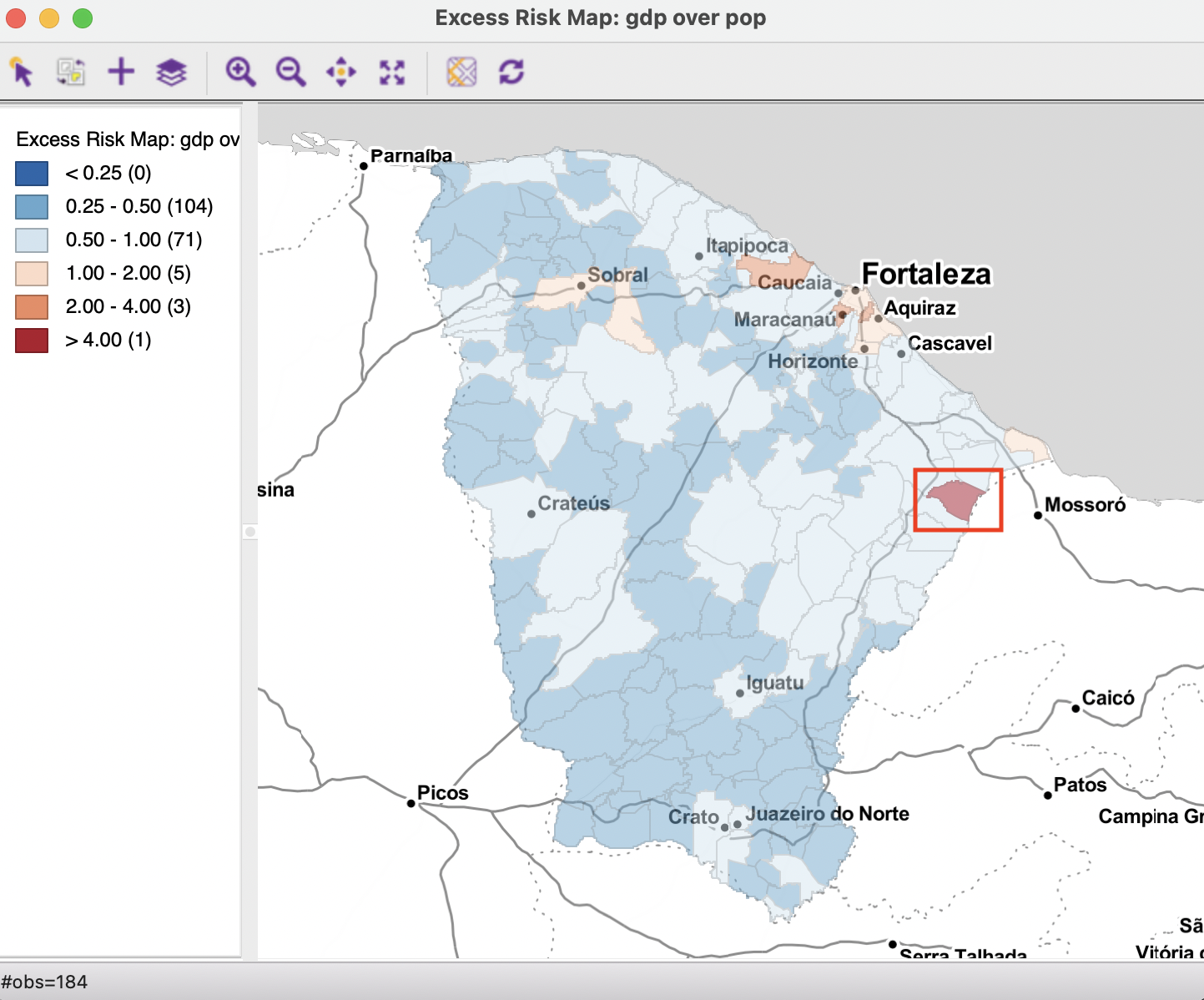
Figure 6.7: GDP per capita excess risk
As it turns out, the identified observation is the small rural municipality of Quixeré, which specializes in high-tech agriculture. Due to the high capital intensive nature of that production and its small population, it has an extremely high GDP per capita from that activity (see also Figure 6.8). However, this extreme value may be an artifact of the particular data set.39
All standard map options also apply to the excess risk map.
6.3.2.1 Saving and calculating excess risk
As shown in Section 6.2.2.1, the rates can be saved to the table, as well as calculated directly in the table. This works in the same way for the excess risk ratios. The default variable name when saving the rate is R_EXCESS.
Figure 6.8 illustrates this for the GDP per capita. The original gdpcap is shown, together with the excess rate. The observations are ranked by the excess rate. The highest rate of 4.34 is obtained by Quixeré, with a GDP per capita of 40. The total GDP for the state of Ceará is 77,865,442 rais (i.e., the sum of the GDP in all municipalities), with a matching total population of 8,452,380. Consequently, the state GDP per capital is 9.21. Clearly, the GDP per capita of 40 for Quixeré exceeds this more than four-fold. As pointed out in the review of the map, this is actually an exception, with most of the municipalities not matching the state average. Figure 6.8 shows the top nine municipalities with excess rates greater than one. More importantly, the spatial distribution shown in the map in Figure 6.7 highlights the importance of spatial heterogeneity. Specifically, assuming that the economies of the municipalities in the state follow the state GDP per capita is highly misleading, as only a few such locations meet or exceed that standard.
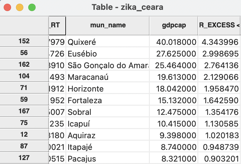
Figure 6.8: GDP per capita excess risk in table
There may be a problem with the GDP data for that municipality in the Ceará data set. The figure for GDP is from the 2013 IBGE publication. As it turns out, in later years, this figure was revised downward.↩︎