5.2 Extreme Value Maps
Extreme value maps are variations of common choropleth maps where the classification is designed to highlight observations at the extreme lower and upper end of the scale. The objective is to identify and highlight outliers. These maps were developed in the spirit of spatializing EDA, i.e., adding spatial features to commonly used approaches in non-spatial EDA (Anselin 1994).
GeoDa currently supports three such map types in the Map menu: a Percentile Map, a Box Map, and a
Standard Deviation Map. These are briefly described below. Only their distinctive features are highlighted, since they share all the same options with the traditional thematic map types (Section 4.5).
It should be noted that the extreme value maps are examples of a diverging legend, whereas the
conventional maps have a sequential legend.
The extreme value maps are the third to sixth items in the map menu of Figure 4.2.
5.2.1 Percentile map
The percentile map is a variant of a quantile map that would start off with 100 categories. However, rather than having these 100 categories, the map classification is reduced to six ranges, the lowest 1%, 1-10%, 10-50%, 50-90%, 90-99% and the top 1%. This is shown in Figure 5.1 for the housing variable from the Ceará sample data set.
This map is created by selecting Map > Percentile Map from the map menu or the map toolbar icon and specifying the variable.
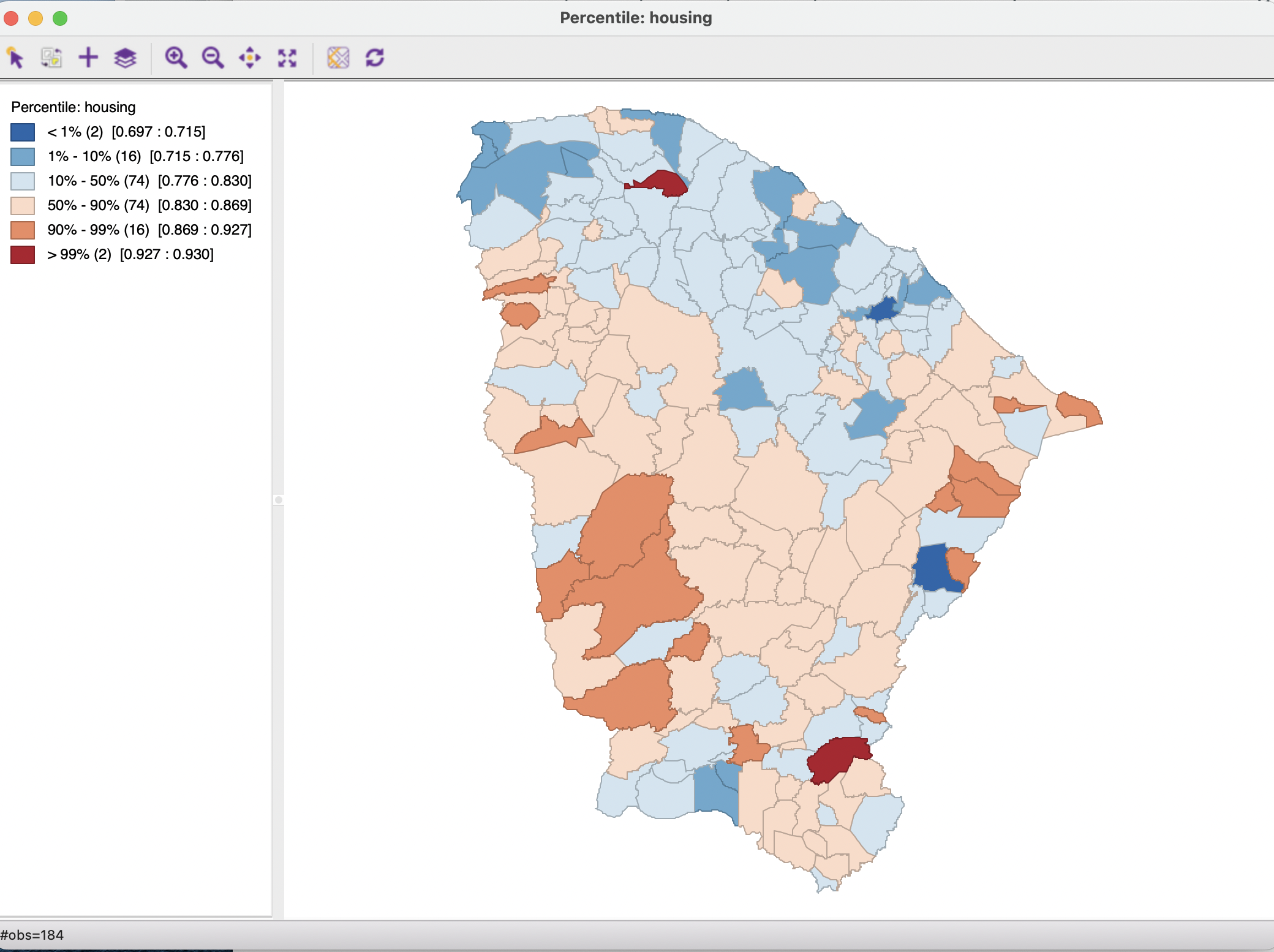
Figure 5.1: Percentile map
Compared to the traditional map classifications discussed in Section 4.4, the extreme values are much better highlighted. Both the bottom and top 1% contain two observations, with a very small range, respectively 0.697 to 0.715 and 0.927 to 0.930. Interestingly, these extreme values are not closely together in space, countering any suggestion of clustering. However, at least in one case (the northernmost upper percentile observation), a very high value is surrounded by much lower ones, suggesting the potential of a spatial outlier.
With the focus on the large range of middle values (i.e., 10-50 percentile and 50-90), two large bands of adjoining municipios in the same category seem to manifest themselves, with below median values in the northeast and above median values forming a U-shape in the center of the state.
As for any quantile map, there are some drawbacks to this approach related to ties and potential heterogeneity of values within the same category. In addition, a percentile map only makes sense when there are more than 100 observations, which is the case here. It is particularly useful to identify the location in space of the truly extreme observations.
5.2.2 Box map
Whereas the category bounds in the percentile map are to some extent arbitrary, in the box map these are connected to the visualization of the distribution of a variable in a box plot (see Chapter 7).
The box map (Anselin 1994) is thus the mapping counterpart of the idea behind a box plot. The point of departure is again a quantile map, or, more specifically, a quartile map. The four categories are extended to six bins, to separately identify the lower and upper outliers. The definition of outliers is a function of a multiple of the inter-quartile range (IQR), the difference between the values for the 75 and 25 percentile. As is customary, there are two options for these cut-off values, or hinges in a box plot: 1.5 and 3.0. The box map uses the same convention.
The box map is created by selecting Map > Box Map (Hinge=1.5) from the map options and specifying the variable. For the Ceará housing index variable, this yields the map shown in the left panel of Figure 5.2. For easy reference, the corresponding box plot is contained in the right panel.
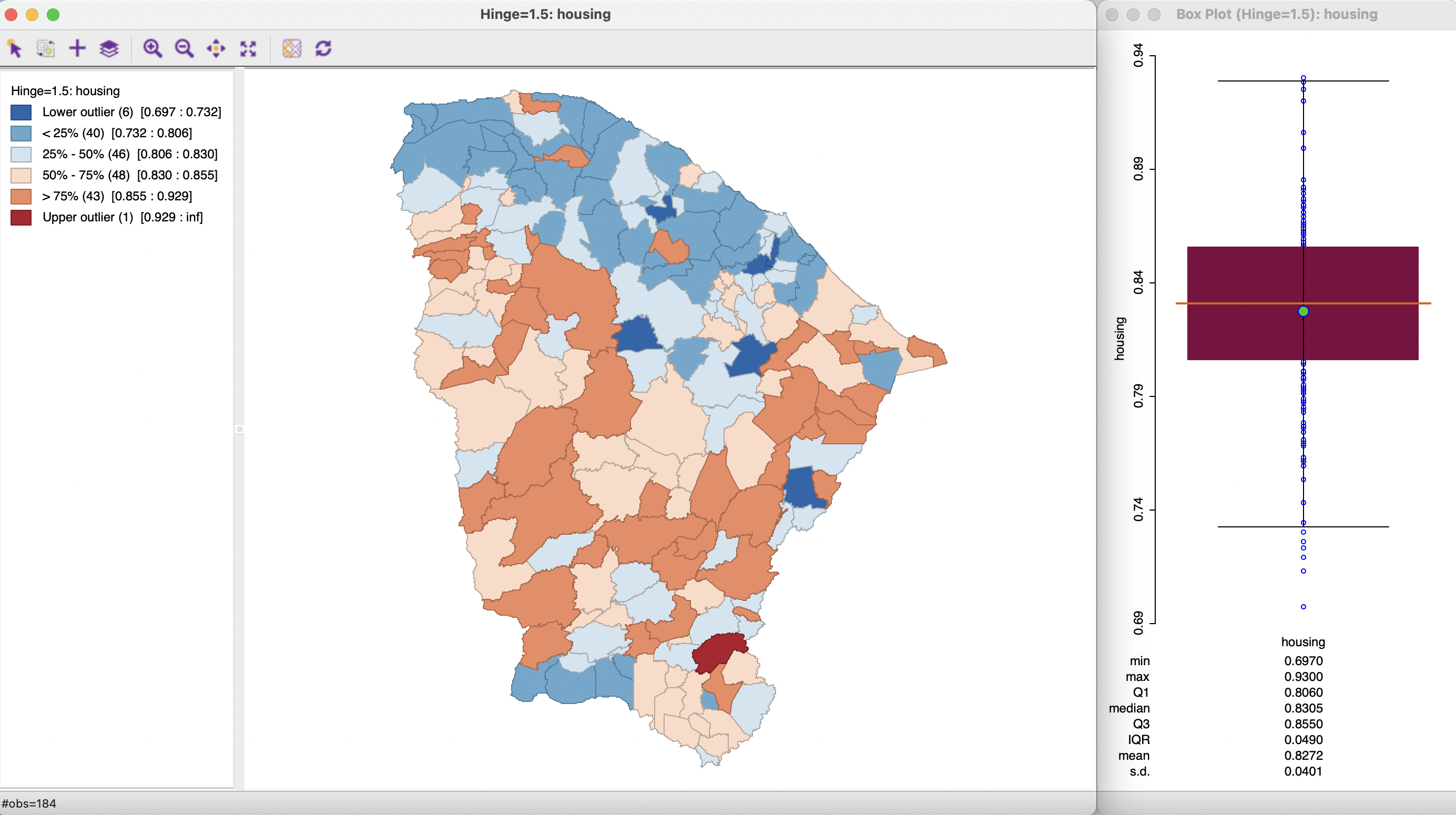
Figure 5.2: Box map, hinge=1.5, with box plot
Compared to a standard quartile map, the box map in Figure 5.2 separates out six lower outliers from the other 40 observations in the first quartile. They are depicted in dark blue. Similarly, it separates a single upper outlier from the 43 other observations in the upper quartile. The upper outlier is colored dark red. The main focus of interest in a box map is to identify the extent to which the outliers show any kind of spatial pattern. In this example, there does not seem to be a suggestion of clustering, but possibly of the presence of spatial outliers (this is explored more formally in Chapters 16 to 19). This constitutes the spatial perspective that the box map adds to the data exploration.
To further illustrate the correspondence between the box plot and the box map, in Figure 5.3, the six lower outliers are selected in the box plot in the right hand panel. Through linking, these are also highlighted in the map and correspond exactly to the lower outlier category. Again, there is a fundamental difference between a traditional box plot where outlying observations are identified, and the box map, where their location is taken into account as well.
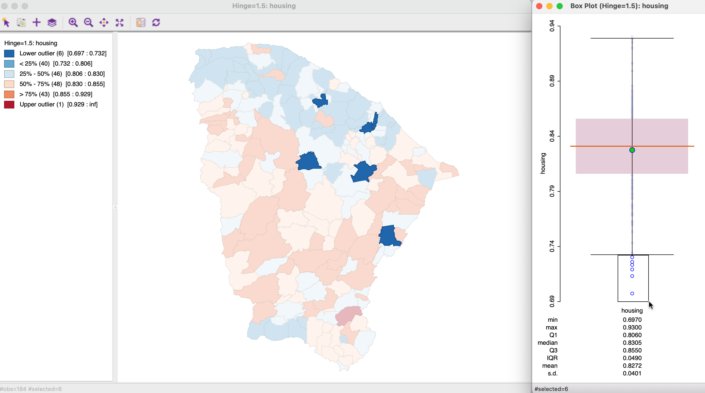
Figure 5.3: Outliers in box plot and box map
From the current map, the box map can be switched between the hinge criterion of 1.5 and 3.0 by opening the options menu (right click on the map) and selecting Change Current Map Type > Box Map (Hinge = 3.0). Alternatively, a new map window can be opened from the main menu or map toolbar icon by selecting Box Map (Hinge=3.0) as the option.
The box map is arguably the preferred method to quickly and efficiently identify outliers and broad spatial patterns in a data set, although it does suffer form the same drawbacks as any other quantile map.
5.2.3 Standard deviation map
The third type of extreme values map is a standard deviation map. In some way, this is a parametric counterpart to the box map, in that the standard deviation is used as the criterion to identify outliers, instead of the inter-quartile range.
In a standard deviation map, the variable under consideration is represented as standard deviational units (with mean 0 and standard deviation 1). This is equivalent to the z-standardization (see Section 2.4.2.3).
The number of categories in the classification depends on the range of values, i.e., how many standard deviational units cover the range from lowest to highest. It is possible that some categories do not contain any observations, since there may be gaps in the distribution for a given standard deviational range.34
The relevant option is Map > Standard Deviation Map, which yields the map in Figure 5.4 for the Ceará housing index example.
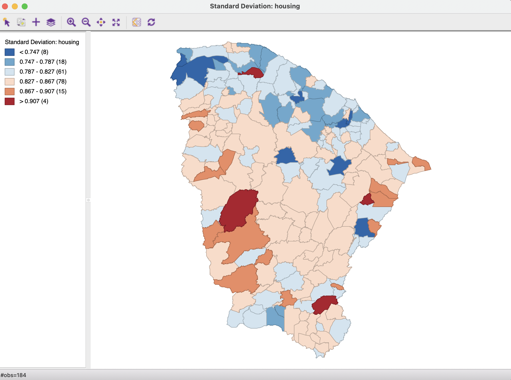
Figure 5.4: Standard deviation map
In the example, there are six categories, each with a range of 0.040. There are eight observations that are more than two standard deviational units away from the mean in the lower direction, colored dark blue. As in the other extreme value maps, they do not seem to show any particular spatial pattern.
In the upward direction, there are four observations more than two standard deviational units from the mean, which is quite a bit more than identified with the box map. The one observations in the north seems to be both an outlier in the value distribution as well as a spatial outlier. Otherwise, there is no indication of any clustering of the extremes.
On the other hand, when focusing on the central values in the distribution, again there is the suggestion of a northern band of lower values and a U-shape pattern of observations within one standard deviation above the mean.
In practice, it is often useful to compare the outliers identified by both the non-parametric (box map) and parametric (standard deviation map) approaches. Of particular importance is whether extreme values show an interesting spatial pattern, which can then be more formally investigated by means of the local spatial autocorrelation indicators in Chapters 16 to 19.
For example, this would be the case when outlying observations are more than one standard deviational unit away from the rest of the distribution.↩︎