20.2 Heat Map
The Heat Map as implemented in GeoDa is a simple uniform kernel for a given bandwidth. A circle with radius equal
to the bandwidth is centered on each point in turn, and the number of points within the radius is counted. There is
no correction for distance decay. The
density of the points is reflected in the color shading.
The Heat Map follows the same principle as the idea underlying the Geographical Analysis Machine or GAM of Openshaw et al. (1987), where the uniform kernel is computed for a range of bandwidths to identify high intensity clusters. However, in the implementation considered here, no significance is assigned, and the heat map is used primarily as a visual device to highlight differences in the density of the points.
20.2.1 Implementation
Unlike the other methods considered in this Chapter, the Heat Map is not invoked from the cluster menu, but as the Heat Map option on any point map. This brings up a dialog with various options. The top item is to Display Heat Map, which, when checked, brings up the default, with the Heat Map on Top item active.
The default Heat Map is constructed for the max-min bandwidth that ensures that each location has at least one other location within its circle. This is the same default as used to specify the distance-band spatial weights (see Section 11.3.1). In most applications, this is not very informative, as shown in Figure 20.2, which depicts the locations contained in the Italy Community Banks sample data set.126 The Heat Map Bandwidth Setup Dialog in the example indicates a value of 124,660 (meters), the same as for the distance-band spatial weights used as an illustration in Chapter 11. The map can be customized using the various available options, of which the most important is to Specify Bandwidth.
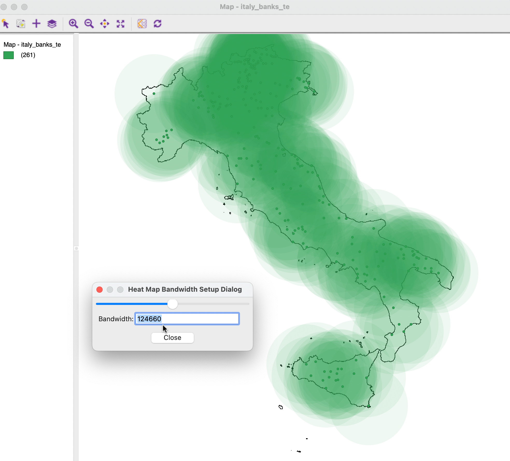
Figure 20.2: Default Heat Map
20.2.1.1 Options
In Figure 20.3, a customized version is shown, where advantage is taken of several of the options. First, the bandwidth is set to 73,000 (meters), the same as in Section 11.4.2 (Figure 11.8). In addition, the Change Fill Color is used to set the color to blue, with the Change Transparency to 0.95.
These settings provide a much clearer indication of the varying density over the map, with different gradations of the color corresponding to high and low density regions. In particular, the area in the North of the country is highlighted as a high density location.
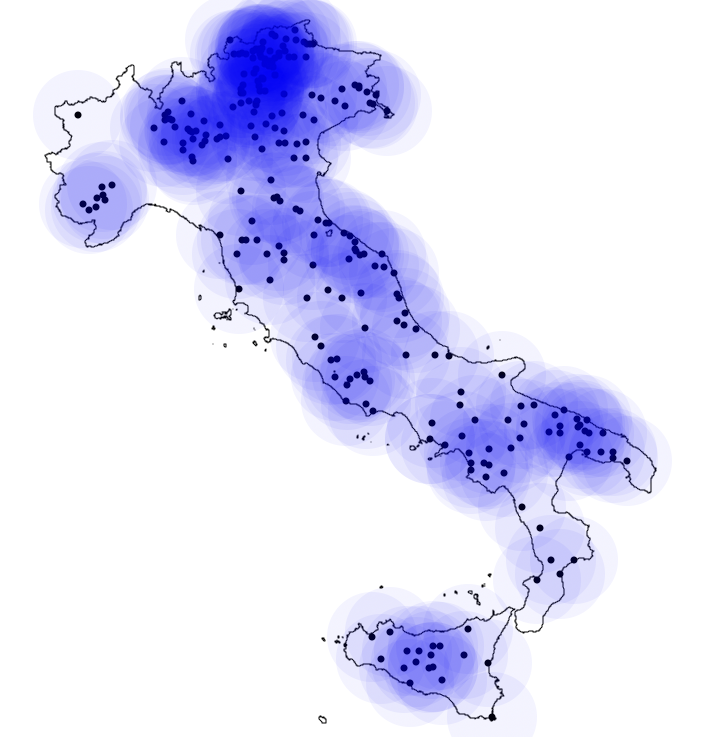
Figure 20.3: Heat Map with Bandwidth 73km
A final option, Specify Core Distance, only applies to the output of an HDBSCAN clustering routine (see Section 20.5.5.3).
The map shown in the figure has the default point colors changed to black, with the point size as 3. In addition a second layer consisting of the outlines of the Italian regions is added, of which the Only Map Boundary option is selected.↩︎