9.4 Treatment Effect Analysis - Averages Chart
As pointed out in Section 7.5.1, the real power of the Averages Chart lies in the comparison over time of the differences in a variable distribution between two subsets of the data. This is particularly relevant in so-called treatment effect analysis, where one group of observations (the Selected) is subject to a policy (treatment) between a beginning point and an endpoint. A target variable (outcome) is observed for both time periods, i.e., before and after the policy is implemented. The objective is to assess whether the treatment had a significant effect on the target variable by comparing its change over time to that for a control group (the Unselected).
In the example used here, the target variable is p_PHA, the percentage population with access to health care. Consider an imaginary policy experiment, where between 2000 and 2020 a targeted set of policies would have been applied to improve access to health care in higher elevation municipalities, specifically municipalities in the upper two quantiles of a six quantile distribution for altitude (ALTID). Note that this example is used only to illustrate the logic and implementation of a treatment effect analysis. It does not in fact correspond to an actual policy carried out in Oaxaca.
The treated municipalities (Selected) are depicted in the familiar quantile map for ALTID, with their selection highlighted in Figure 9.13.
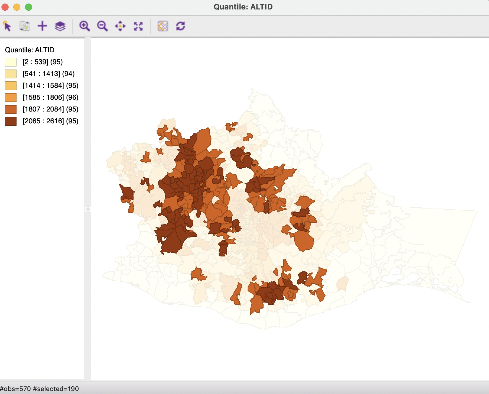
Figure 9.13: Selected municipalities with altitude in two upper quantiles
The Averages Charts is invoked in the same manner as in the cross-sectional case, either from the menu, as Explore > Averages Chart, or by selecting the right icon in the toolbar shown in Figure 9.1. Unlike what was the case in the cross-sectional context, once the Averages Chart is applied to a time enabled variable, it becomes possible to specify Period 1 and Period 2 in the interface.
This allows for two different types of applications. One is the same Difference-in-Means Test as considered before, applied statically to the variable at different points in time. A second is a more complete treatment effect analysis, implemented through the Run Diff-in-Diff Test option. Each is considered in turn.
9.4.1 Difference in means
To carry out a simple static difference in means test, the time-enabled variable p_PHA must be specified in the Variable drop down list, with the Groups set as Selected vs. Unselected. The time-enabled property of the variable is revealed by the beginning and end period in parentheses, (2000-2020), following the variable name.
As before, the Difference-in-Means Test requires Selected for Group 1, and Unselected for Group 2, but now the Period selection allows a choice among three time periods for 1 and for 2 (the period for 1 must always be before or equal to that for 2). A static analysis requires both periods to be the same. In the left-hand panel of Figure 9.14, the date is set to 2000, whereas in the right-hand panel, it pertains to 2020.
The graph in each panel shows the values for all three time periods. However, the relevant period is highlighted with a yellow bar and the statistics pertain only that period.
In the illustration, in 2000, the mean for Selected is 10.45, compared to 14.74 for Unselected, for a difference of -4.29. In 2020, the situation is reversed, with a mean of 79.51 for Selected, compared to 73.90 for Unselected, now yielding a positive difference of 5.61. In both cases the static difference in means test is highly significant.
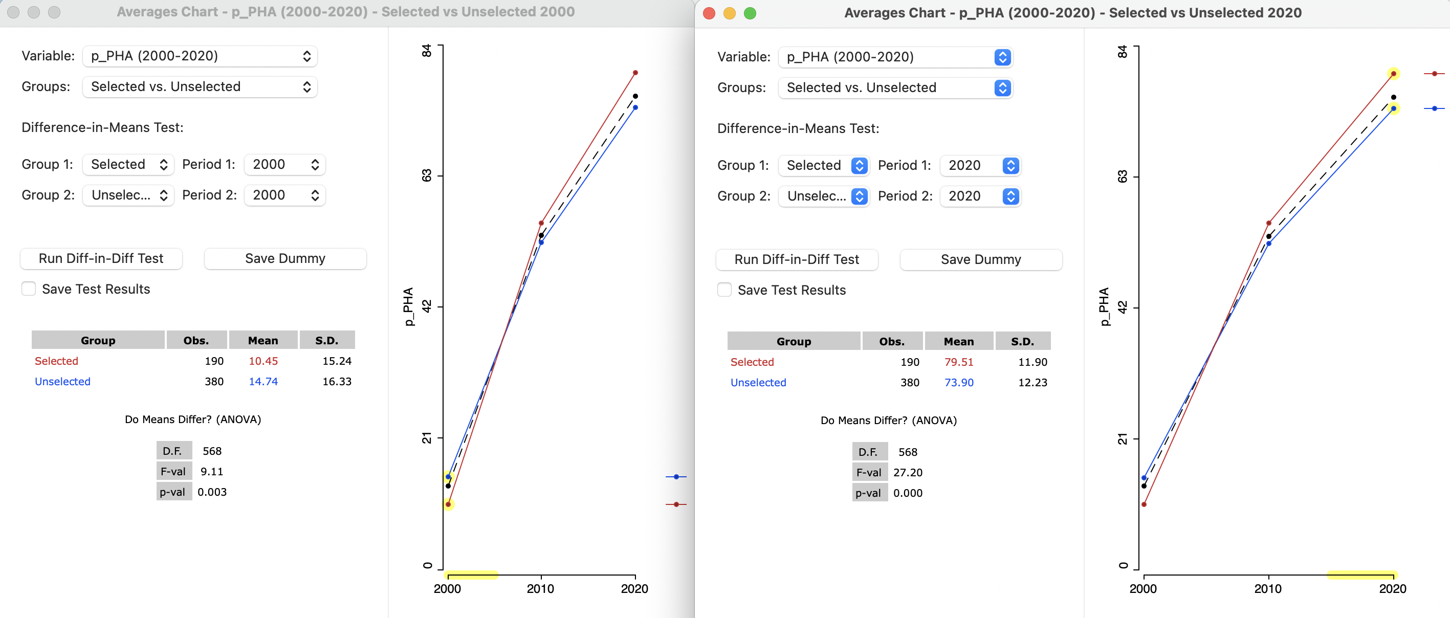
Figure 9.14: Difference in means, selected and unselected, static, in 2000 and 2020
To what extent might the difference of between the mean of 79.51 in 2020 and 10.45 in 2000 be due to our imaginary policy? This is answered by the Diff-in-Diff Test.
9.4.2 Difference in difference (DID)
The principle behind treatment effect analysis is to compare the evolution of the target variable in the treated group before and after the policy implementation (respectively Period 1 and Period 2) to a counterfactual, i.e., what would have happened to that variable had the treatment not been applied. Rather than a simple before and after difference in means test, the evolution of the target variable for a control group is taken into account as well. This is the basis for a difference in difference analysis. The problem is that the counterfactual is not actually observed. Its behavior is inferred from what happens to the control group.
A critical assumption is that in the absence of the policy, the target variable follows parallel paths over time for the treatment and control group. In other words, the difference between the treatment and control group at period 1 would be the same in period 2, in the absence of a treatment effect.
The counterfactual is thus a simple trend extrapolation of the treated group. In the absence of a treatment effect, the value of the target variable in period 2 should be equal to the difference between treated and control in period 1 added to the change for the control between period 1 and period 2, i.e., the trend extrapolation. The difference between that extrapolated value for the counterfactual and the actual target variable at period 2 is then the estimate of the treatment effect.
Formally, this can be expressed as a simple linear regression of the target variable stacked over the two periods, using a dummy variable for the treatment-control dichotomy (the space dummy, \(S\), equal to 1 for the Selected), a second one for the before and after dichotomy (the time dummy, \(T\), equal to 1 for Period 2), and a third dummy for the interaction between the two (i.e, treatment in the second period, \(S \times T\)):63 \[y_t = \beta_0 + \beta_1 S + \beta_2 T + \beta_3 (S \times T) + \epsilon,\] with \(\beta\) as the estimated coefficients, and \(\epsilon\) as a random error term. The treatment effect is the coefficient \(\beta_3\). The coefficient \(\beta_0\) corresponds to the mean in the control group (Unselected) in 2000 (14.74 in Figure 9.14). \(\beta_1\) is the pure space effect, the difference in means between Selected and Unselected in 2000 (-4.29 in Figure 9.14). Finally, \(\beta_2\) is the time trend in the control group, which has not yet been computed in the cross-sectional analysis (but see Figure 9.17).
9.4.2.1 Implementation
The difference in difference implementation uses the same Averages Chart interface as before, but with settings that disable the difference in means test. As shown in Figure 9.15, the two groups are Selected and Unselected, but Period 1 is 2000, with Period 2 as 2020. Even though the two means are listed and the graph is shown in the right hand panel, the results of the difference in means test are listed as 0.
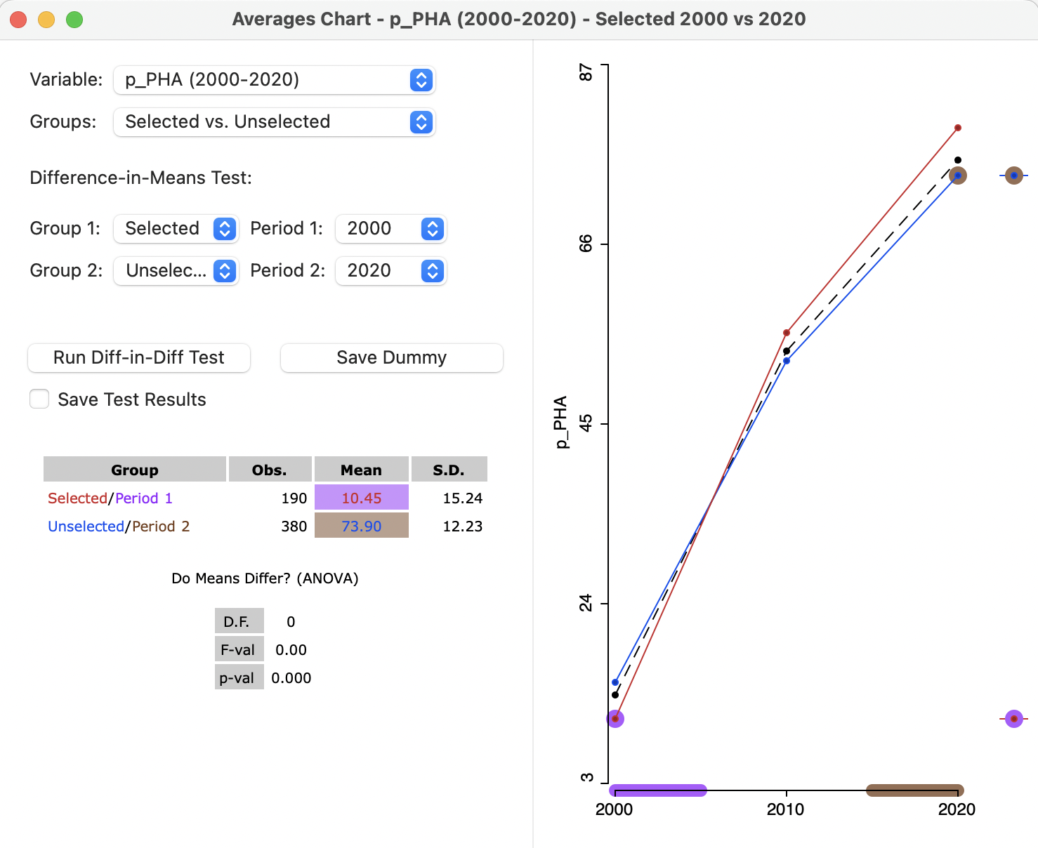
Figure 9.15: Difference in Difference setup, 2000 to 2020
The analysis is carried out by selecting the Run Diff-in-Diff Test button. This
yields the standard GeoDa regression output, shown in Figure 9.16.64 The overall fit is quite good, with an \(R^2\) of 83 %, and
all coefficients are highly significant.
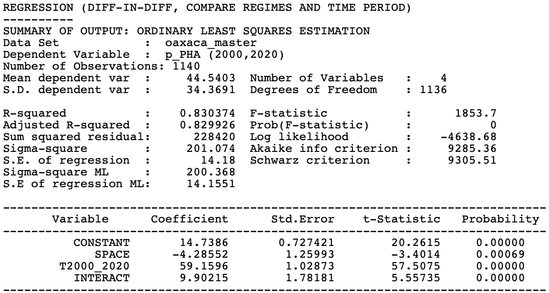
Figure 9.16: Difference in difference results
9.4.2.2 Interpretation and options of Diff-in-Diff results
The interpretation of the Diff-in-Diff results centers on the regression coefficients in Figure 9.16. The estimate of the treatment effect is the coefficient of INTERACT, 9.90, and highly significant. This would suggest that our imaginary high altitude policies indeed had a significant positive effect on health care access.
The other pieces of the puzzle can be found in the remaining coefficients. The CONSTANT is 14.7386, which is the value shown for the analysis in 2000 in Figure 9.14 as the mean of the Unselected. The SPACE coefficient estimate of -4.2855 corresponds to the difference in means between Selected and Unselected in 2000 in Figure 9.14. The trend coefficient (T2000_2020) is 59.16. In Figure 9.17, the means for Unselected are shown for Period 1 (14.74) and Period 2 (73.90). The difference between the two is 59.16, the same as the coefficient for the time trend, T2000_2020.
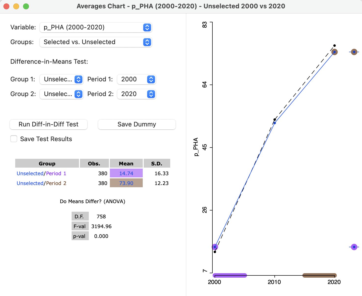
Figure 9.17: Difference in means, unselected, dynamic, 2000 to 2020
The interface offers two options to Save Dummy and Save Test Results. Selecting those options brings up a File > Save dialog to specify the file type and file name to save a panel data listing of the observations and dummy variables. This can be used for
more sophisticated regression analysis in other software (including GeoDa), e.g., to
include relevant control variables, and correct for serial and spatial correlation. This is beyond the current scope.65
In spite of the limitations of the simple difference in difference analysis, it provides a way to more formally assess the potential impact of spatial policy initiatives.
A full discussion of the econometrics of difference in difference analysis is beyond the scope of this chapter and can be found in Angrist and Pischke (2015), among others.↩︎
The regression functionality of
GeoDain not considered in this book. For a detailed treatment, see Anselin and Rey (2014).↩︎For recent reviews of some of the methodological issues associated with incorporating spatial effects in treatment effects analysis, see, among others, Kolak and Anselin (2020), Reich et al. (2021), and Akbari, Winter, and Tomko (2021).↩︎