7.5 Spatial Heterogeneity
Together with spatial dependence, spatial heterogeneity is the other critical aspect in any spatial data analysis. In essence, its presence suggests that more than one underlying distribution may be responsible for generating the observed sample. This is evidenced in the form of structural breaks, such as different mean or median values in different subsets of the data, or different slopes in a bivariate regression over observations in those subsets (see Anselin 1988, for a more formal treatment).
The spatial aspect in the heterogeneity comes from the nature of the subsets in the data, which are spatially defined. Examples are the difference between center and periphery, east and west, and north and south. In an exploratory data analysis, spatial heterogeneity can be assessed by selection in a map linked to a statistical graph. An application of this idea was illustrated in the context of a linked map and histogram (Section 7.2.1.4). Next, two further implementations of this approach are considered. One is the analysis of differences in means through the Averages Chart, the other the investigation of structural stability in a scatter plot by means of brushing a map linked to the scatter plot.
7.5.1 Averages chart
The Averages Chart is an implementation of a simple test on the difference in means between selected and unselected observations. Its most meaningful use is in the context of observations at different points in time (see Chapter 9), but it is equally applicable in a cross-sectional setting, illustrated here.
The core functionality of this chart is to illustrate and quantify the difference between the
mean of a variable for selected observations and unselected observations (the complement).
In GeoDa, this is not implemented as a traditional t-test, but rather as an F-statistic for
a regression that includes an indicator variable for the selection (i.e., value = 1 for selected,
and zero otherwise). The F-statistic on the significance of the joint slopes in that regression is
equivalent to a t-test on the coefficient of the indicator variable, since there is only one slope.
This F-statistic is basically a test on whether there is a significant gain in explanation in the regression beyond the overall mean (i.e., the constant term). Formally, the statistic uses the sum of squared residuals in the regression RSS and the sum of squared deviations from the mean for the dependent variable RSY. The statistic follows as: \[F = \frac{RSS - RSY}{k - 1} / \frac{RSY}{n - k},\] with \(k\) as the number of explanatory variables. In our simple dummy variable regression, \(k = 2\), so that the degrees of freedom for the F-statistic are \(1, n-2\) (see also Anselin and Rey 2014, 98–99.)
7.5.1.1 Selected and unselected observations
The averages chart is invoked from the menu as Explore > Averages Chart. However, its toolbar icon is not part of the EDA group, but instead is included as the right-most icon in the time management toolbar in Figure 9.1. Its most effective application is in a space-time context, but here its use is illustrated in a cross-sectional setup.
The example explores the difference in mean food insecurity in 2020 between the Oaxaca Central Valleys and the rest of the country. The so-called Valles Centrales are the location of the original Zapotec civilization and are still characterized by a large indigenous population. They also contain the state capital of Oaxaca.
The overall spatial distribution of pfood_20 is shown in the box map in Figure 7.19, with the central valley municipalities highlighted. The selection is obtained by setting region = 8 in the selection tool (see Section 2.5.1).
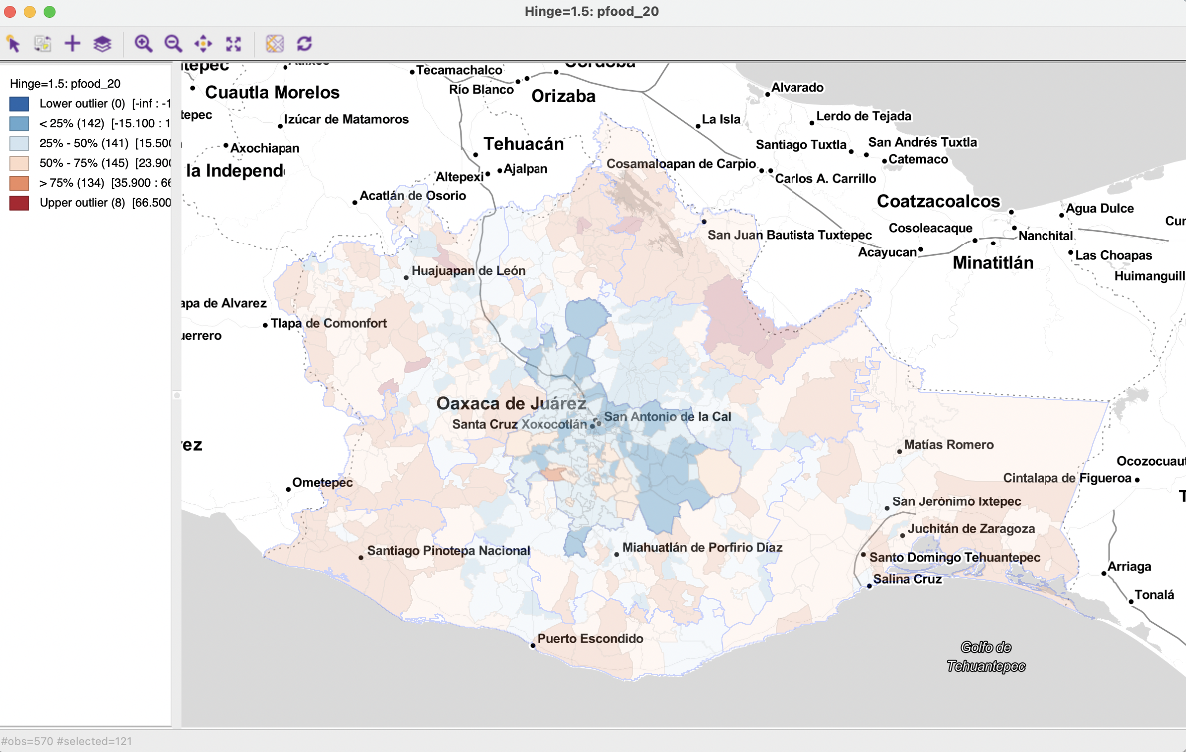
Figure 7.19: Food insecurity 2020 in Valles Centrales
The selection is used in the averages chart to define selected and unselected as the Groups. In Figure 7.20, the Variable is specified as pfood_20. In the current context, the time settings can be ignored. The statistics for the two groups are listed in a small table. Selected has 121 observations with a Mean of 17.65 and S.D. of 7.74. In contrast, the Unselected group contains 449 observations, with Mean of 29.09 and S.D. of 15.07.
The formal test on equality of means results in an F-statistic of 64.99, which yields a very small p-value (essentially zero) for 568 degrees of freedom.
In the right-hand panel of the window, the overall mean (black), selected mean (red) and unselected mean (blue) are represented graphically.
In this case, there is strong evidence that food insecurity is less severe in the Central Valleys compared to the rest of the state.
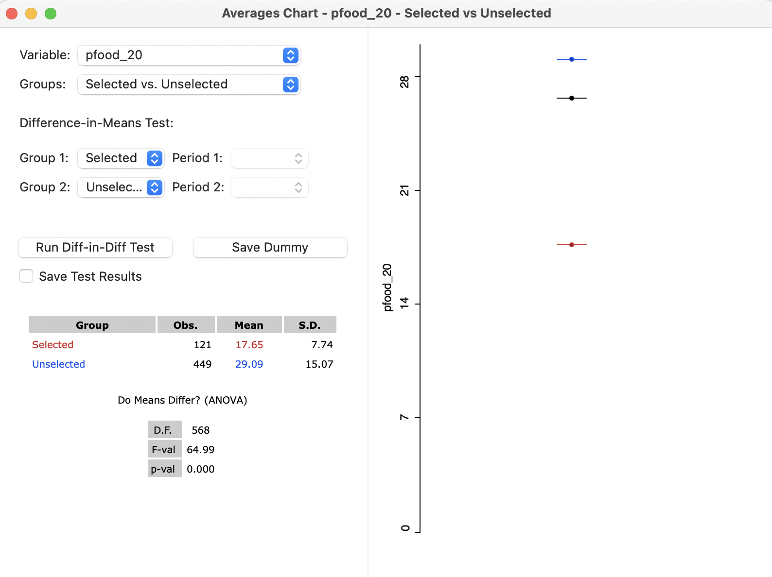
Figure 7.20: Averages Chart - Valles Centrales
7.5.1.2 Map brushing and the averages chart
A more comprehensive exploration of spatial heterogeneity is achieved by brushing a map linked to the averages chart. As the selection in the map changes, the statistics in the averages chart are updated. As a result, one can assess the extent to which subregions of the data have a different mean for the variable under consideration.
For example, Figure 7.21 has a six category quantile map for elevation on the left-hand side. As the brush is moved from west to east, the effect on the test of means can be assessed in the averages chart on the right. Note that the brushing is not based on the altitude variable, but is purely a move over space. However, by including a different variable, one may be able to discover what lies behind the spatial structural differences.
The variable under consideration in the averages chart is ppov_20. The first selection contains 213 observations with a mean of 75.42, compared to a mean of 78.46 for the rest. The test on the difference between the means is not significant at p = 0.052. Thus this initial selection of higher elevation locations is not substantially different from the rest of the state.
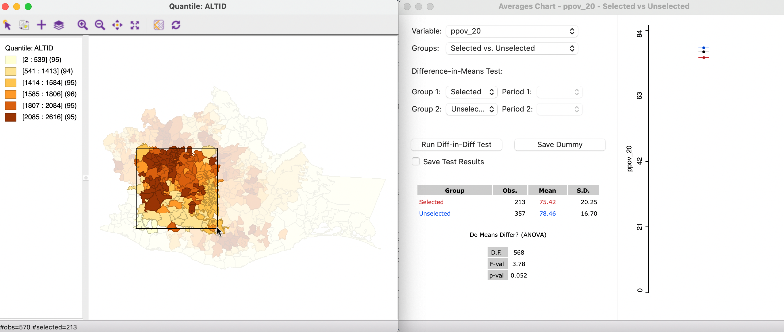
Figure 7.21: Map brushing and the averages chart - 1
In Figure 7.22, the selection is moved to the center of the state, with 215 selected observations, yielding a mean of 73.69. The unselected mean is 79.53. For this selection, the test rejects the null hypothesis with a p-value of 0.000, suggesting strong spatial heterogeneity.
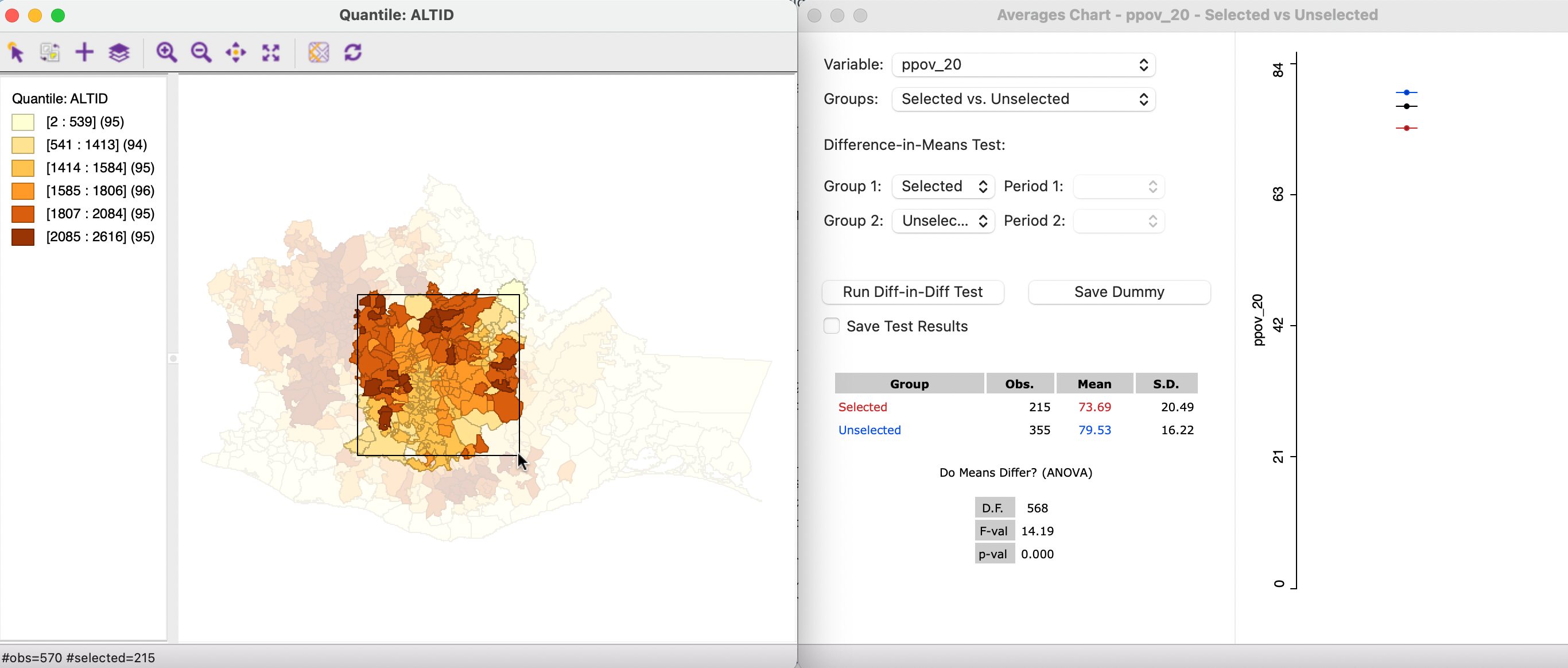
Figure 7.22: Map brushing and the averages chart - 2
Finally, in Figure 7.23, the selection is moved even further to the east. The 87 selected observations have a mean of 79.01, whereas the complement has a mean of 77.02. The test on difference between the means is not significant at p = 0.348.
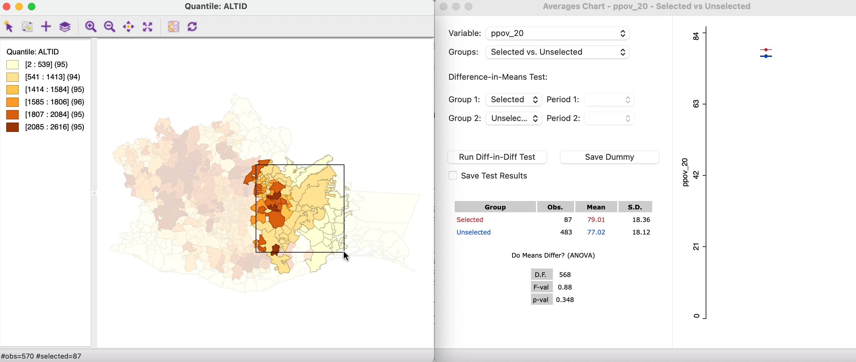
Figure 7.23: Map brushing and the averages chart - 3
By moving the brush over different regions of the map, the extent of spatial structural instability can be assessed. In addition, by using a map for a different variable (such as altitude here), one can possibly gain insight into factors that may be behind the spatial structural instability. However, for this to be meaningful, one has to make sure that sufficient observations are contained in each selection.
7.5.1.3 Averages chart options
The default setting for the averages chart is to have a Fixed scale over time. This means that the minimum and maximum tick marks on the left side axis remain the same as the selection changes. In some instances, the respective means may no longer fall within this range. As a result, they will not be shown in the graph. To remedy this, the Axis Option can be set to Enable User Defined Value Range of Y-Axis, through which the range can be customized.
A final option is to Set Display Precision of Y-Axis.
7.5.2 Brushing the scatter plot
7.5.2.1 Scatter plot brushing
The concept of scatter plot brushing was initially suggested by Stuetzle (1987), and extended to the map context by Monmonier (1989). The idea is to dynamically adjust the selection
of observations in the scatter plot within a selection brush (typically a rectangle). As the brush moves over the plot, observations are added to and dropped from the selection and the slope of the linear fit is adjusted. As discussed in Section 7.3.1.1, this is
implemented in GeoDa through the Regimes Regression option (see also Figure 7.11).
Since all windows are simultaneously linked in the basic architecture
of the GeoDa software (Anselin, Syabri, and Kho 2006), the dynamic selection through brushing can be initiated in
any open window. This results in an immediate adjustment of the slope of the linear fit
in the scatter plot and an updated computation of the Chow test. As in the averages chart, spatial heterogeneity can be assessed by initiating a spatial selection through the brushing operation in a map.
7.5.2.2 Map brushing and scatter plot
To illustrate the dynamic map brushing operation, a scatter plot of c_ptot12 on ppov_20 is considered jointly with the elevation map used before. The global linear fit yields a slope coefficient estimate of -0.272, with an \(R^2\) of 0.121. The brush moves from west to east.
In Figure 7.24, the brush is initiated by selecting 93 observations in the higher altitude region in the western part of the state. The regression slope of the selected observations is -0.217, compared to -0.303 for the unselected, yielding a significant Chow test result at p = 0.0012. Note that the coefficient for the selected observations is not significant (p=0.128).
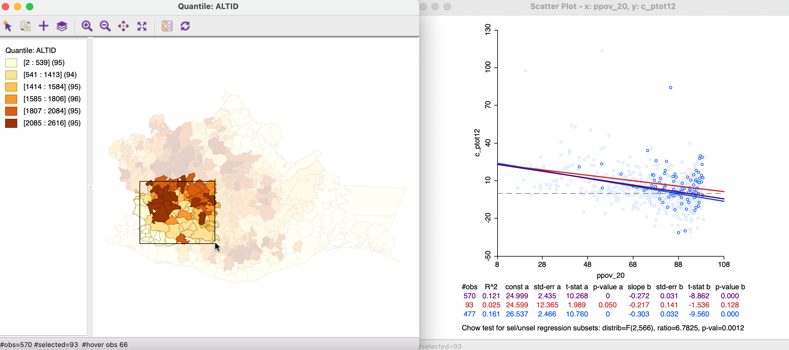
Figure 7.24: Map brushing and the scatter plot - 1
As the brush is moved to the right, the selection is adjusted. In Figure 7.25, the slope of the 77 selected observations has changed to -0.390, compared to -0.266 for the unselected. Even though the estimates are both significant, they cannot be deemed to be different, with the Chow test yielding a p-value of 0.387.
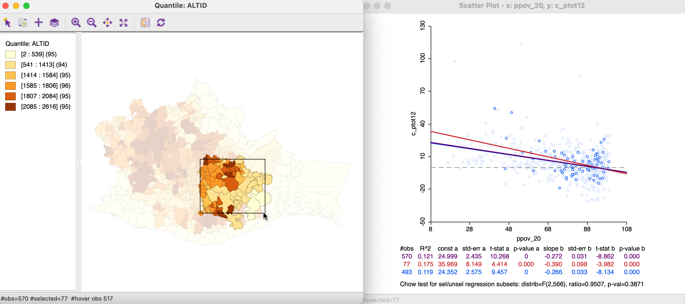
Figure 7.25: Map brushing and the scatter plot - 2
In Figure 7.26, the brush is moved even further to the east, yielding a selection of 33 observations. Note that since the brush size is fixed, but the spatial extent of the municipalities varies, the number of observations contained in each spatial selection will not be constant. The municipalities in this part of the state tend to be larger, resulting in fewer observations in the selection window. This will affect the precision of the estimates in the subset, and, indirectly, also the Chow test statistic.
At this point, the selected observations show no significant relationship, which a slightly positive coefficient of 0.056 (p-value of 0.335). In contrast, the coefficient in the unselected observations is negative at -0.307, and highly significant.
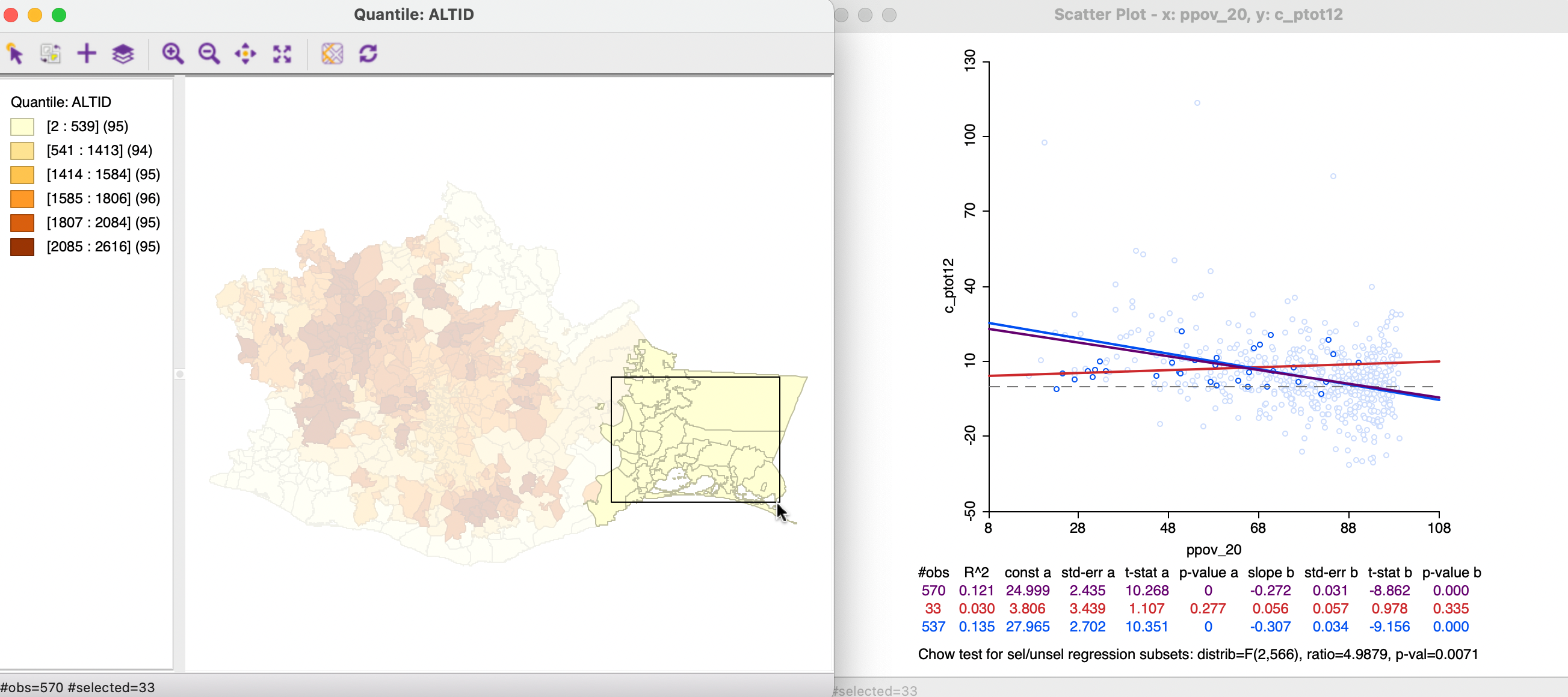
Figure 7.26: Map brushing and the scatter plot - 3
A careful assessment of the effect of different spatial selections can provide insight into spatially defined structural instabilities in the relationship between any two variables. The inclusion of a Chow test provides some guidance, even though its results need to be interpreted with caution due to the problem of multiple comparisons (many tests carried out with the same data). However, it allows for a more quantitative measure of the spatial heterogeneity, instead of relying on a purely visual assessment, which can be misleading. This is in the spirit of the more recently developed perspectives on EDA, e.g., as discussed in Section 4.2.1.