8.5 Parallel Coordinate Plot
So far, the methods discussed were limited to three or four variables. Once more than three variables are considered, it is no longer possible to graphically represent the data points in a multi-dimensional data cube. The parallel coordinate plot or PCP provides an alternative that can be generalized to many dimensions. Data points are replaced by data lines, which allows a large number of variables to be considered. The only limitation is human perception and screen real estate.
This approach was originally suggested by Inselberg (1985; see also Inselberg and Dimsdale 1990), and it has become a main feature in many visual data mining frameworks (e.g., Wegman 1990; Wegman and Dorfman 2003).
In a PCP, each variable is represented as a parallel axis, and each observation consists of a line that connects points on the axes. Additional variables are represented by
new axes, so that it is easy to go beyond three variables. The only visual limitation
is the number of observations, which can make the plot of lines very crowded. However,
techniques exist to overcome this hurdle, such as binning, although this is currently
not implemented in GeoDa.
A main objective in the application of PCP is the identification of clusters and outliers in multi-attribute space. Clusters are found as groups of lines (i.e., observations) that follow a similar path. This is equivalent to points that are close together in multidimensional variable space. Outliers in a PCP are lines that show a very different pattern from the rest, similar to outlying points in a multi-dimensional cloud.
8.5.1 Implementation
The PCP functionality is invoked from the menu as Explore > Parallel Coordinate Plot, or by means of the PCP toolbar icon, the third item from the left in Figure 8.1. This brings up a Parallel Coordinate Plot variable selection interface that consists of two columns: Exclude and Include. Variables are chosen by moving them to the Include column by means of arrow buttons.
Four variables are selected to illustrate the PCP: peduc_20, pserv_20, and pepov_20, as well as pss_20 (percent of population without social security). With the default settings, the result is as in Figure 8.19. Each variable is represented by a horizontal axis, with the observations as lines connecting points on each axis. The variable name is listed at the left, together with the range of the variable, its mean and standard deviation. Note that the axes are represented with equal lengths, which corresponds to the range for each individual variable. This implies that the distance between points on each axis does not necessarily correspond with the same difference in value for each variable.
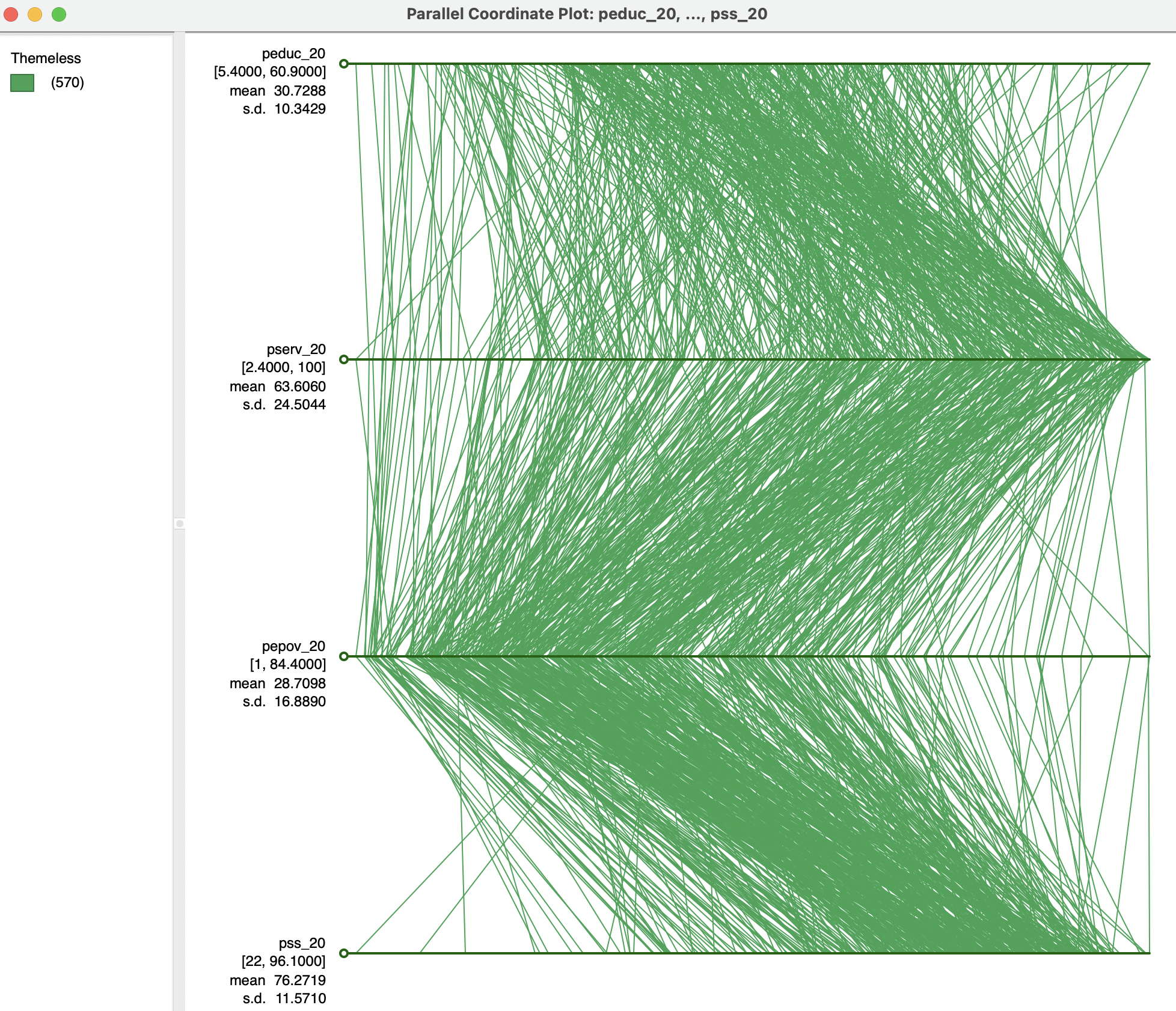
Figure 8.19: Parallel coordinate plot
8.5.1.1 PCP options
The PCP has nine main options, invoked by right clicking on the graph. They are the same as discussed for other graphs, and are not further considered in detail.60 The Data option offers a way to make all axes lengths equivalent by selecting View Standardized Data. As a result, the data points on each axis are given in standard deviational units and become directly comparable between the different variables, as in Figure 8.20. Observations that are outside the -2 to +2 range can be considered to be outliers.
This graph also illustrates another feature of the PCP. By grabbing the small circular handle on the left of an axis, it can be moved up or down in the graph, changing the order of the variables. For example, in Figure 8.20, the axis for pepov_20 has been moved up to be above pserv_20. Realigning the axes in this manner can often bring out patterns in the data. However, in practice, it is not always clear which is the optimal alignment.
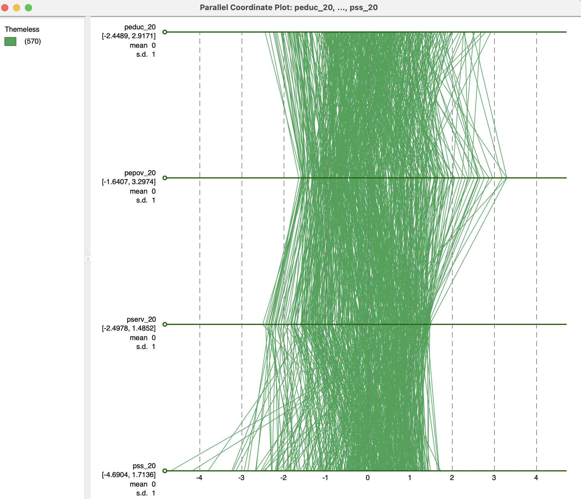
Figure 8.20: Parallel coordinate plot - standardized variables
8.5.1.2 Brushing the PCP
Selection of observations in the PCP is implemented by moving the selection shape over one of the axes. As for the other graphs, the default is a rectangle. Figure 8.21 illustrates this with a small selection rectangle situated over the highest values for pss_20. This highlights the lines (observations) that are selected. Of particular interest is the extent to which these lines move together. For example, in the example, several observations follow a similar path for pss_20, pserv_20 and pepov_20, but not for peduc_20. Insight into any corresponding spatial pattern can be obtained by linking the selection with a map, as in the example, using the six quantile map for ALTID.
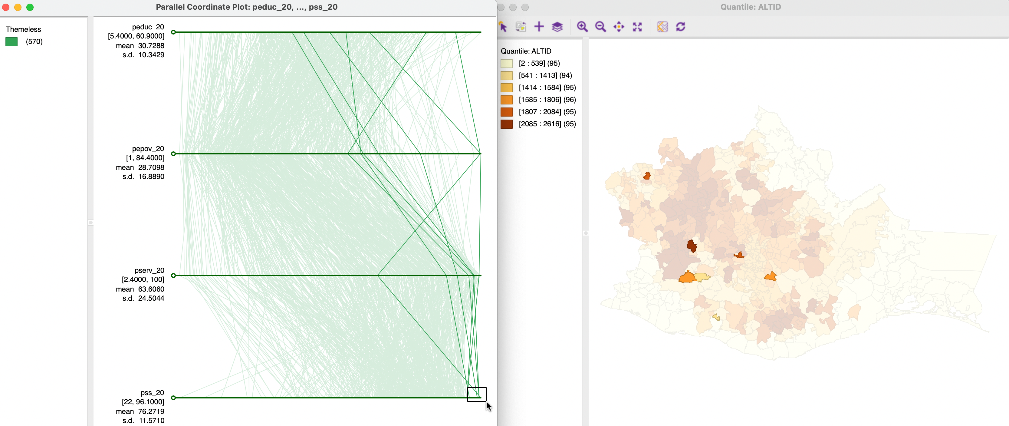
Figure 8.21: Brushing the PCP
A more explicit spatial perspective is taken by brushing a map linked to the PCP. In Figure 8.22, this is again implemented with the same six quantile map. The selection in the map suggests that several locations within close geographical proximity also take on similar values for a subset of the variables (close lines), but not for all. This illustrates some of the practical difficulties associated with the concept of multivariate spatial correlation.
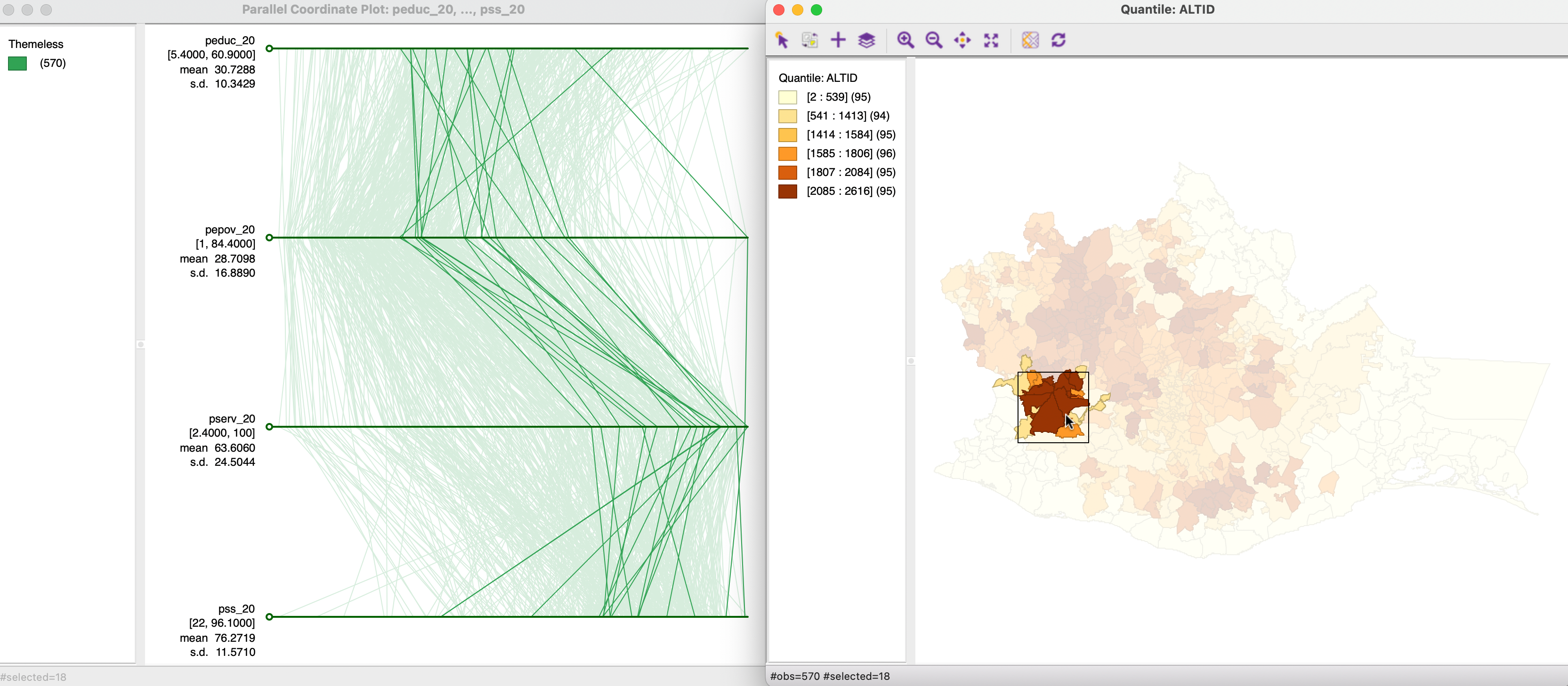
Figure 8.22: Brushing map and PCP
8.5.2 Clusters and outliers in PCP
Visual cluster detection (e.g., Wegman and Dorfman 2003) consists of locating groups of lines in the PCP that follow a similar path. To illustrate this feature, Figure 8.23 shows a three-variable PCP side by side with a three-dimensional data cube for the variables peduc_20, pserv_20 and pepov_20. The selection rectangle is centered on the three lowest values of peduc_20 in the top axis (i.e., the best educational access). In the PCP, the observation lines closely track for the three variables. In the data cube on the right, the same three observations are highlighted in yellow (with the red arrow pointing to them), very close together near the origin of the axes. This demonstrates the equivalence of lines being close together in the PCP and observation points being close together in multi-attribute variable space. Clearly, for more than three variables, only the PCP remains a viable method to assess such closeness.
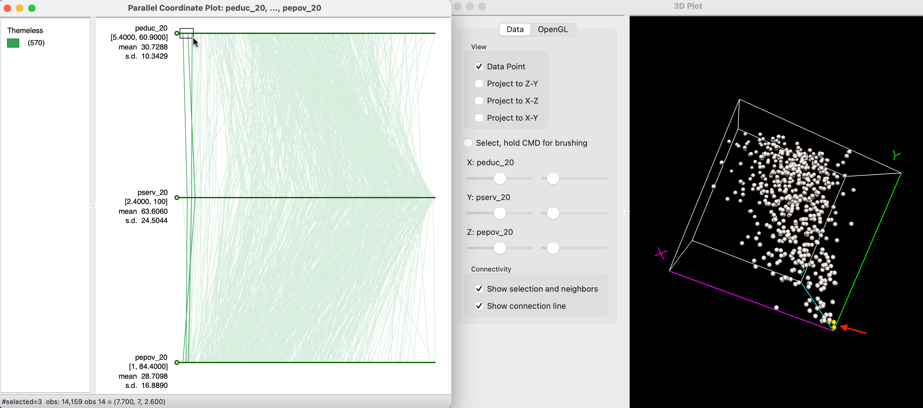
Figure 8.23: Clusters of observations in PCP
Figure 8.24 illustrates the concept of an outlier in the PCP. Now, the selection rectangle is over the highest value for pepov_20 (in the lowest axis), an observation with extreme poverty. As the graph shows, this also corresponds to an extreme value for pserv_20, but much less so for peduc_20. In the data cube, the selected observation, highlighted in yellow (with the red arrow pointing to it), is indeed somewhat removed from the rest of the data cloud.
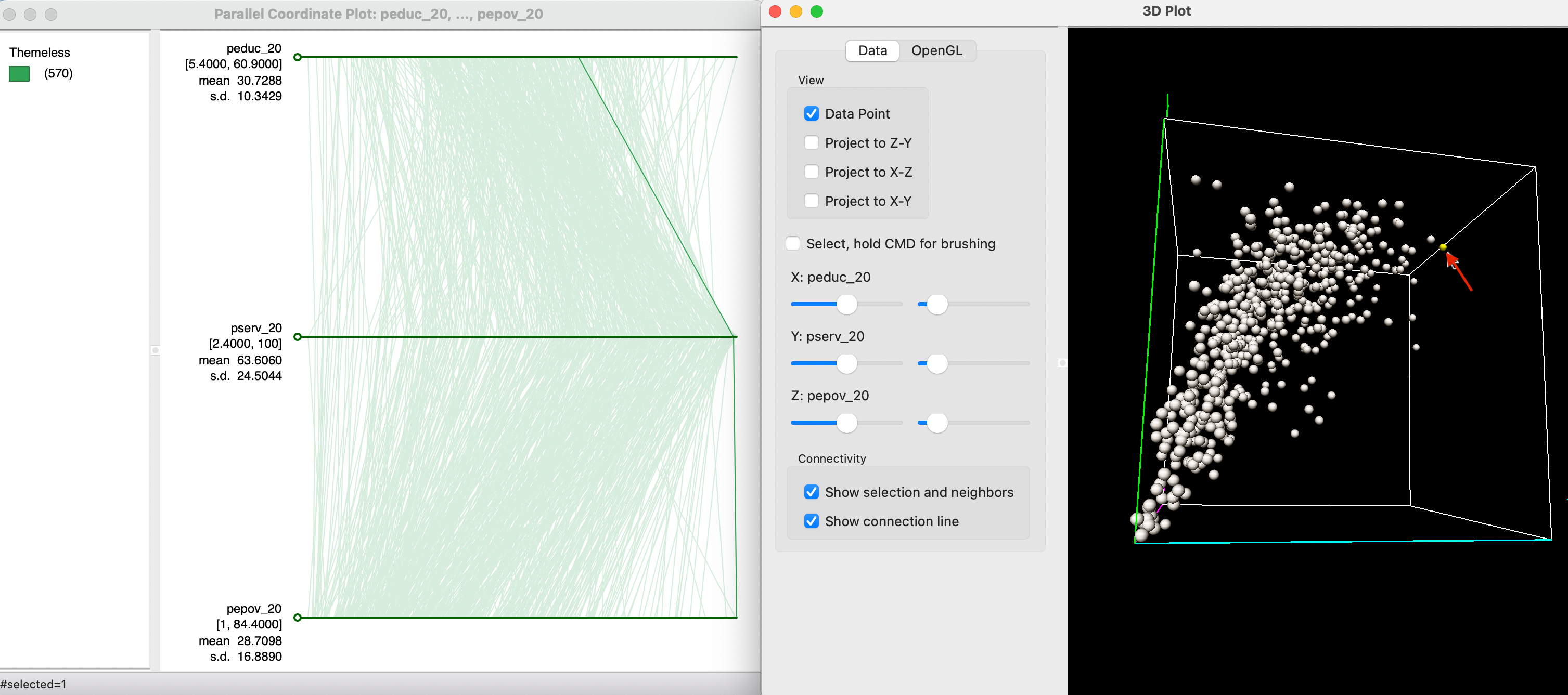
Figure 8.24: Outlier observation in PCP
The number of variables that can be visualized with a PCP is only constrained by screen real estate. However, as pointed out, for larger data sets, the graph can become quite cluttered, making it less practical.
Specifically, the options are Classification Themes, Save Categories, Data, View, Selection Shape, Color, Save Selection, Copy Image to Clipboard and Save Image As. Note that Classification Themes always pertains to the variable that was originally listed on top, even when the order of axes is later changed.↩︎