4.3 Thematic Maps – Overview
4.3.1 Choropleth map
A thematic map is commonly known as a choropleth map, from the Greek word choros, which stands for area or region. Even though sometimes referred to as chloropleth map, the latter term is incorrect. A choropleth map is a means to visualize the spatial distribution of a variable over discrete areal units.
The proper design of a map involves the manipulation of several parameters, including scale, symbols, legend, intervals and colors (Monmonier 2018). As mentioned in the chapter introduction, this topic is much too broad to be covered in-depth here. Therefore, only some essential elements are touched upon.
The role of datum and projection was introduced in Section 3.2. The scale of a map, i.e., the correspondence between a distance unit on the map and a matching distance in real-life is an aspect that is ignored in GeoDa, since any map window can be resized and/or subject to zooming in and out. This operation changes the scale of the displayed map on the fly. As a result, it becomes impractical to portray these continuous changes in scale.
The three map design parameters that play an important role in GeoDa are classification, legend and color. These are briefly reviewed next.
4.3.2 Map classification
A map classification is the process of binning the observations from a continuous distribution into discrete categories. Each of these then corresponds to a different color (or shading) on the map. There have been proposals to visually represent the full continuity of the distribution, e.g., by special cross-hatching (Tobler 1973) or the use of a full color
spectrum (Brewer 1997). However, this quickly becomes impractical for larger data sets. Alternatively, symbols with different sizes and/or colors can be used as well. GeoDa only supports discrete categories.
In terms of designing a classification, important decisions pertain to the number of categories and how the cut-off or break points are determined. These can be based on external (or exogenous) considerations, such as thresholds determined by policy (e.g., income categories), or, more commonly, endogenously. Endogenous classification exploits the properties of the underlying distribution to come up with meaningful break points. Common methods use the quantiles of the distribution, in a quantile map, or divide the range of the variable into a number of equal intervals, similar to what is customary for a histogram. An approach based on a clustering logic results in so-called natural breaks, i.e., optimal groupings of observations into categories that are most similar internally and maximize the distinction between the categories. These traditional methods are discussed in Section 4.4.
Other classifications that emphasize extreme observations are covered in Chapter 5.
4.3.3 Legend and color
The legend is the way in which the map classification is symbolized, typically positioned next to the map itself. There are two important aspects to the legend. One is the choice of color, which can have major impacts on the perception of value and pattern in the map. For example, red colors are typically associated with hot locations, whereas blues are associated with cold. More importantly, red is often used to represent or imply danger, especially in political maps. In GeoDa, the selection of default color hues and gradations follows the ColorBrewer recommendations, which can be found at colorbrewer2.org
(Brewer, Hatchard, and Harrower 2003; Harrower and Brewer 2003).
The second aspect is the gradation of values represented in the legend bar. Three broad categories can be distinguished. For maps where the values represented are ordered and follow a single direction, from low to high, a sequential legend is appropriate. Such a legend typically uses a single hue and associates higher categories with increasingly darker values. For example, this is the case for the three traditional map classifications reviewed in Section 4.4.
In contrast, for the extreme value maps in Chapter 5, the focus is on the central tendency (mean or median) and how observations sort themselves away from the center, either in downward or upward direction. An appropriate legend for this situation is a diverging legend, which emphasizes the extremes in either direction. It uses two different hues, one for the downward direction (typically blue) and one for the upward direction (typically red or brown).
Finally, for categorical data, no order should be implied (no high or low values) and the legend should suggest the equivalence of categories. For such discrete categories, a qualitative legend is appropriate, as in Section 5.3.1.
4.3.4 Implementation
A thematic map is created in GeoDa from the Map menu item, or by selecting the left-most toolbar icon in Figure 4.1, Maps and Rates. This yields a list of options, shown in Figure 4.2.
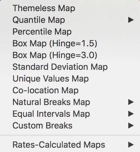
Figure 4.2: Mapping options
In the current chapter, the focus is on traditional map classifications, i.e., the Quantile Map, Equal Intervals Map, and Natural Breaks Map. The other options are treated in the next two chapters.