9.3 Time Player - Comparative Statics
The Time Player is the mechanism through which the space-time dynamics are implemented. It is automatically started when selecting the Time icon from the toolbar, but not from the menu, where it is a separate item from Time Editor. From the menu, it is invoked as Time > Time Player.
The dialog, shown in Figure 9.5, shares several aspects with the design of the Animation interface (see Section 5.5). The Current time is shown at the top of the interface (2000 in the example). The default is to Loop through the different time periods, which is started by pressing the > button (the loop can also be run in Reverse by checking the corresponding box). Single step forward or backward is implemented through the double arrows, >> and <<. Finally, the Speed of the loop can be adjusted using the slider, just as in the animation tool.

Figure 9.5: Time Player dialog
Whenever a grouped (time-enabled) variable is selected for a graph or map, the Time Player becomes active. The starting point (time) is determined from a dropdown list below the variable name, which includes all available periods (for an example, see Figure 9.8 for a scatter plot). After the initial period is selected, one can move through discrete time steps by means of the player. While such a process does not assess true space-time dynamics, it allows one to carry out comparative statics, i.e., to compare cross-sectional patterns at different discrete time periods.
The comparative statics approach is illustrated with three examples that highlight some additional features of space-time exploration: the evolution of a box plot over time; a scatter plot with a time lagged variable; and a thematic map over time.
9.3.1 Box plot over time
To assess the evolution of the distribution of a variable over time, it is often useful to plot the corresponding box plots side-by-side. This is the default behavior when selecting the box plot functionality for a time-enabled (grouped) variable.
For example, in Figure 9.6, this is implemented for p_P614NS. The three graphs are shown side-by-side, with summary statistics below. It is clear that the schooling situation improved considerably between 2000 and 2010, but less so from 2010 to 2020. The median percent unschooled 6 to 14 year olds decreases from 9.13 % to 4.53 % in the first decade, and to 4.51 % in the ten years afterwards. However, the distribution is slightly more compact in 2020, with an IQR of 3.85 compared to 4.27 in 2010 (in 2020, the IQR was 6.8). Interestingly, this resulted in more upper outliers (i.e., municipalities that do much worse than the bulk), 22 in 2020 vs. 13 in 2010. The combination of the descriptive statistics with a visual representation of the distribution provides an effective way to assess broad changes over time.
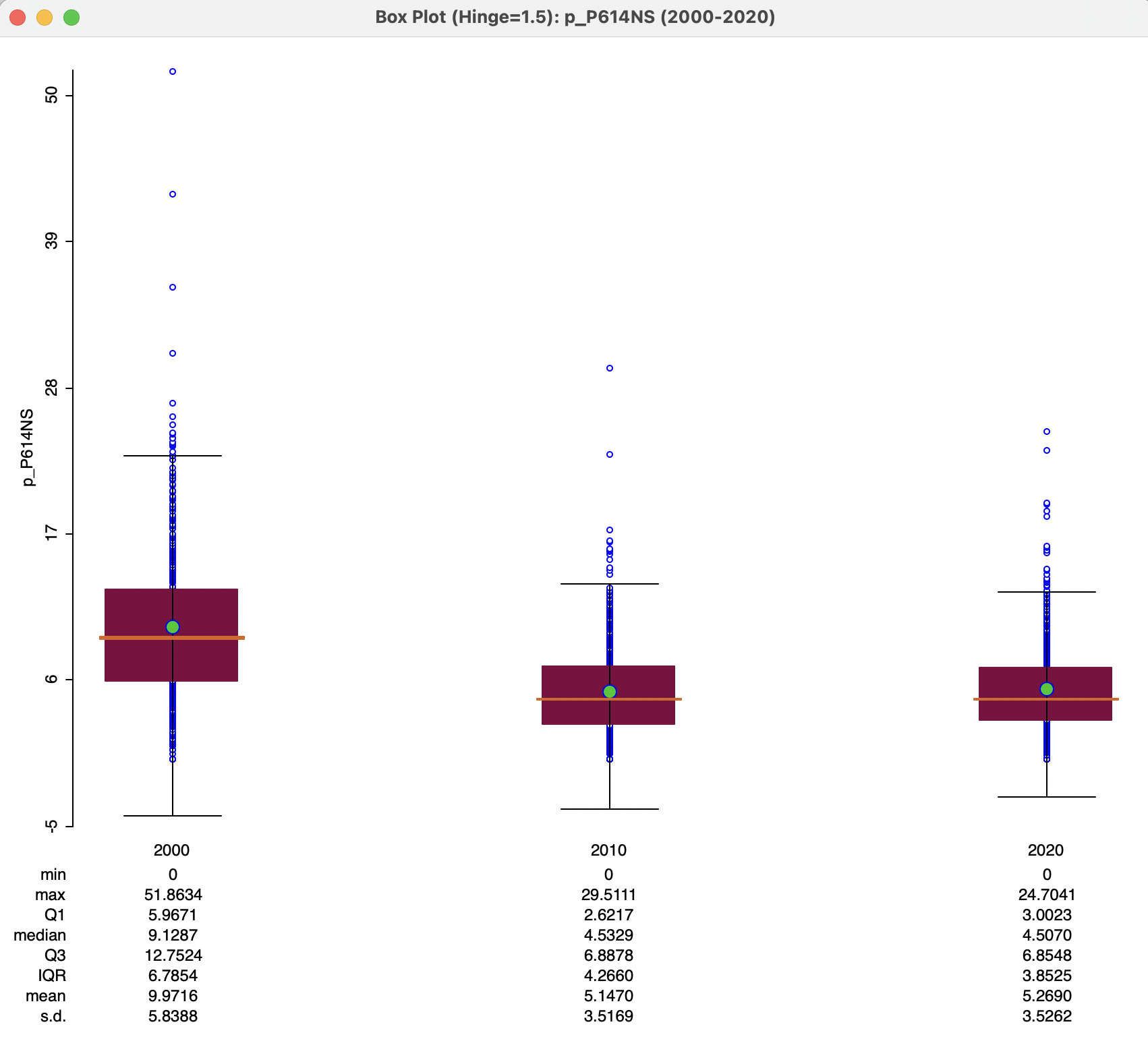
Figure 9.6: Box plot over time
9.3.1.1 Dynamic box plot options
The dynamic box plots share all the standard options with the regular box plot, see Section 7.2.2.3. In addition, there are three sets of special options: Scale Options, Number of Box Plots, and Time Variable Options. The latter is by default checked to allow synchronization with the Time Control. This can be specified for each individual graph. Turning this check off disables the forward and backward movement of time periods through the Time Player, i.e., it makes the graph a static graph.
The Scale Options have by default Fixed scale over time. Turning this off adjusts the scale for each time period, in function of the relevant variable range. This is immaterial when all three box plots are shown, but matters when this is not the case.
Finally, Number of Box Plots is set by default to All, resulting in the side-by-side plots as in Figure 9.6. Other options are all values up to the number of periods in the group, in this example, 1 and 2. Figure 9.7 illustrates the case with two plots, for 2000 and 2010.
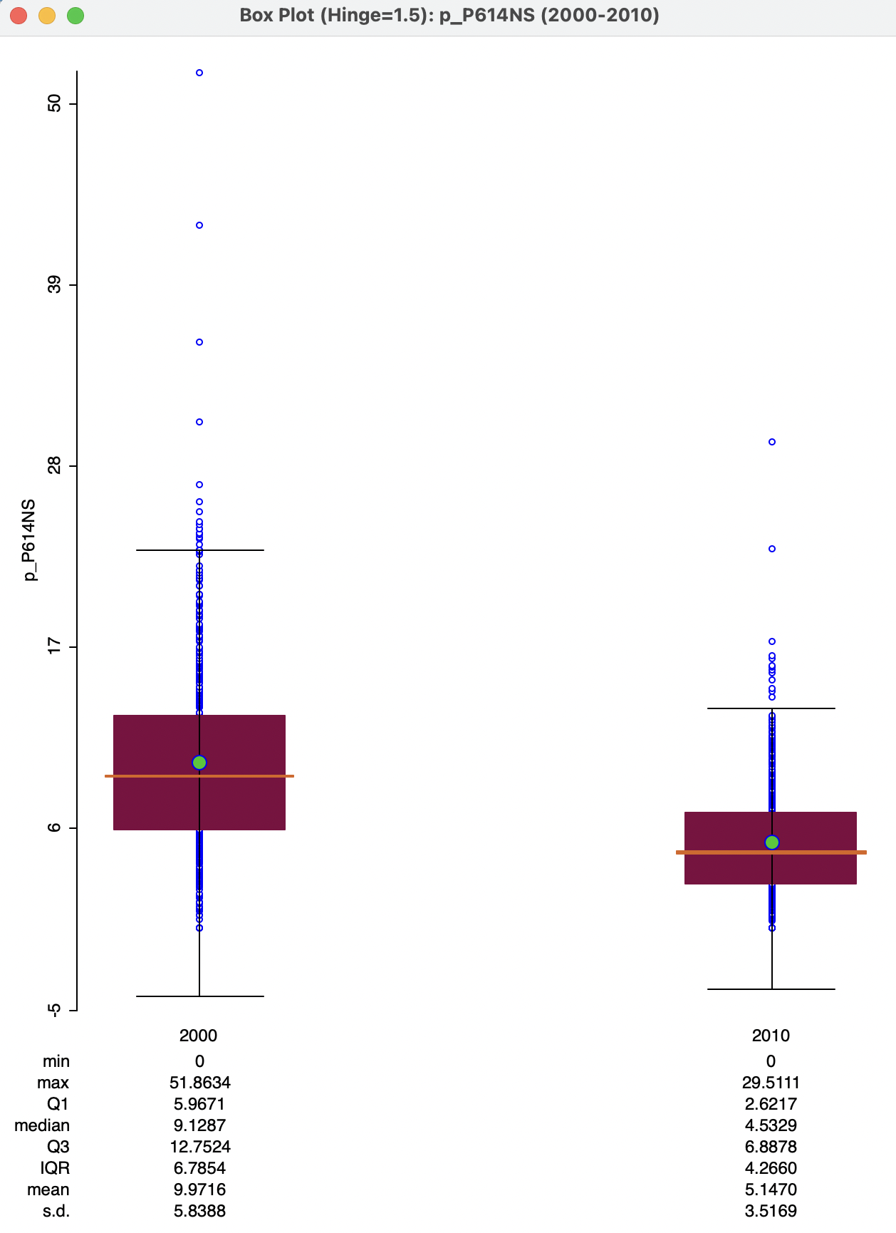
Figure 9.7: Box plot for two time periods
9.3.2 Scatter plot with a time-lagged variable
With time-enabled variables, it becomes possible to create a scatter plot of the same variable at two points in time. The slope of the linear fit then corresponds to the serial autoregressive coefficient, i.e., how the variable in one period is related to its values in a previous period. More formally, this is the slope coefficient in a linear regression of \(y_t\) on \(y_{t-1}\).
Since the time periods for the variables are available from a drop down list in the variable selection dialog, it is easy to change the time selection for both X and Y variables. In Figure 9.8, this is illustrated for p_PJOB. The Independent Var X is set to Time 2000, and the drop down list for Dependent Var Y is checked for Time 2010.
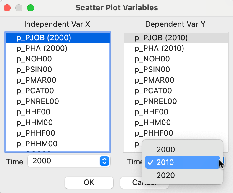
Figure 9.8: Time lagged scatter plot variables
This results in the scatter plot shown in the left-hand panel of Figure 9.9, including both a linear fit and a LOWESS smoother (with the bandwidth changed to 0.4). The slope of 0.288, while highly significant, only results in an overall fit of 10 %. The LOWESS smoother illustrates why this is the case. There is a clear break in the slope, with a positive slope (steeper than the overall 0.288) for values of p_PJOB in 2000 up to roughly 52 %, but beyond that it turns to a negative slope. So, for municipalities that already had a high percentages employed people, the relationship between 2000 and 2010 is negative, suggesting a loss of employment for those municipalities. In an actual application, this structural break should be further investigated by means of a Chow test. Also, its spatial footprint can be assessed by means of linking and brushing with a map (see Sections 7.3.1.1 and 7.5.2 in Chapter 7).
After adjusting the Time for the X-variable to 2010 and for the Y-variable to 2020, the scatter plot in the right-hand panel of Figure 9.9 results. Now, the slope is much steeper, and the fit quite a bit better (\(R^2\) of 24.9 %). However, there is still considerable evidence of structural instability, as emphasized by the S-shaped LOWESS fit (again with bandwidth at 0.4). In an actual application, this would need to be investigated further.
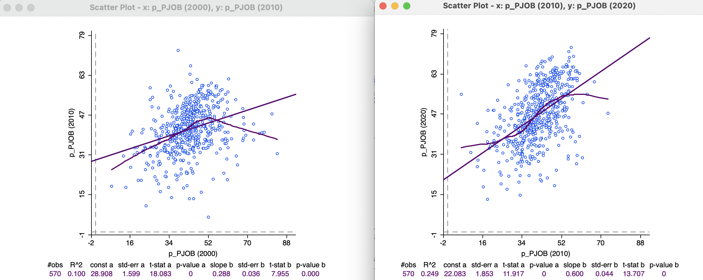
Figure 9.9: Scatter plots with time lagged variables
Unlike what is the case for univariate graphs (and maps), the Time Player does not necessarily have the desired effect. It is essentially a univariate tool, so it only changes the Time period for the dependent variable (Y). The X-variable remains unchanged, rather than updating both axes to move the time lag forward or backwards.
9.3.3 Thematic map over time
Since a thematic map shows the spatial distribution of a single variable, it can be readily manipulated by means of the Time Player when it pertains to a time enabled variable. However, since any map classification is by design relative, this may lead to an unsatisfactory outcome.
For example, the left-hand panel of Figures 9.10-9.12 contains a six quantile map for the percentage car ownership, p_CAR, in 2000, 2010, and 2020. These maps show an overall spatial distribution that seems to undergo little change. However, unless one carefully inspects each map legend, the maps represent very different realities. In 2000, the percentage car ownership ranged from 0 to 46.8 %, whereas in 2020, it varied between 1.1 % and 65.8 %, a 20 % difference for the maximum.
In order to better represent these absolute changes, a set of custom categories must be created by means of the Category Editor (see Section 4.6). In the right-hand panel of Figures 9.10-9.12, a six-category equal interval classification is employed, going from 0 to 66 (the map legend lists car_map as the classification method).
The result is very different. The paucity of car ownership in the first period is emphasized (there are only five observations over 33 %) and the maps show a gradual increase over time, with growing prevalence of the darker colors (from the center outward and to the east).
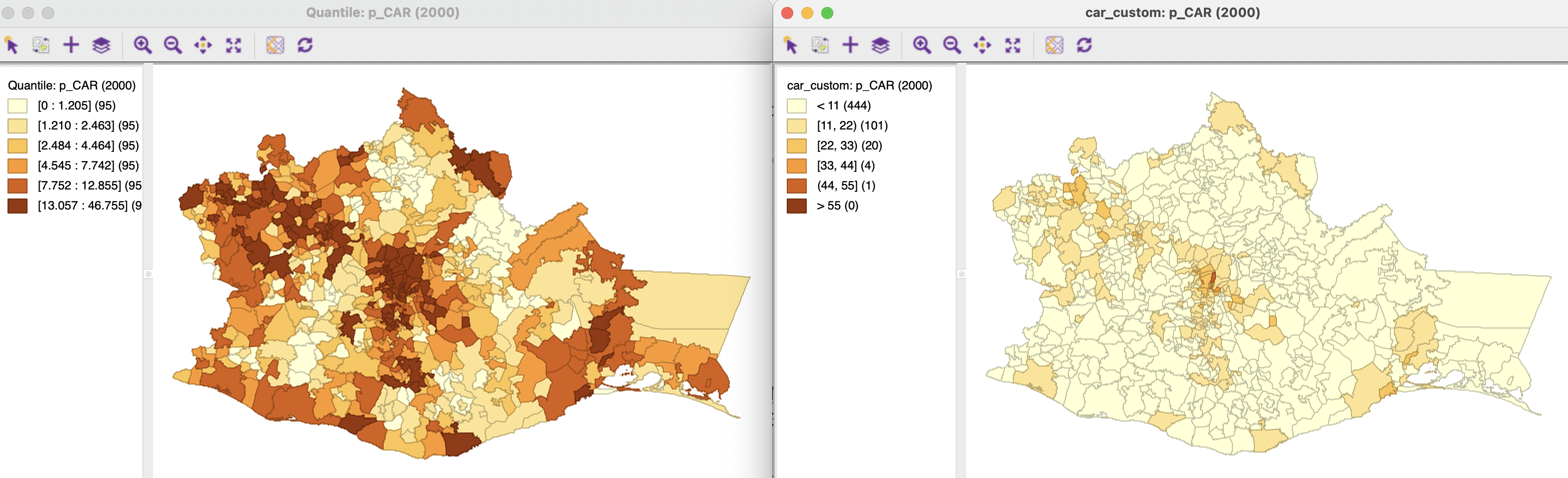
Figure 9.10: Thematic maps for car ownership in 2000
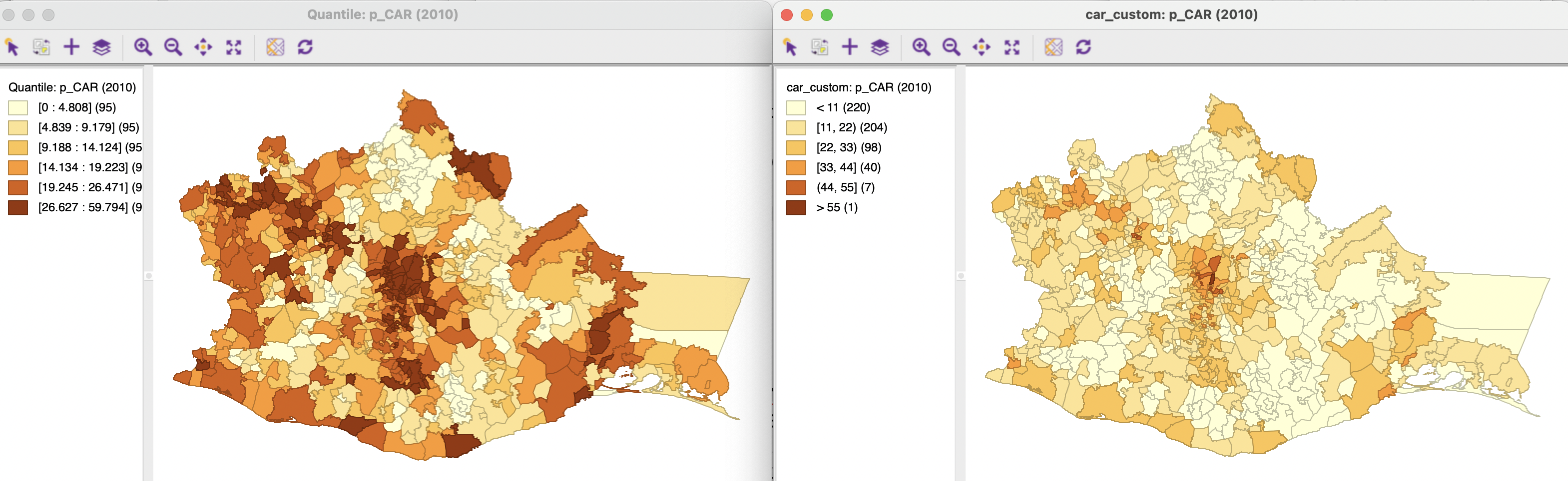
Figure 9.11: Thematic maps for car ownership in 2010
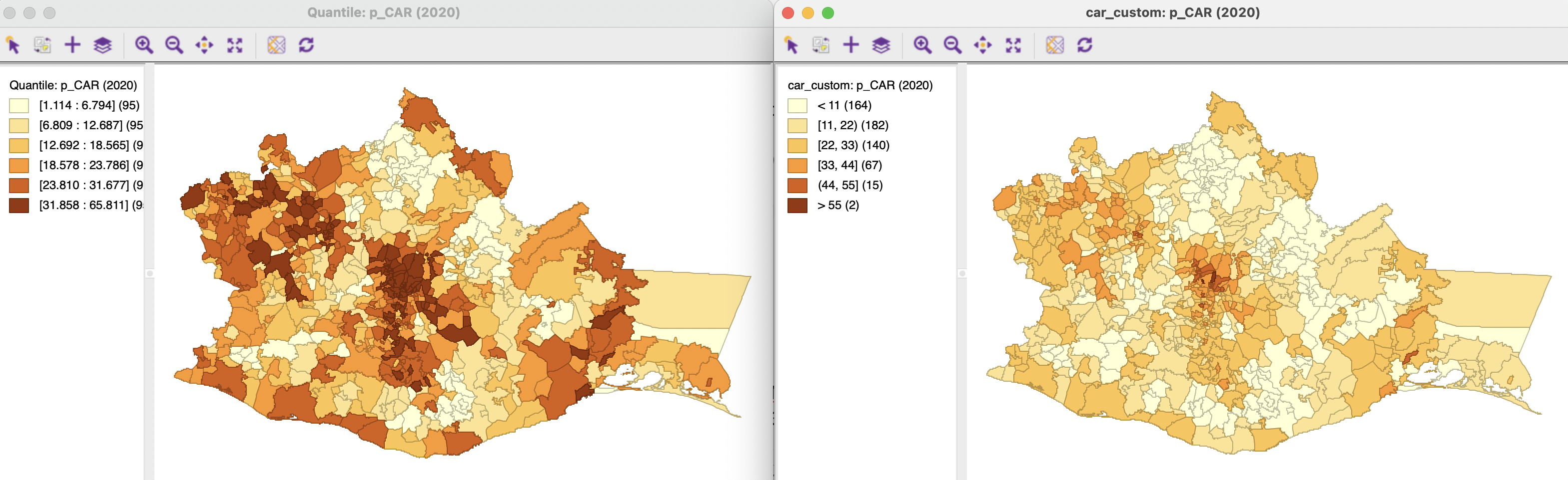
Figure 9.12: Thematic maps for car ownership in 2020