5.5 Map Animation
Animation is a method to discover patterns in data by moving through observations in a systematic fashion. A typical example is to consider maps or graphs for the same variable over time (see Chapter 9). Alternatively, a given map or graph can be explored by moving through the observations from low to high, or from high to low, either individually (highlighting one at a time), or cumulatively (taking up increasingly larger parts of the map or graph).
In GeoDa, animation is implemented through the Map Movie functionality (referred to as such for historical reasons). It is invoked from the menu as
Map > Map Movie or by selecting the third icon in the toolbar shown in
Figure 4.1.
This brings up the Animation dialog, shown in Figure 5.11, the control center through which the various aspects of the animation are manipulated. The first item to specify is the Variable, selected from a drop down list, here sanitation.
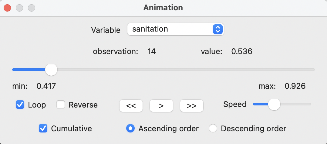
Figure 5.11: Animation control panel
At the bottom of the dialog are the main controls: the start > button, step-by-step forward >> or backward <<, whether the animation loops or stops at the end, an option to Reverse the progress, the speed of the animation, and whether the order followed is ascending or descending. The defaults are usually good, with Cumulative checked (i.e., the selection grows as the animation progresses) and Ascending order.
Once the forward button is activated, each observation is selected in turn, starting with the lowest value. This selection is not only for the map, but, through linking, for all currently active windows. The slider in the Animation dialog moves from left to right. Under the variable name, the currently selected observation and its value are listed.
The animation tool can be paused at any point, reversed, changed from continuous change to step-by-step, etc., using the controls provided. The main point of the animation is to visually check for any patterns, such as all the lowest or highest values occurring in one location, or an increase in value that follows a given spatial trend (e.g., core-periphery, or East-West). Of course, this visual impression is only that, and will need to be confirmed with the more formal pattern detection methods covered in later chapters.
A particular powerful feature of the animation tool is to assess the spatial relationship between two (or more) variables. This is carried out by selecting one as the variable in the animation control, but following the selected observations for a different variable.
In the example in Figure 5.12, the progression is based on the variable sanitation. Two quintile maps are shown side by side, one for sanitation and one for infra (see also Figure 4.18).
As shown in Figure 5.11, the current cut-off value for sanitation is 0.536. This results in 21 of the lowest observations to be highlighted in the map on the left. Through linking, the corresponding observations in the map on the right, for infra, are highlighted as well. This allows for the comparison of the cumulative locations of the values from low to high between the two variables. More precisely, one assesses the extent to which the colors for the matching locations in the two maps follow the same pattern. In the example, several of the lowest observations for sanitation belong to a higher quintile in the map for infra.
An extension to multiple maps and graphs is straightforward.
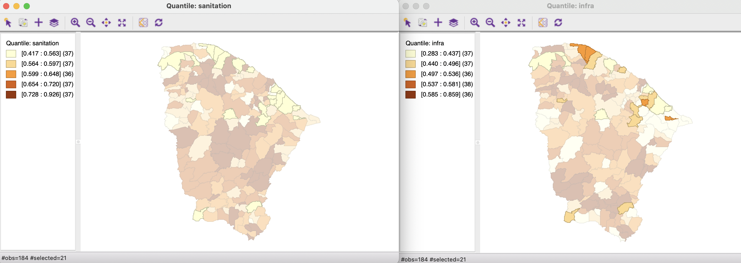
Figure 5.12: Linked animation sanitation-infrastructure