13.5 Moran’s I
Moran’s I is arguably the most used spatial autocorrelation statistic in practice, especially after its discussion in the classic works by Cliff and Ord (Cliff and Ord 1973, 1981). In this section, I briefly review its statistical properties and introduce an approach towards its visualization by means of the Moran scatter plot (Anselin 1996). The implementation of the Moran scatter plot in GeoDa is further detailed in Section 13.6.
13.5.1 Statistic
Moran’s I statistic, given in Equation (13.1), is a cross-product statistic similar to a Pearson correlation coefficient. However, the latter is a bivariate statistic, whereas Moran’s I is a univariate statistic. Also, the magnitude for Moran’s I critically depends on the characteristics of the spatial weights matrix \(\mathbf{W}\). This has as the unfamiliar consequence that, as such, without standardization, the values of Moran’s I statistics are not directly comparable, unless they are constructed with the same spatial weights. This contrasts with the interpretation of the Pearson correlation coefficient, where a larger value implies stronger correlation. For Moran’s I, this is not necessarily the case, depending on the structure of the spatial weights involved.
The scaling factor for the denominator of the statistic is the familiar \(n\), i.e., the total number of observations (sample size), but the scaling factor for the numerator is unusual. The latter is \(S_0\), the sum of all the (non-zero) spatial weights. However, since the cross-product in the numerator is only counted when \(w_{ij} \neq 0\), this turns out to be the proper adjustment. For example, dividing by \(n^2\) would also account for all the zero cross-products, which would not be appropriate.
For row-standardized weights, in the absence of unconnected observations (isolates), the sum of weights equals the number of observations, \(S_0 = n\). As a result, the scaling factors in numerator and denominator cancel out. Therefore, the statistic can be written concisely in matrix form as: \[I = \frac{\mathbf{z}' \mathbf{W} \mathbf{z}}{\mathbf{z}' \mathbf{z}},\] with \(\mathbf{z}\) as a \(n \times 1\) vector of observations as deviations from the mean.99
13.5.2 Inference
Inference is carried out by assessing whether the observed value for Moran’s I is compatible with its distribution under the null hypothesis of spatial randomness. This can be approached from either an analytical or a computational perspective.
13.5.2.1 Analytical inference
Analytical inference starts with assuming an uncorrelated distribution, which then allows for asymptotic properties of the statistic to be derived. An exception is the result for an exact (finite sample) distribution obtained by Tiefelsdorf and Boots (1995), under fairly strict assumptions of normality. The statistic is treated as a special case of the ratio of two quadratic forms of random variables. The resulting exact distribution depends on the eigenvalues of the weights matrix.
In Cliff and Ord (1973) and Cliff and Ord (1981), the point of departure is either a Gaussian distribution or an equal probability (randomization) assumption. In each framework, the mean and variance of the statistic under the null distribution can be derived, which can then be used to construct an approximation by a normal distribution. The derivation of moments leads to some interesting and rather surprising results.
In both approaches, the theoretical mean of the statistic is: \[E[I] = - \frac{1}{n-1}.\] In other words, under the null hypothesis of spatial randomness, the mean of Moran’s I is not zero, but slightly negative relative to zero. Clearly, as \(n \rightarrow \infty\), the mean will approach zero.
In the case of a Gaussian assumption, the second order moment is obtained as: \[E[I^2] = \frac{n^2S_1 - nS_2 + 3S_0^2}{S_0^2(n^2-1)},\] with \(S_1 = (1/2) \sum_i \sum_j (w_{ij} + w_{ji})^2\), \(S_2 = \sum_i (\sum_j w_{ij} + \sum_j w_{ji})^2\), and \(S_0\) as before.
Interestingly, the variance depends only on the elements of the spatial weights, irrespective of the characteristics of the distribution of the variable under consideration, except that the latter needs to be Gaussian. As a consequence, as long as the same spatial weights are used, the variance computed for different variables will always be identical.
This property no longer holds under the randomization assumption. Now, the second order moment is obtained as: \[E[I^2] = \frac{n((n^2 - 3n +3)S_1 - nS_2 + 3S_0^2) - b_2((n^2-n)S_1 - 2nS_2 + 6S_0^2)}{(n-1)(n-2)(n-3) S_0^2},\] with \(b_2 = m_4 / m_2^2\), the ratio of the fourth moment of the variable over the second moment squared.
In other words, under randomization, the variance of Moran’s I does depend on the moments of the variable under consideration, which is a more standard result.
Actual inference is then based on a normal approximation of the distribution under the null. Operationally, this is accomplished by transforming Moran’s I to a standardized z-variable, by subtracting the theoretical mean and dividing by the theoretical standard deviation:
\[z(I) = \frac{I - E[I]}{SD[I]},\] with \(SD[I]\) as the theoretical standard deviation of Moran’s I. The probability of the result is then obtained from a standard normal distribution.
Note that the approximation is asymptotic, i.e., in the limit, for an imaginary infinitely large number of observations. It may therefore not work well in small samples.100
13.5.2.2 Permutation inference
An alternative to the analytical approximation of the distribution is to simulate spatial randomness by permuting the observed values over the locations. The statistic is calculated for each of such artificial and spatially random data sets. The total collection of such statistics then forms a reference distribution, mimicking the null distribution.
This procedure maintains all the properties of the attribute distribution, but alters the spatial layout of the observations.
The comparison of the Moran’s I statistic computed for the actual observations to the reference distribution allows for the calculation of a pseudo p-value. This provides a summary of the position of the statistic relative to the reference distribution. With \(m\) as the number of times the computed Moran’s I from the simulated data equals or exceeds the actual value out of \(R\) permutations, the pseudo p-value is obtained as: \[p = \frac{m + 1}{R + 1},\] with the \(1\) accounting for the observed Moran’s I. In order to obtain nicely rounded figures, \(R\) is typically taken to be a value such as 99, 999, etc.
The pseudo p-value is only a summary of the results from the reference distribution and should not be interpreted as an analytical p-value. Most importantly, it should be kept in mind that the extent of significance is determined in part by the number of random permutations. More precisely, a result that has a p-value of 0.01 with 99 permutations is not necessarily less significant than a result with a p-value of 0.001 with 999 permutations. In each instance, the observed Moran’s I is so extreme that none of the results computed for simulated data sets exceeds its value, hence \(m = 0\).
Figure 13.7 illustrates a reference distribution based on 999 random permutations for the Chicago community area income per capita, using queen contiguity for the spatial weights. The green bar corresponds with the Moran’s I statistic of 0.6011. The dark bars form a histogram for the statistics computed from the simulated data sets. The theoretical expected value for Moran’s I depends only on the number of observations. In this example, \(n = 77\), such that \(E[I] = -1 / 76 = -0.0132\). This compares to the mean of the reference distribution of -0.0125. The standard deviation from the reference distribution is 0.0696, which yields the z-value as: \[z(I) = \frac{0.6011 + 0.0125}{0.0696} = 8.82,\] as listed at the bottom of the graph. Since none of the simulated values exceed 0.6011, the pseudo p-value is 0.001.
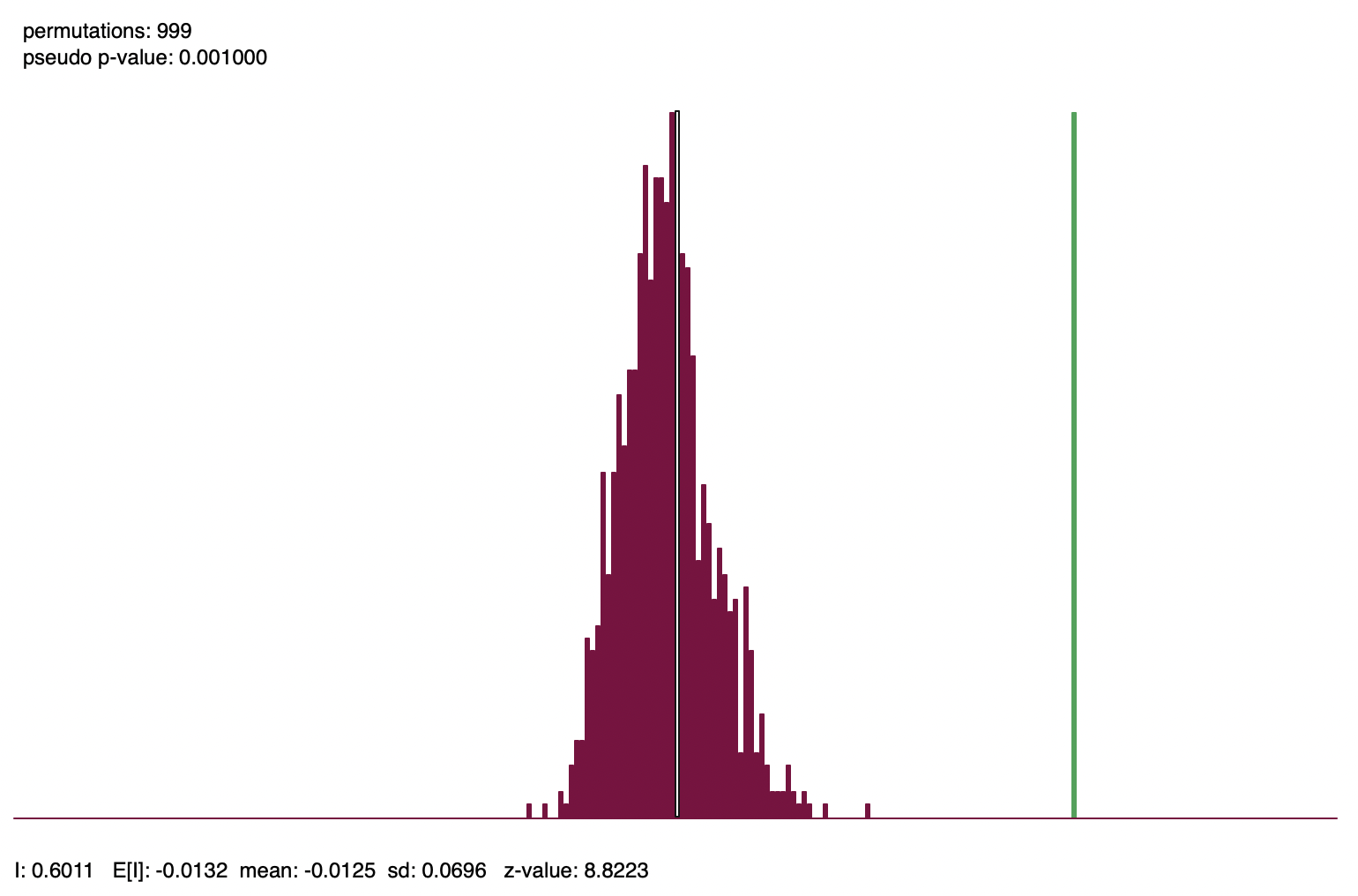
Figure 13.7: Reference distribution, Moran’s I for per capita income
In contrast, Figure 13.8 shows the reference distribution for Moran’s I computed from the randomized per capita incomes from the right-hand panel in Figure 13.3. Moran’s I is -0.0470, with a corresponding z-value of -0.4361, and a pseudo p-value of 0.357. In the figure, the green bar for the observed Moran’s I is slightly to the left of the center of the graph. In other words, it is indistinguishable from a statistic that was computed for a simulated spatially random data set with the same attribute values.
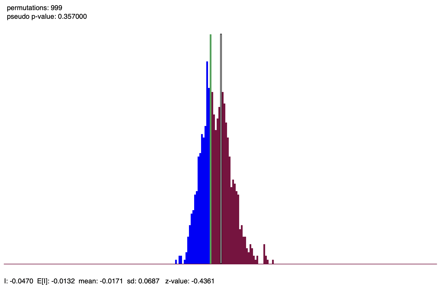
Figure 13.8: Reference distribution, Moran’s I for randomized per capita income
13.5.3 Interpretation
The interpretation of Moran’s I is based on a combination of its sign and its significance. More precisely, the statistic must be compared to its theoretical mean of \(-1/(n-1)\). Values larger than E[I] indicate positive spatial autocorrelation, values smaller suggest negative spatial autocorrelation.
However, this interpretation is only meaningful when the statistic is also significant. Otherwise, one cannot really distinguish the result from that of a spatially random pattern, and thus the sign is meaningless.
It should be noted that Moran’s I is a statistic for global spatial autocorrelation. More precisely, it is a single value that characterizes the complete spatial pattern. Therefore, Moran’s I may indicate clustering, but it does not provide the location of the clusters. This requires a local statistic.
Also, the indication of clustering is the property of the pattern, but it does not suggest what process may have generated the pattern. In fact, different processes may result in the same pattern. Without further information, it is impossible to infer what process may have generated the pattern.
This is an example of the inverse problem (also called the identification problem in econometrics). In the spatial context, it boils down to the failure to distinguish between true contagion and apparent contagion. True contagion yields a clustered pattern as a result of spatial interaction, such as peer effects and diffusion. In contrast, apparent contagion provides clustering as the result of spatial heterogeneity, in the sense that different spatial structures create local similarity.
This is an important limitation of cross-sectional spatial analysis. It can only be remedied by exploiting external information, or sometimes by using both temporal and spatial dimensions.
13.5.3.1 Comparison of Moran’s I results
In contrast to a Pearson correlation coefficient, the value of Moran’s I is not meaningful in and of itself. Its interpretation and the comparison of results among variables depend critically on the spatial weights used. Only when the same weights are used are results among variables directly comparable. To avoid this problem, a reliable comparison should be based on the z-values.
For example, using queen contiguity, Moran’s I is 0.601 for the per capita income, but 0.472 using k-nearest neighbor weights, with k=8. This would suggest that the spatial correlation is stronger for queen weights than for knn weights. However, when considering the corresponding z-values, this turns out not to be the case. For queen weights, the z-value is 8.82, whereas for k-nearest neighbor weights, it is 9.46, instead suggesting the latter shows stronger spatial correlation.
Comparison of Moran’s I among different variables is only valid when the same weights are used. For example, percent population change between 2020 and 2010 yields a Moran’s I of 0.410 using queen contiguity, with a corresponding z-value of 6.30. In this instance, there is consistent evidence that income per capita shows a stronger pattern of spatial clustering.
13.5.4 Moran scatter plot
The Moran scatter plot, first outlined in Anselin (1996), consists of a plot with the spatially lagged variable on the y-axis and the original variable on the x-axis. The slope of the linear fit to the scatter plot equals Moran’s I.
As pointed out, with row-standardized weights, the sum of all the weights (\(S_0\)) equals the number of observations (\(n\)). As a result, the expression for Moran’s I simplifies to: \[I = \frac{\sum_i\sum_j w_{ij} z_i.z_j}{\sum_i z_i^2} = \frac{\sum_i (z_i \times \sum_j w_{ij} z_j)}{\sum_i z_i^2},\] with \(z\) in deviations from the mean.
Upon closer examination, this expression turns out to be the slope of a regression of \(\sum_j w_{ij}z_j\) on \(z_i\).101 This becomes the principle underlying the Moran scatter plot. While the plot provides a way to visualize the magnitude of Moran’s I, inference should still be based on a permutation approach, and not on a traditional t-test to assess the significance of the regression line.
Figure 13.9 illustrates the Moran scatter plot for the income per capita data for Chicago community areas (based on queen contiguity). The value for income per capita is shown in standard deviational units on the horizontal axis, with mean at zero. The vertical axis corresponds to the spatial lag of these standard deviational units. While its mean is close to zero, it is not actually zero. Hence the horizontal dashed line is typically not exactly at zero. The slope of the linear fit, in this case 0.611, is listed at the top of the graph.
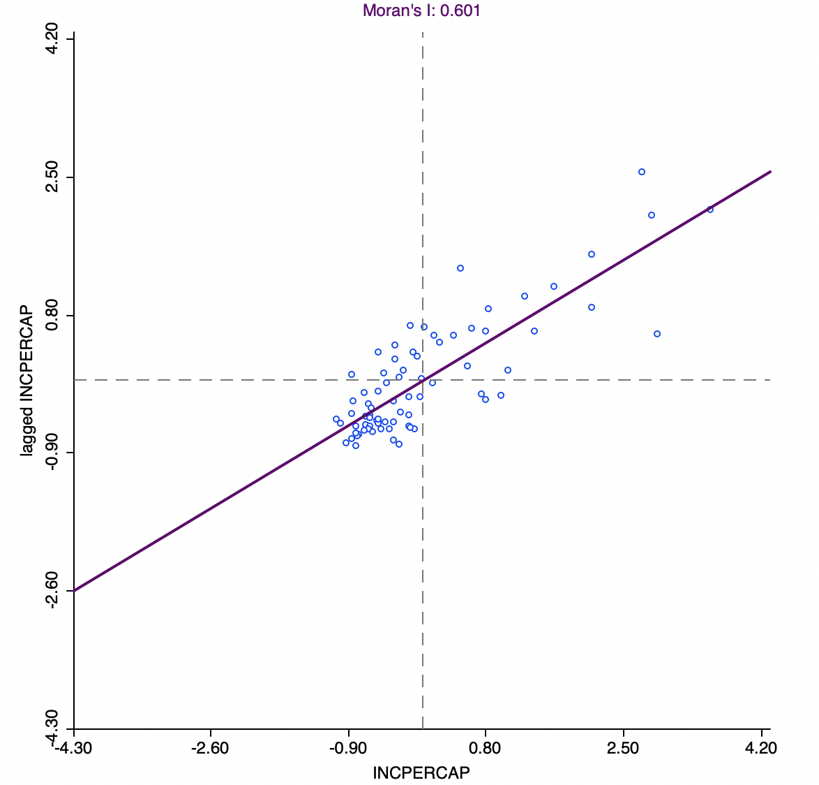
Figure 13.9: Moran scatter plot, community area per capita income
13.5.4.1 Categories of spatial autocorrelation
An important aspect of the visualization in the Moran scatter plot is the classification of the nature of spatial autocorrelation into four categories. Since the plot is centered on the mean (of zero), all points to the right of the mean have \(z_i > 0\) and all points to the left have \(z_i < 0\). These values can be referred to respectively as high and low, in the limited sense of higher or lower than average. Similarly, the values for the spatial lag can be classified above and below the mean as high and low.
The scatter plot is then easily decomposed into four quadrants. The upper-right quadrant and the lower-left quadrant correspond to positive spatial autocorrelation (similar values at neighboring locations). They are referred to as respectively high-high and low-low spatial autocorrelation. In contrast, the lower-right and upper-left quadrant correspond to negative spatial autocorrelation (dissimilar values at neighboring locations). Those are referred to as respectively high-low and low-high spatial autocorrelation.
The classification of the spatial autocorrelation into four types begins to make the connection between global and local spatial autocorrelation. However, it is important to keep in mind that the classification as such does not imply significance. This is further explored in the discussion of local indicators of spatial association in Chapter 16.
Figure 13.10 illustrates the high-high quadrant for the income per capita Moran scatter plot. The points selected in the left-hand graph are linked to their locations in the map on the right. Clearly, these tend to be locations in the upper quartile (as well as upper outliers) surrounded by locations with a similar classification.
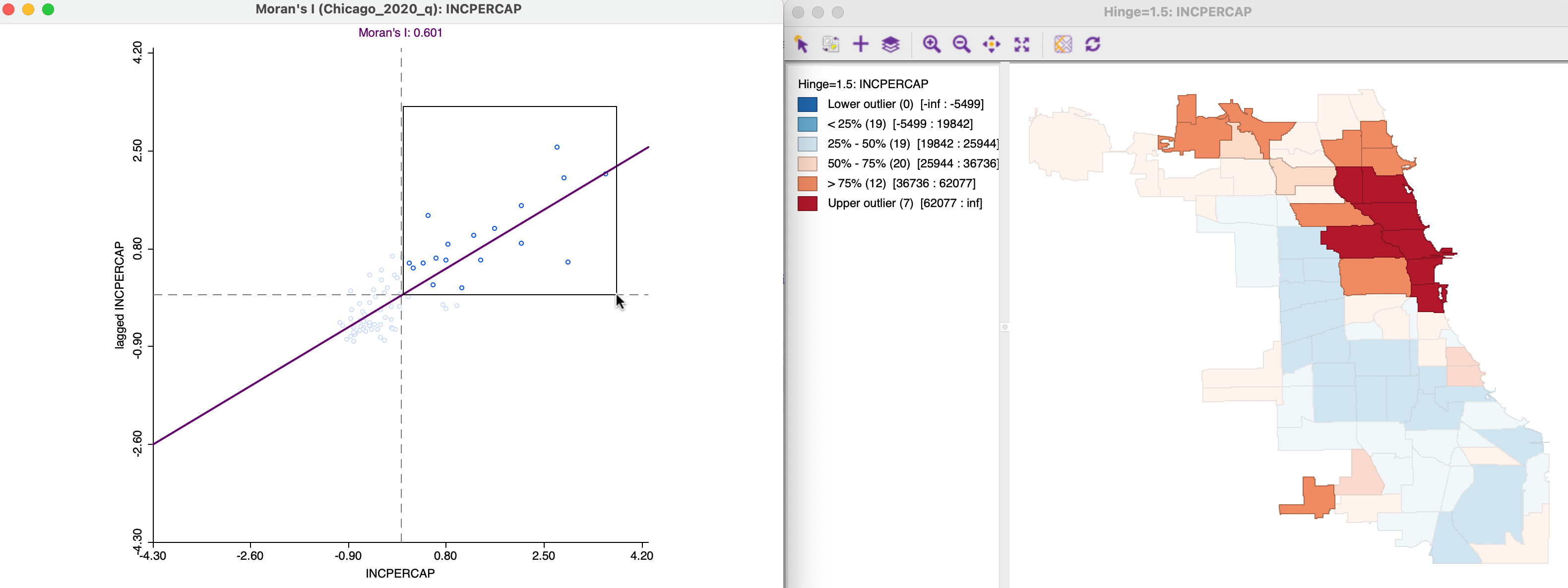
Figure 13.10: Positive spatial autocorrelation, high-high
Negative spatial autocorrelation of the low-high type is illustrated in Figure 13.11. The community area selected in the map on the right is in the second quartile, surrounded by neighbors that are mostly of a higher quartile. One neighbor in particular belongs to the upper outliers, which will pull up the value for the spatial lag. The corresponding selection in the scatter plot on the left is indeed in the low-high quadrant.
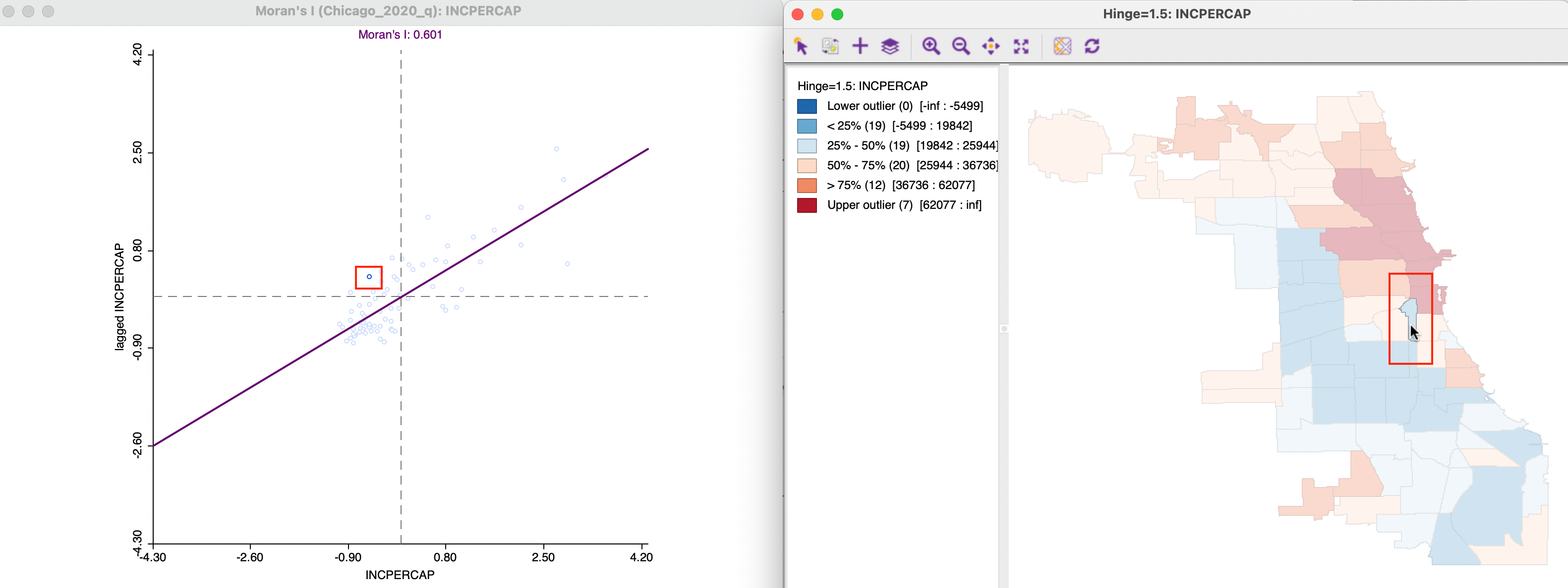
Figure 13.11: Negative spatial autocorrelation, low-high
One issue to keep in mind when assessing the relative position of the value at a location relative to its neighbors is that a box map such as Figure 13.3 reduces the distribution to six discrete categories. These are based on quartiles, but the range between the lowest and highest observation in a given category can be quite large. In other words, it is not always intuitive to assess the high-low or low-high relationship from the categories in the map.
Expressed in this manner, the statistic takes on the same form as the familiar Durbin-Watson statistic for serial correlation in regression residuals.↩︎
An alternative alternative approximation based on the saddlepoint principle is given in Tiefelsdorf (2002), but it is seldom used in practice.↩︎
In a bivariate linear regression \(y = \alpha + \beta x\), the least squares estimate for \(\beta\) is \(\sum_i (x_i \times y_i) / \sum_i x_i^2\). In the Moran scatter plot, the role of y is taken by the spatial lag \(\sum_j w_{ij} z_j\).↩︎