2.4 Visualizing principal components
Once the principal components are added to the data table, they are available
for analysis in any of the many statistical graphs in GeoDa (see Chapters 7-8 in Volume 1). Two use cases warrant some special attention: a scatter plot of any pair of
principal components, and the contribution to a component as visualized by means of a parallel coordinate
plot.
2.4.1 Scatter plot
A useful graph is a scatter plot of any pair of principal components. For example, such a graph is shown for the first two components (based on the SVD method) in Figure 2.9. By construction, the principal component variables are uncorrelated, which yields the characteristic circular cloud plot. A regression line fit to this scatter plot results in a horizontal line (with slope zero). Through linking and brushing, any point or subset of points in the scatter plot can be associated with locations on the map.
In addition, this type of bivariate plot is sometimes employed to visually identify clusters in the data. Such clusters would be suggested by distinct high density clumps of points in the graph. Such points are close in a multivariate sense, since they correspond to a linear combination of the original variables that maximizes explained variance.6
For example, the density cluster methods from Chapter 20 in Volume 1 could be employed to identify clusters among the points in the PCA scatter plot. To achieve this, geographical coordinates would be replaced by coordinates along the two principal component dimensions. This provides an alternative perspective on multivariate local clusters.
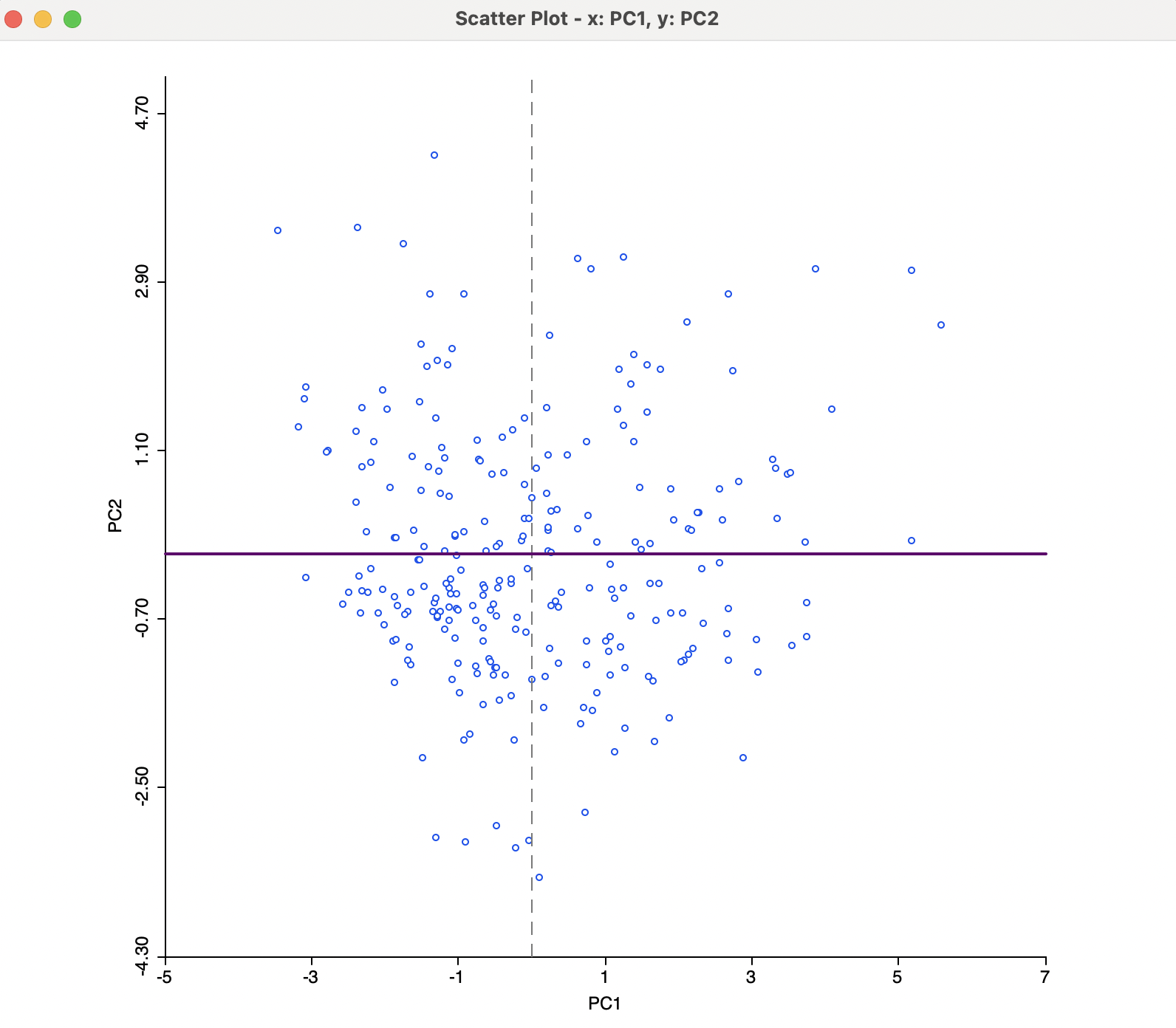
Figure 2.9: Principal Component Scatter Plot
To illustrate the effect of the choice of eigenvalue computation, Figure 2.10 shows a scatter plot of the second principal component using the SVD method (PC2) and the Eigen method (PC2e). The sign change is reflected in the perfect negative correlation in the scatter plot.
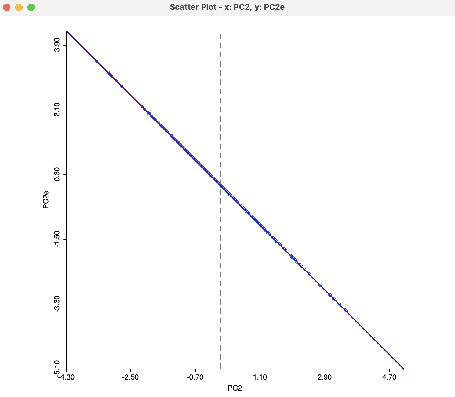
Figure 2.10: SVD versus EIGEN Results
2.4.2 Multivariate decomposition
Further insight into the connection between a principal component and its constituent variables can be gained from an investigation of a parallel coordinate plot. In the left-hand panel of Figure 2.11, the observations from the bottom 10% of the first principal component are selected (26 observations). The three main contributing variables are shown in the parallel coordinate plot on the right, in standardized form (s_intr, s_eqln, and s_caprat). The selected observations suggest a clustering, with low scores on the principal component corresponding to community banks with a high ratio of interest expenses over total funds, a low ratio of total equity over customer loans and a low ratio of capital over risk weighted assets, all indicators of rather poor performance.
Again, this illustrates how a univariate principal component can be used as a proxy for multivariate relationships, especially when a high percent of the variance of the original variables is explained, with a distinct and small number of contributing variables to the component.
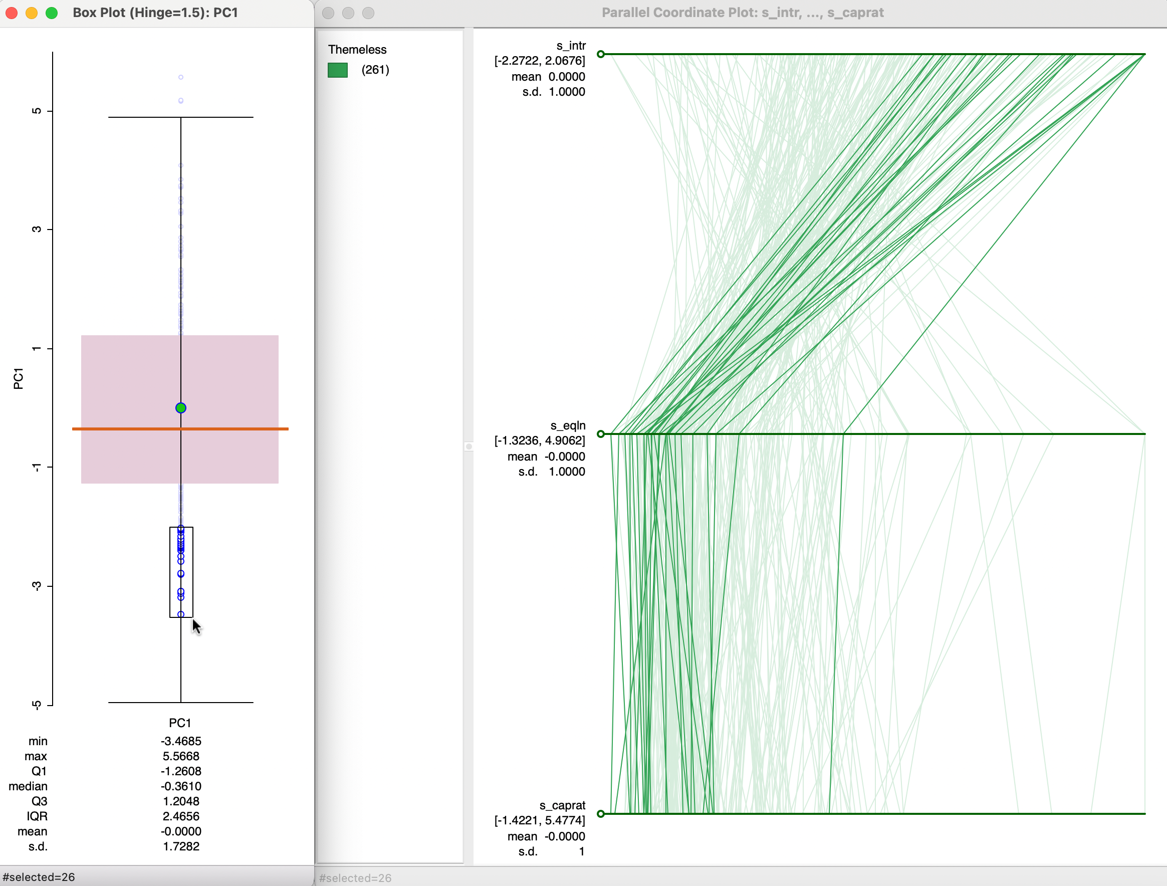
Figure 2.11: Principal Components and PCP