6.3 Implementation
The K-means algorithm is illustrated with a partial replication of the cluster analysis in Kolak et al. (2020). The variables selected are matched as closely as possible, but instead of using all the U.S. census tracts, the analysis is based on the 791 Chicago census tracts in the Chicago SDOH sample data set.
The following sixteen variables were included:
- EP_MINRTY: minority population share
- Ovr6514P: population share aged > 65
- EP_AGE17: population share aged < 18
- EP_DISABL: disabled population share
- EP_NOHSDP: no high school
- EP_LIMENG: limited English proficiency
- EP_SNGPNT: percent single parent households
- Pov14: poverty rate
- PerCap14: per capita income
- Unemp14: unemployment rate
- EP_UNINSUR: percent without health insurance
- EP_CROWD: percent crowded housing
- EP_NOVEH: no car
- ChildPvt14: child poverty rate
- HealtLit: health literacy index
- FORCLRISK: foreclosure risk
This set nearly matches the variables listed in Table 2 of Kolak et al. (2020), except that for the Chicago census tract data, no variables were included for Renter and Rent Burden. Instead, the variables for child poverty rate, health literacy index and foreclosure risk were added.
Descriptive statistics are reported in Figure 6.11. Most variables are characterized by a large range and associated standard deviation. A sense of the effect of the spatial scale, i.e., census tract compared to community area, can be gleaned from a comparison of the descriptive statistics for matching variables in Figure 5.13.
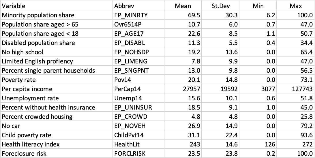
Figure 6.11: SDOH Census Tract Variables Descriptive Statistics
In practice, when many variables are considered, it is often more effective to carry out the clustering exercise after dimension reduction. Instead of using the sixteen variables listed, the clustering is based on the main principal components.32
6.3.1 Digression: Clustering with Dimension Reduction
A principal component analysis of the sixteen variables yields four main components, according to the Kaiser criterion (see Section 2.3.2.1). As it turns out, this matches the results in Kolak et al. (2020) for the whole U.S.
The first component explains 44.3 % of the variance, the second 17.7 %, the third 8.6 %, and the fourth 6.7 %., for a total of 77.4 %. The principal loadings of the variables for the four components are listed in Figure 6.12.
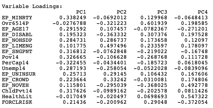
Figure 6.12: Principal Components Variable Loadings
The interpretation of the components is not that straightforward. Following Kolak et al. (2020), the main focus is on loadings that are larger than 0.30 in absolute value. Similar to the national results, the first component can be labeled economic disadvantage, with strong positive loadings on percent minority, poverty rate (including child poverty) and single parent households, and a negative loading on income per capita.
The results for the second component also closely match the national findings, with strong positive loadings on limited English proficiency, crowded housing, and lack of health insurance, with negative loadings on disability, elderly and lack of vehicles. This would suggest more immigrant neighborhoods.
The loadings for the third and fourth components differ somewhat from the national results, which is not surprising, given the urban nature of the data, in contrast to a mix of urban and rural in the national sample.
For the third component, the strongest positive loadings are age over 65 and percent disabled, but with a negative loading on lack of cars, suggesting neighborhoods with an older population, further from the urban core, requiring car use (early suburbs). Finally, the fourth component loads strongly positive on health literacy and the lack of vehicles, and negative on foreclosure risk, suggesting better educated stable neighborhoods with good transit access.
6.3.2 Cluster Parameters
K-Means clustering is invoked from the drop down list associated with the cluster toolbar icon, as the first item in the classic clustering methods subset, shown in Figure 6.1. It can also be selected from the menu as Clusters > K Means.
This brings up the KMeans Clustering Settings dialog. This dialog has a similar structure to the one for hierarchical clustering, with a left hand panel to select the variables and specify the cluster parameters, and a right hand panel that lists the Summary results.
The left panel is shown in Figure 6.13.
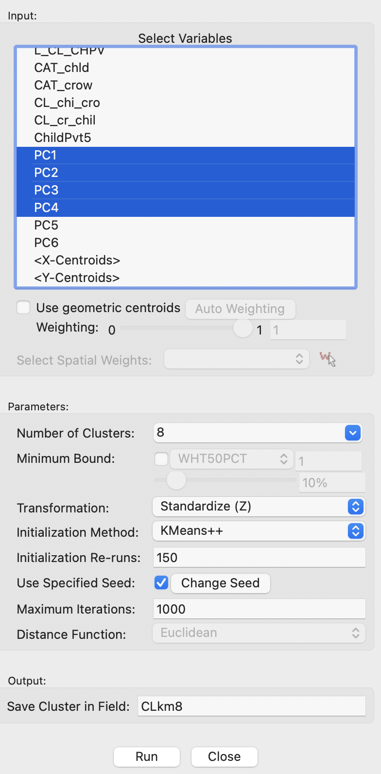
Figure 6.13: K-Means Clustering Variable Settings
In the example, the four principal components are selected as variables, and the Number of Clusters is set to 8. In contrast to hierarchical clustering, this is not set to a default value and must be specified. All other items are left to their default settings. This means that the Initialization Method is KMeans++, with 150 Initialization Re-runs, and 1000 Maximum Iterations. The random seed is set to the default value, but that can be altered. The variables are transformed to Standardize (Z). Since K-means clustering only works for Euclidean distance, the Distance Function is not available.
Clicking on Run saves the cluster classification in the table under the field specified as such (here, CLkm8). It also provides the cluster characteristics in the Summary panel, with the associated cluster map in a separate window.
6.3.3 Cluster Results
The cluster characteristics reported in the Summary panel are the same as for hierarchical clustering. In fact, all cluster methods in GeoDa share the same summary format.
Figure 6.14 lists the results for K-means with \(k\)=8 on the four principal components of socio-economic determinants of health. The cluster centers are again reported, but these are not that easy to interpret, since they pertain to principal components, not to the original variables.
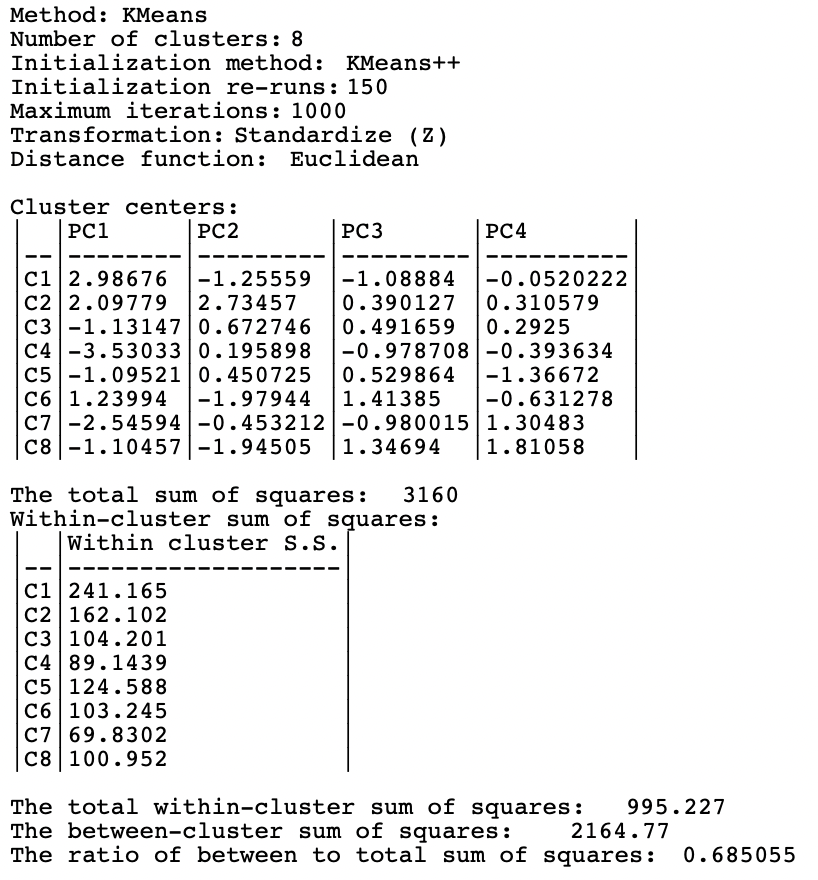
Figure 6.14: Summary - K-Means Method, k=8
The total sum of squares is 3160. The within sum of squares yields 995.227, resulting in a between to total ratio of 0.685.
Figure 6.15 visualizes the relative scores for the mean centers on each of the principal components for the eight clusters in a parallel coordinate plot. The colors associated with each cluster match the legend in the cluster map in Figure 6.16. Given the way the PCP is implemented in GeoDa, the unique values classification is based on the first principal component. Even though the components are continuous variables, the cluster center scores are distinct, so that they can be treated as unique values.33 Cluster 1 starts with the highest score for PC1, but then achieves low scores for the other components. Cluster 2 starts with the second highest score for PC1 and the highest score for PC2, with middle of the road values for the other components. Each of the polylines yields a clearly distinct pattern from the others, corresponding to the dissimilarity between clusters. With some imagination and creativity, the clusters can be associated with substantive concepts, such as economic distress for the first cluster. As with the interpretation of principal components, this is not always straightforward.
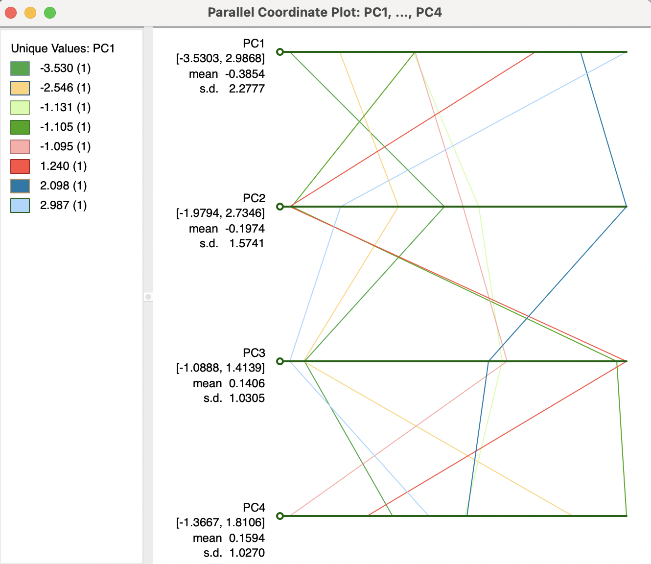
Figure 6.15: PCP Plot of K-Means Cluster Centers
The spatial layout of the clusters is shown in Figure 6.16. The clusters range in size from 154 tracts for the largest to 44 for the smallest. They tend to consist of large chunks of contiguous tracts, which is likely a result of the high degree of racial and socio-economic spatial stratification in Chicago. A priori, one would not expect such spatially grouped results. For example, the largest cluster is made up predominantly by a set of contiguous tracts in the west and similarly in the south, corresponding with traditionally economically distressed (predominantly minority) neighborhoods. Cluster 4 (114 tracts) and cluster 7 (60 tracts) are primarily in northern lakeside of the city, well-known to consist of higher income (predominantly white) neighborhoods.
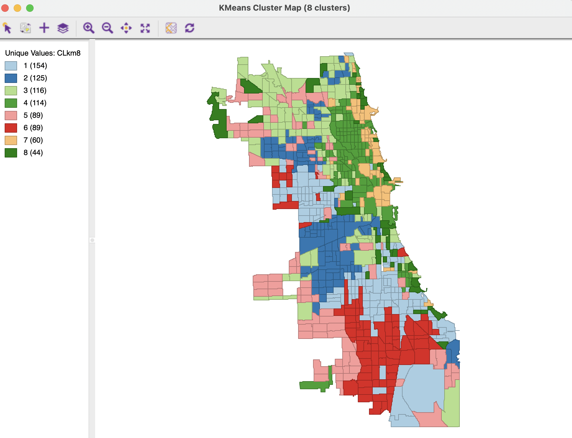
Figure 6.16: Cluster Map - K-Means Method, k=8
In sum, even though no spatial constraints were imposed on the clustering method, the results bring up very pronounced (and well known) spatial patterns in the cluster formations.
6.3.3.1 Adjusting cluster labels
Since the cluster map is simply a special case of a GeoDa unique values map, its legend categories can be moved around. This can be particularly useful when comparing the maps for different cluster classifications, where the ordering by size of cluster may not be the same. Changing the color (and thus the label) of the clusters by moving the legend rectangles up or down in the list may facilitate visual comparison of the cluster maps.
6.3.4 Options and Sensitivity Analysis
The K-means run with the default options yields a local optimum among several possible solutions. In order to assess the quality of the solution, several parameters and options can be manipulated. Most important of these are the initialization (the starting point for the iterative relocation) and the number of clusters, \(k\). In addition, while Z standardization is often the norm, this is by no means a requirement. Some other approaches, which may be more robust to the effect of outliers (on the estimates of mean and variance used in the standardization) are the MAD, mentioned in the context of PCA, as well as range standardization. The latter is often recommended for cluster exercises (e.g., Everitt et al. 2011). It rescales each variable such that its minimum is zero and its maximum becomes one by subtracting the minimum and dividing by the range. For each cluster method, the usual full range of standardization options is available.
Finally, in many contexts, small clusters are undesirable and some minimum size constraint may need to be imposed. For example, this is often the case when reporting rates for rare diseases, where the population at risk must meet a minimum size (e.g., 100,000). GeoDa provides an option to set a minimum bound for the cluster size.
6.3.4.1 Initialization
The Initialization Method option provides Random initialization as an alternative to KMeans++. The number of initial solutions that are evaluated is set in the Initialization Re-runs box. Typically, the default of 150 is fine in most applications. In fact, in the current example, changing this option only affects the ultimate solution in marginal ways. The number of tracts in some clusters differs slightly, but several different combinations all yield a BSS/TSS of 0.685.
Changing this option is more important when the initial default results do not indicate a good separation between clusters.
6.3.4.2 Selecting k – Elbow plot
Selecting the optimal \(k\) is critical both for the quality of the ultimate solution and for its interpretation. Unfortunately, this is not that easy in practice. An elbow plot shows the change in performance as \(k\) increases. By construction, the WSS will decrease and the BSS/TSS ratio will increase. The goal is to identify a kink in the plot, i.e., a value for \(k\) beyond which there are no more major improvements in the cluster characteristics.
As such, GeoDa does not include functionality for an elbow plot, but all the needed information is contained in the summary output. Figure 6.17 lists the values for the within sum of squares (WSS) and the ratio of between sum of squares to total sum of squares (BSS/TSS) for \(k\) going from 1 (when WSS=TSS) to 20. The third and fourth columns list the change in BSS/TSS as well as the percentage change.
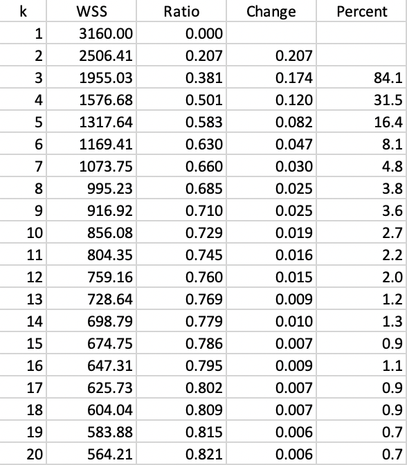
Figure 6.17: K-Means - Evolution of fit with k
The improvement in fit is quite substantial in the early stages, but it seems to stabilize between \(k\)=8 and \(k\)=10, moving to a much smaller change. For example, the change in value for BSS/TSS achieved between \(k\)=5 and \(k\)=8 (yielding 0.685) is about the same as that between \(k\)=8 to \(k\)=15 (yielding 0.786). Therefore, a choice of \(k\) between 8 and 10 seems to be reasonable in this application.
A graphical representation of the evolution of the fit is given in the elbow plots in Figures 6.18 and 6.19, respectively for WSS and for BSS/TSS. Whereas it is clear that the improvement in fit gradually decreases with higher \(k\), identifying a clear kink in the curve is not that straightforward.
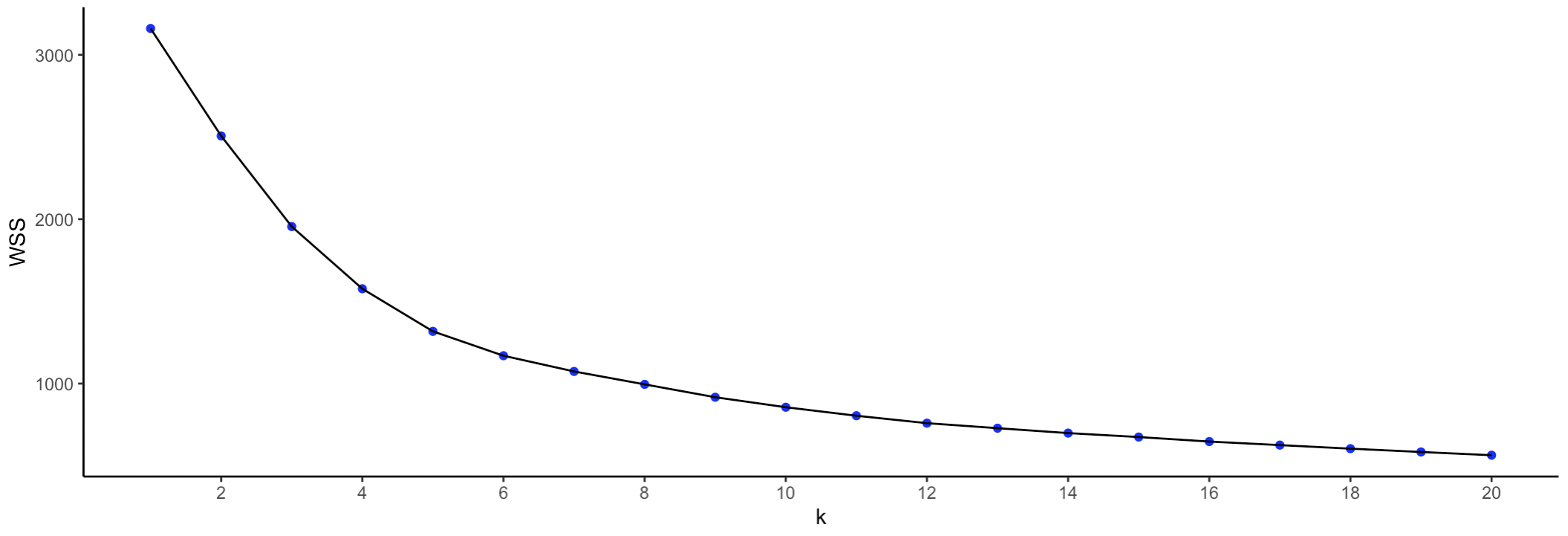
Figure 6.18: K-Means - Elbow Plot WSS
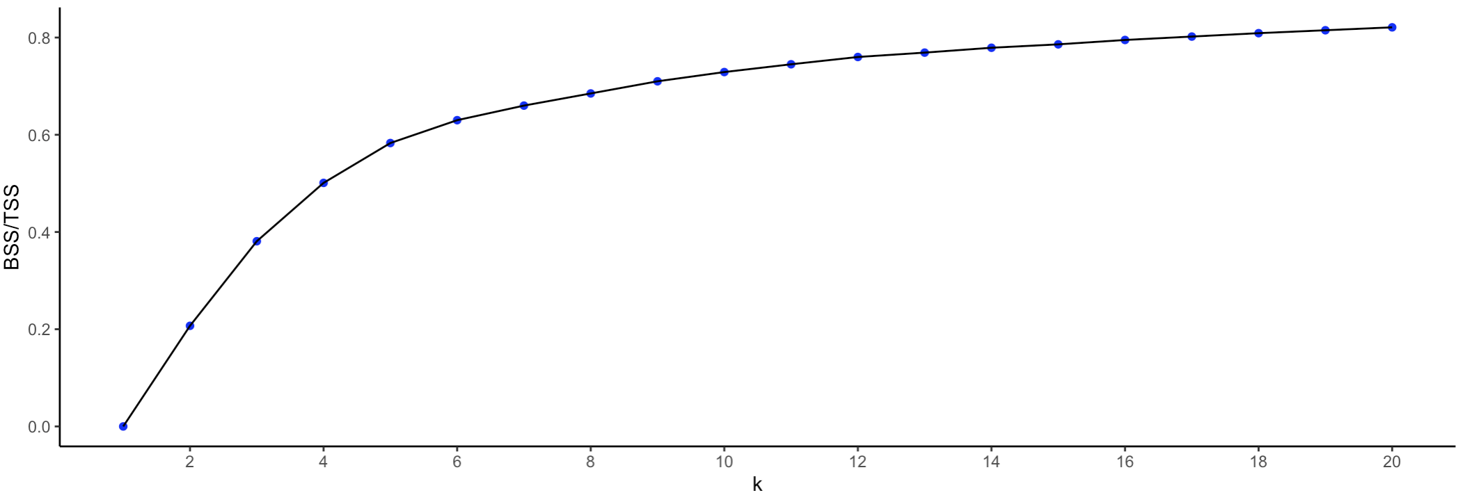
Figure 6.19: K-Means - Elbow Plot BSS/TSS
6.3.4.3 Standardization
In the current example, the principal components are already somewhat standardized. By construction, the means are zero and the range is limited by the standardization on the factor loadings. While the variance for each component is not identical, the difference in range is limited. Therefore, in this instance, different standardizations do not yield meaningfully different results. However, in general, depending on the context, even though the standard Z transformation is appropriate in most circumstances, there may be instances where a different transformation (or even no transformation) may be a better option.
6.3.4.4 Minimum bound
In several applications, it is necessary that each cluster achieves a minimum size, such as the population at risk in epidemiological studies, or a critical population threshold in marketing studies. In GeoDa,
it is possible to constrain the K-means
clustering solution by imposing a minimum value for a spatially extensive variable, such as a
population total. This ensures that the clusters meet a minimum size for that variable.
This is accomplished through the Minimum Bound option. It is turned on by checking the corresponding box in the left-hand panel of the interface and specifying a spatially extensive variable from the drop down list. More specifically, the variable should be a count that lends itself to aggregation by means of a simple sum, rather than percentages, per capita ratios or median values.
For example, the variable Pop2014 contains the population size for each tract. The default setting is to take the value of the 10th percentile for this variable, in this case a value of 271,050. However, with this value and for \(k\)=8, none of the solutions achieves the minimum bound (see also Section 6.4.2).
Instead, with a population threshold of 200,000, the results shown in Figures 6.20 and 6.21 are obtained. The price for imposing the constraint as opposed to an unconstrained solution is a slight deterioration in the BSS/TSS ratio, to 0.681806.
Relative to the unconstrained solution, the cluster sizes are slightly more balanced, with somewhat smaller larger clusters and somewhat larger smaller clusters. Also, as the cluster map illustrates, the location of the larger clusters has shifted, from predominantly in the south and west for the unconstrained solution to a northern location for the constrained solution. Other such spatial shifts can be observed as well.
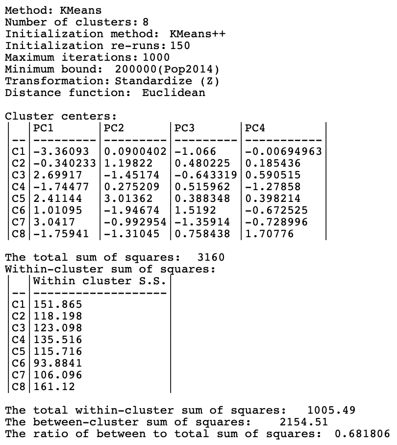
Figure 6.20: Summary - K-Means Method, population bound 200,000, k=8
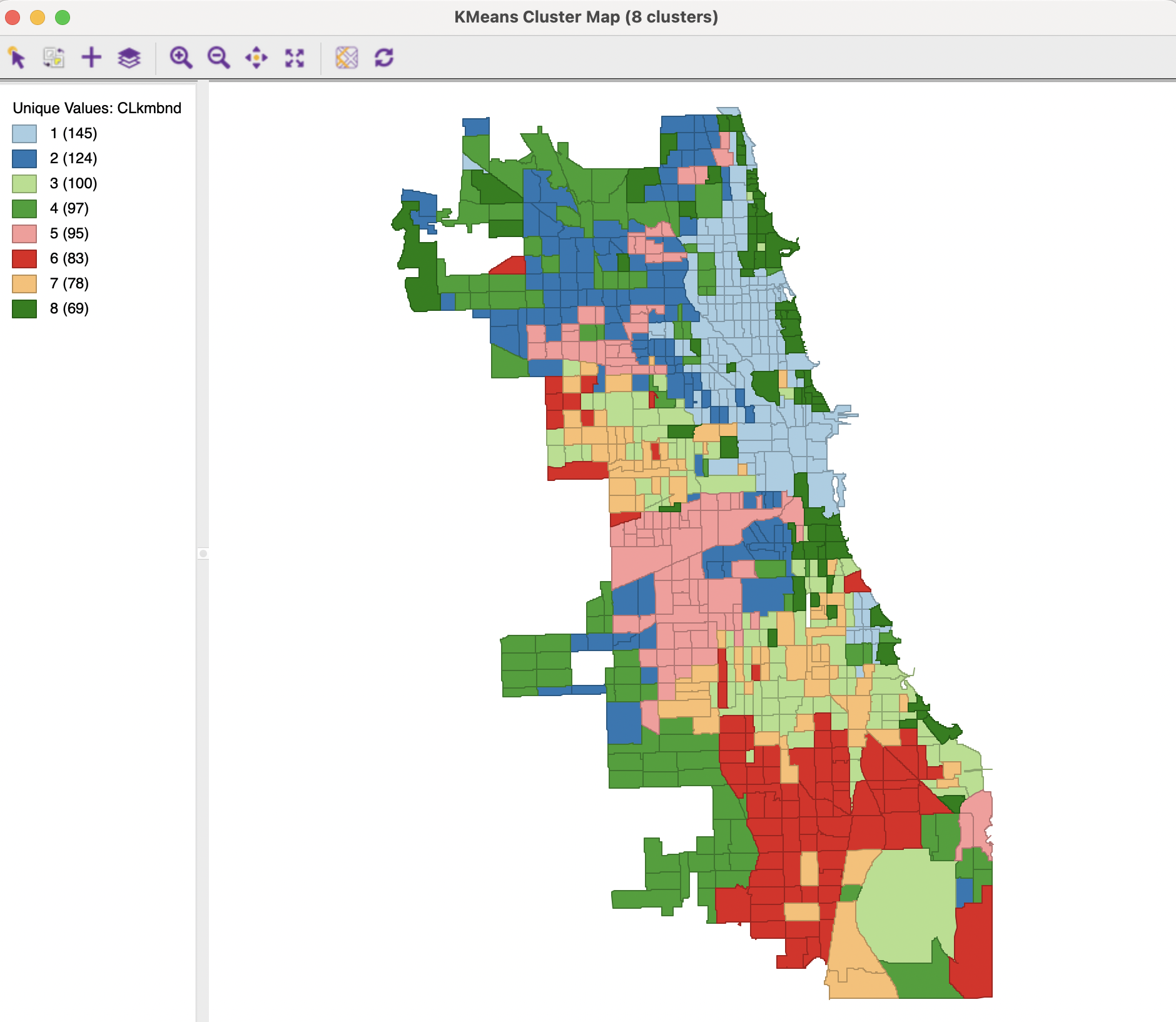
Figure 6.21: Cluster Map - K-Means Method, population bound 200,000, k=8
This follows the logic in the Kolak et al. (2020) paper. The difference is that the principal components are derived from the Chicago census tract observations, whereas in Kolak et al. (2020) they were computed for all U.S. census tracts.↩︎
The graph is constructed by saving the cluster summary to a text file and subsequently extracting the mean center information. This then becomes the input to
GeoDaas a csv file with the principal components as variables and the cluster labels as observations. The colors in the legend are edited to match the cluster map classification.↩︎